Detailed analysis of the
DiMAGE Z10 images, from Imatest(tm)
I've recently begun using Norman Koren's excellent "Imatest" analysis program for quantitative, thoroughly objective analysis of digicam test images. I highly commend it to our technically-oriented readers, as it's far and away the best, most comprehensive analysis program I've found to date. (And with an introductory price of only $59, it's hard to beat.)
My comments below are just brief observations of what I see in the Imatest results. A full discussion of all the data Imatest produces is really beyond the scope of this review: Visit the Imatest web site for a full discussion of what the program measures, how it performs its computations, and how to interpret its output.
Here's some of the results produced by Imatest for the Konica Minolta DiMAGE
Z10:
Color Accuracy
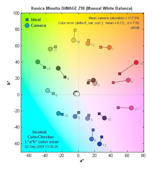
Color accuracy seems to be the Z10's weakest point. As the plot above shows,
it tends to oversaturate its colors quite a bit, and shades of red and pink
in particular are pumped up beyond natural levels. (This explains why Marti's
skin tones looked so red in the "Sunlit" portrait test.) The oversaturation
is shown by the extent to which the circles (camera color) are displaced outward
(higher saturation) relative to the ideal values (squares). On average, color
saturation of swatches on the MacBeth ColorChecker(tm) chart are 117.5% of
their ideal values. (An average oversaturation of 17.5%.)
Color Analysis
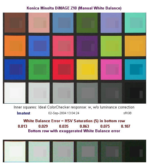
These images show the color behavior of the Z10 directly. In each color swatch, the outer perimeter shows the color as actually captured by the camera, the inner square shows the color after correcting for the luminance of the photographed chart (as determined by a 2nd-order curve fit to the values of the gray swatches), and the small rectangle inside the inner square shows what the color should actually be, based on perfect rendering to the sRGB color space.
Here, it seems like most of what appears visually to be oversaturation is actually
a problem with the camera's overly contrasty tone curve.
Gray Patch Tone and Noise Analysis

There's a lot in this particular graph, a lot more than I have room to go into
here. Bottom line, the Z10's noise levels are surprisingly low, particularly
for such an inexpensive camera, and what noise there is tends to be fairly fine-grained.
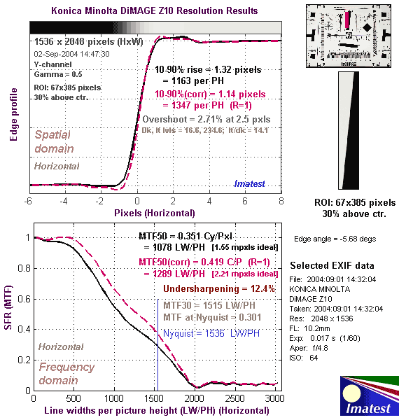
Resolution Chart Test Results
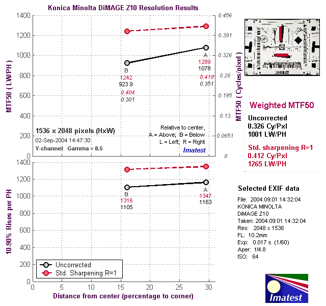
The chart above shows consolidated results from spatial frequency response
measurements in both the horizontal and vertical axes. The "MTF 50"
numbers tend to correlate best with visual perceptions of sharpness, so those
are what I focus on here. The uncorrected resolution figures are1078 line widths
per picture height in the horizontal direction (corresponding to the vertically-oriented
edge), and 923.9 along the vertical axis (corresponding to the horizontally-oriented
edge), for a combined average of 1001 LW/PH. Correcting to a "standardized"
sharpening with a one-pixel radius improves the results considerably, to an
average of 1265 LW/PH. (This supports my findings that the Z10 can deliver significantly
better resolution if you shoot with its sharpness adjustment at the low setting,
and then sharpen post-exposure in Photoshop(tm).)
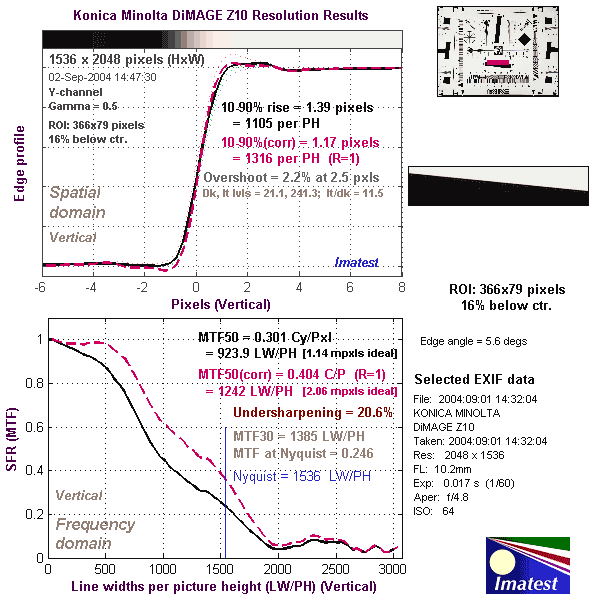
For the real techno-geeks, the two plots below show the actual edge response
of the Z10, for horizontal and vertical edges:
Z10 Test Images
Z10 Imatest Results
Z10 Specifications
Z10 "Picky Details"
Up to Imaging Resource digital cameras area

Follow Imaging Resource: