500px photo sharing site overhauls look, makes photos even bigger
posted Thursday, July 18, 2013 at 1:22 PM EDT
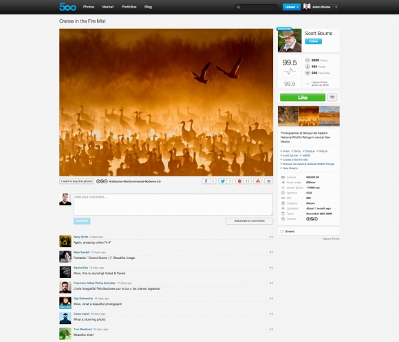
Starting last night, some 500px users may have noticed that their image pages have shown up looking slightly different. 500px has just tweaked the layout of photo pages, and now shows less clutter around photographs.
The changes started rolling out to 500px users yesterday so not everyone might be seeing it yet, but the big change is that much of the info that was previously shown on the sides of an image is now shifted above and below, allowing images more room to stand on their own.
As you can see in the comparisons below, previously information about the photographer, the image's popularity, and its settings were kept on the right side of the photograph. In the new layout, those have been bumped either above or below, and photographs (especially those in landscape format) have a bit more space.
The other new addition is "Focus View." If you click on an image, it'll launch a lightbox for quickly going through photographs, which you can control, favorite, and like, using just your keyboard. If you want to use the new view in photo streams such as "Popular" and "Upcoming," just hit H on your keyboard to launch it.
This is mostly a relatively minor layout change, and one that allows photographs to be seen in slightly larger sized — but even minor redesigns are contentious. Something as minor as adding a permanent navbar on Flickr caused an uproar recently, so we'll see how people take this new look.