One Enchanted Winner: We announce our Photo of the Month award winners for May
posted Friday, June 6, 2014 at 5:00 PM EDT
It's that time again when we have the honor of announcing our worthy Photo of the Month award winners. The quality of incoming submissions has been very high lately, and we're grateful to all of you who submit photos to our contest as it makes our job much more enjoyable.
To those of you who were awarded a daily winner in May but didn't make the podium here, please know that this month we had the toughest time whittling down the selections, and actually battled for longer than we ever have in my two years here in the process (no physical contact I'm happy to report, but certainly fiery and heated). This is also the first time I've witnessed a hat trick from one manufacturer - as a Canon DSLR was used for all three of the prize winning shots.
The top three winners from this month all receive gift certificates from Adorama of $300, $200 and $100, respectively.
Now, without further ado, we present our contest winners from May, with commentary by IR founder and publisher Dave Etchells:

This one was a near-unanimous favorite with the judges, who were captivated by the delicate shading and subtle color gradations. It's interesting compositionally, too, with the leaves of the plant drawing attention to the central cluster. Note particularly the way the tops of the leaves reinforce the horizontal aspect ratio, suggesting a rectangular frame within the overall image, while the edges of the leaves create strong leading lines pointing to the central subject. In fact, this in some ways is a "double rule of thirds" photo, with the three central leaves located in the lower right rule of thirds area in both the overall image, and also within the inner rectangular frame created by the leaf tips. A great shot, Peggy, congratulations!

The first reaction of everyone who saw this was "awww..." People enjoy seeing nature shots where seemingly human emotions are expressed, in this case, a sense of caring and protectiveness. (Although I'm guessing that this is a courtship dance, with the more colorful male bird in the lower position.) When I saw this photo, my second reaction (see above for the first) was that Debra should have cropped it tighter on the left, but after playing Hollywood Director for a bit and trying out different framings with my hands, I ended up concluding that Debra's framing was better than anything I could come up with. I think the large, light, blank background in the upper left helps balance and draw attention to the weight of the birds on the right. The positioning of the birds within the frame is also very interesting. The bird on the right's eye is almost exactly on the upper right rule of thirds point, and its eye and bill taken together form a leading line pointing to a point near the center of the lower bird's beak - which happens to be almost exactly in the center of the overall image. It's easy to get carried away with numbers and proportions, but I found it intriguing in this case, where the rule of thirds supported a focal point almost dead-center in the photo. Whatever the particulars of proportion, it's a beautifully shot and framed photo, Debra's a very talented photographer. (POTD regulars will recognize her name from her photos that appear as daily winners almost every month.) Congratulations on another fine shot, Debra!
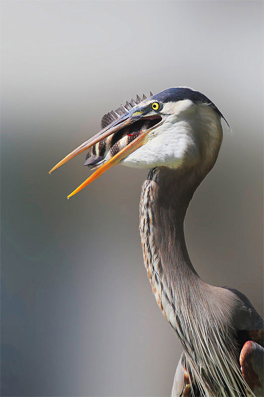
Linn Smith is another regular daily winner here, and this is an absolutely stunning bird portrait. Whether it's just excellent lens bokeh, or an effect done later in Photoshop, the luxuriant softness of the background contrasts dramatically with the bird's plumage and beak, and the spines and scales of the fish. The background tonal gradations also do a great job of supporting the main subject as well; note how the dark sides and light center help draw attention to the bird, and the way the bird's head is resting on what looks like a very soft horizon line. The net effect is a portrait with great contrast and drama, supporting the dramatic nature of the action that's been captured.
Beautiful job, Linn!

Portraits with "character" can be tough; it's easy to overdo or over-emphasize the "character" part, ending up relying on a too-obvious play for sentimentality, rather than good composition or something that more accurately reflects the character of the subjects themselves. This shot is really excellent, in that it gives a sense of a tough, no-nonsense young girl, but doesn't rely on "wow, look how different this person is from you" for its appeal. I personally find it endearing and engaging, wonder about the girl's thoughts and life, feel drawn to look at her over and over again. I think some of why it works so well is that the girl's eyes are visible, yet deeply shadowed, perhaps adding to the mystery. I could talk about composition again, rule of thirds, offsetting areas of light and dark (and those are all great and very nicely done) but ultimately it comes down to the indefinable art of portraying character, which this picture embodies perfectly.
Big kudos, Mayank, a very nice portrait!

Stephen Shpall is another photographer whose work frequently graces these pages; in this shot, he once again shows his eye for dramatic landscapes. As with Debra Dorothy's photo above, my first reaction was to think "gosh, that's a lot of foreground", and to also wonder if cropping more tightly on the right would have worked. As with Debra's shot, though, the more I looked at it, the more I realized that Stephen's framing was excellent. The heavy mass of the the lower right foreground balances and creates contrast with the setting sun in the upper left. Supporting that split, the lighter sky in the upper right corner also works to create a diagonal dividing line within the image, that the upper rock mass juts out of: Cropping in on the right to eliminate that little bit of sky showing between the rocks at upper right would ruin the balance of the image, and make a much less interesting composition. All in all a gorgeous dark, moody landscape, Stephen, congrats once again!
A big congratulations to these deserving photographers. Thanks to all of you for participating and please keep the terrific submissions coming our way!
For anyone wanting to know more about our competition please visit this news story which describes our contest and also offers some useful tips to help you succeed. To see camera and exposure information on this month's winners or to visit previous months please visit our POTD winner's gallery.