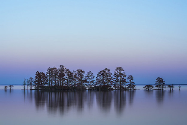
From Kenya to the Florida Keys: Our October Photo of the Day monthly winners impress!
posted Wednesday, November 19, 2014 at 1:47 PM EDT
It's that time again to unveil the monthly winners for our Photo of the Day contest. This October saw some real standout photographs pass through our doors, and we had a tougher time than usual narrowing them down and casting our final votes.
Ultimately we were able to whittle it down to the five worthy photographs shown below, all outstanding in their own right and on any given day the order could easily shift around. From the top winning shot by our regular Melissa Anderson, contributor of so many prize-winning images, to a sublime shot from the Florida Keys by Frederick Ross, to a rather intriguing image by longtime contributor Nikki McDonald, we're yet again proud to be the humble displayers of your terrific work.
Thanks so much to everyone who enters our Photo of the Day contest, and congratulations to the winners this month. The top three all receive gift certificates from Adorama of $300, $200 and $100, respectively. Please keep the wonderful submissions coming our way!
Below are the winning images from October with comments from Imaging Resource publisher Dave Etchells. (Clicking on any image will bring up a larger version in a new window.)
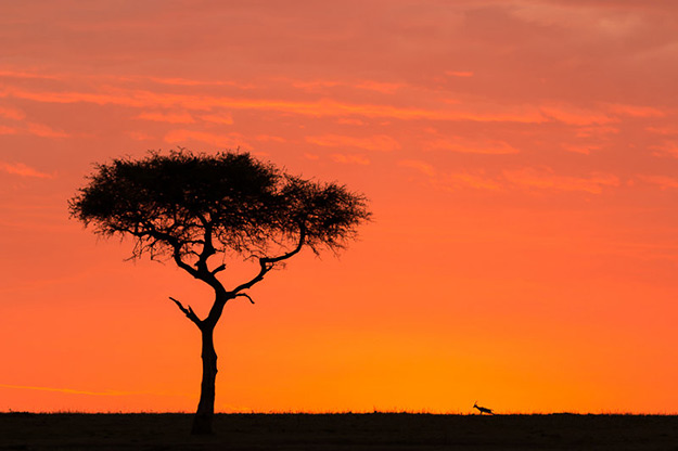
It's interesting how sometimes, the addition of just a tiny element can completely change a picture. Melissa's great Good Morning Kenya here is a perfect example of that. Without the gazelle in the frame, this would be just another picture of a moderately pretty sunrise with a tree in the foreground. With the gazlle in the frame, though, the image opens up enormously, gaining an enormous sense of scale and developing much greater emotional impact as well. (Try it; cover the gazelle with your fingertip, and see how the feeling of the entire image changes.) The gazelle sets an entirely different scale for the image, and also introduces a tension between it and the huge tree. Maybe the tree isn't actually that much bigger and the gazelle is just further away, on the horizon, but that doesn't detract at all from the effect. Our eyes are kept busy, looking between the two, pondering the difference between their sizes and shapes, and perhaps getting a sense of "solitude" in the process. The sky works really well in this shot as well, with the clouds ending at about the level of the treetop and the relatively clear area below setting the stage for the tree and gazelle to play upon. A really great shot, congrats to Melissa on the fruit of her efforts! (Which, besides getting up at pre-dawn, doubtless include a lot of patience and persistence in looking for exactly the right shot.)
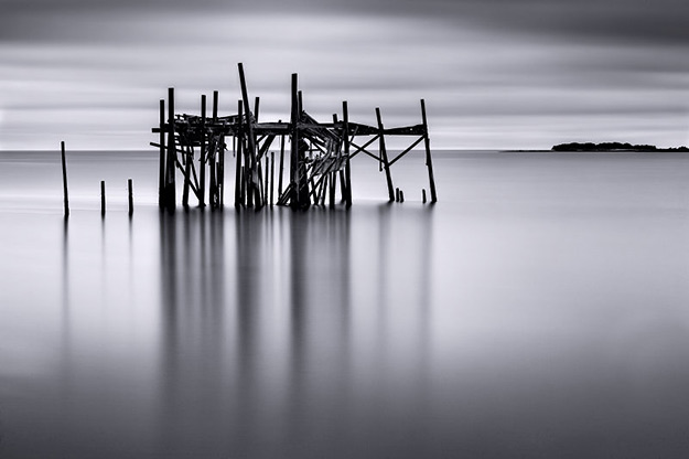
Wow, this is just an incredible photographic composition! I want to stare at it for minutes on end, have a hard time tearing my eyes away long enough to jot down these thoughts on it. (Ok, calm down, Dave...) Seriously, I just get lost in this photo, and it has so many compositional strengths that I can cover only a few. Stepping back visually from the picture, there are three vertical zones, the sky, with strong but soft horizontal elements, abruptly terminated by the sharp horizon line, a lower area of soft, mostly vertical elements, and a central area overlapping the other two, occupied by the skeleton of the "Honeymoon Cottage." The "cottage" bridges the twin worlds of sky and sea, but stands out starkly from both, both in contrast and sharpness. I love the way the vertical lines of the soft reflections of the timbers in the water lead my eye to the "cottage," the subject of the photo. I also love the contrast between the vertical lines of the reflections and the horizontal lines of the sky. This is another photo where the inclusion of one extra element makes the difference between good and great. Try covering the silhouette of the land (island? peninsula?) on the right with your finger, and watch what happens to the photo when you do. Nice, but a little boring, right? Even if you recropped the image, to cut out the whole right side, it's greatly diminshed if you leave out that bit of coastline. That little sliver of land makes all the difference in the image, balancing the weight of the timbers on the left, while reinforcing the strong horizonal of the horizon line, at the same time balancing the negative space in the lower right. Beyond the mechanics of composition, great photos always have an emotional impact as well, and to me, this shot carries a deep sense of melancholy and decay. Congratulations to Frederick on a really remarkable photo!
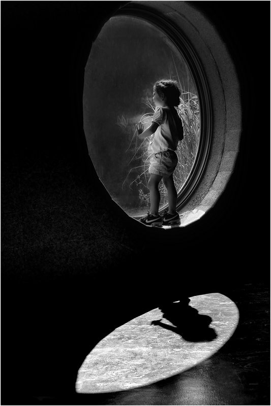
Wow, yet another really great shot! There are just so many things I like about this photo of Nikki's. The echoing of the child and window in the light and shadows on the floor is great. It provides a base for the photo, and the brightness of the light areas draws your eye, but the silhouette of the child and lack of detail in it send your eyes back up to the child him/herself. (I love that sort of visual tension and activity in photos.) The window frames the child, and the curved shape suggests a cradling and evokes the emotions thereof. Combined with the child's rapt attention on whatever's on the other side of the window (Gorillas, presumably, given the title), the photo seems to say "here, let me show you something wonderful." Once again, it's interesting how the elements work together. Take away the light and shadow on the floor, and the photo becomes boring. Change the oval window to a square one, or place the bottom edge of it level with the floor, and you lose the sense of cradling, of lifting up and saying "look here, isn't this wonderful?" A beautiful, evocative shot, big kudos to Nikki for seeing and capturing it!
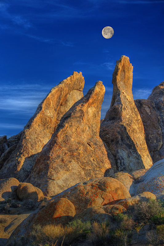
We often wish we had more than 3 prizes to give, but we can at least highlight here the excellent efforts of Tomas DiValentin and Josh Krasner below. Both excellent photos that stood out from the crowd in this month's competition; both ones that we'd be extremely proud to have taken ourselves. Props to Tomas and Josh both; two gorgeous photos!
For anyone wanting to know more about our competition please visit this news story which describes our contest and also offers some useful tips to help you succeed. To see camera and exposure information on this month's winners or to visit previous months please visit our POTD winner's gallery.
[Ready to submit a photo of your own? Just click here! And to compliment these photographers on their submissions or offer your own analysis, please use the comments section below.]
