FINE ART PAPERS
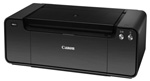
Canon Pro-1
Ten Months Later
By MIKE PASINI
Editor
The Imaging Resource Digital Photography Newsletter
Review Date: July 2012
July 2012
It's hard to believe we've had the Pro-1 in our bunker for over 10 months, but numbers don't lie. They just lead to statistics.
In that time, we've learned a few more things about it (the hard way: entirely from our own experience). In our original review, we promised a further report detailing our experience printing fine arts papers. And we were able to toss in a review of the Pro-1's chief competitor, the Epson R3000, in the meanwhile.
Here's our updated report, with an emphasis on printing third party fine arts papers, as originally promised.
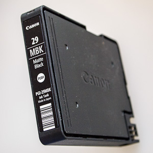
TANK REPLACEMENT | Back to Contents
Compared to an all-in-one device's tiny color ink cartridge, the Pro-1's tanks are like kegs. You can go so long without changing them that you think you won't ever have to do it at all. But you do.
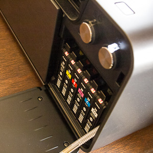
Open. You don't get in here much, but when it's time, you're in here a lot.
When we finally had to change inks, it was laborious. We seemed to be running out of everything at the same time (except, for some odd reason, Matte Black, which the Pro-1 devours) but we only had to change one tank at a time.
It would go something like this:
We'd give the Print command and wait as the printer would flush a little ink out as if it had been sitting a while. Then we'd get an error message that a cartridge was out of ink. So we'd dutifully swap out the cartridge and hit the Resume button on the printer.
The printer would again flush a little ink out, presumably to get the new cartridge cooking (although with tanks and supply line feeding the print head, why would that be?), and again we'd get an error message that another tank or two was out of ink.
This went on about four times, taking half an hour before we could print our image. The flushing of each fresh cartridge seemed to exhaust what little was left in the other low cartridges -- but not all at once.
You might avoid this by not putting the printer to sleep for a few days with low tanks. Or by changing all the low cartridges at once. But it would be silly to make such a recommendation. You run these tanks until they're dry.
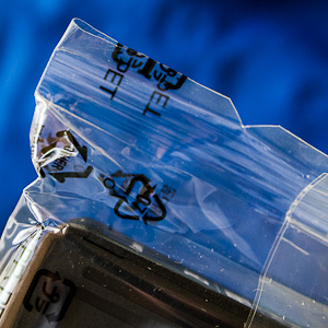
Notch. It points along the long edge. But tear along the short edge. Really.
Just set aside half an hour for a print when the tanks are low.
OPENING THE TANK | Back to Contents
It wasn't easy to open the tank packaging either. There is a notch on the wrap that should be enough of a hint but we tore the packaging along the long side and never made a large enough opening to extract the tank.
The trick is to tear the packaging along the short side of the tank (regardless of the notch's orientation). That opens a large enough hole on the short side to slip the tank out.
We do have to say that swapping tanks was unusually clean. We could do it in our Sunday best (the white sweats) and not worry about getting ink on our hands. Or anywhere else it shouldn't be.
FINE ARTS PAPERS | Back to Contents
In the months since our original review was published, we've run nothing but third-party fine arts papers through the Pro-1. Those included:
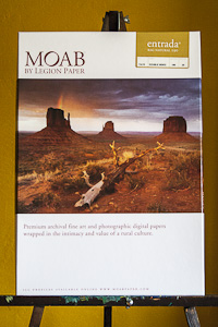
- Moab Entrada Natural
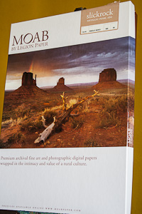
- Moab Slickrock Metallica Pearl 260
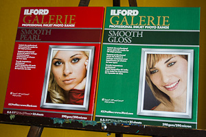
- Ilford Galerie Smooth Pearl
- Ilford Galerie Smooth Gloss
- Ilford Galerie Prestige Smooth Pearl
- Ilford Galerie Prestige Smooth Gloss
- Kodak Ultra Studio Gloss
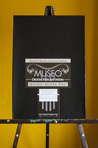
- Museo Silver Rag
OK, the Kodak may not rank very highly in the pantheon of third-party arts papers, but it's an inexpensive, widely-available porous sheet ideal for pigment printing that comes in small sizes. And for 4x6 or 5x7 prints, it was just the ticket.
It's also the only paper we had to create a profile for because Kodak's printers use the code on the back of the sheet to identify it. In a pinch, though, the spec sheet suggests what generic settings will work.
| A Gallery of Fine Arts Papers | ||
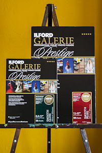
Ilford Galerie Prestige |
Museo Silver Rag |
|
Moab Entrada Natural |
Moab Slickrock Metallica Pearl |
|
Ilford Galerie Premium |
||
For all of the other papers (boxes illustrated above), we used the Pro-1 ICC profiles for those papers supplied by the manufacturers on their respective Web sites. We did not build an ICC profile for any of these papers.
As more experienced printers know, the ICC profile describes the results that can be achieved by a particular ink set on a particular paper. That's the simple explanation.
Ink manufacture has become consistent enough that you don't need to update your ICC profile every time you change a cartridge. And paper characteristics don't wander much from box to box. So with both variables sufficiently consistent from one batch to another, the manufacturer's ICC profile for your printer is a reliable place to start.
As we explained in the original review, though, the Pro-1 has some profiling tools of its own. And if you pursue this for profit, you'll prefer to develop and edit your own ICC profiles.
We also printed with those sheets on an Epson R3000, which preceded the Pro-1 by a few months. And comparing results, we observed some intriguing differences. Here's a few of the more important observations:
Matte Black. We went through matte black quickly, even though we weren't printing much on uncoated papers.
MATTE BLACK. While we liked what the Pro-1 produced, we never did find a way to print very good blacks on uncoated sheets like Moab Entrada Natural. The matte black ink was absorbed into the paper rendering a dark gray that just didn't represent the full tonal range of the image.
This was particularly noticeable when compared to a print made on the same paper with the Epson R3000, as we noted in that review. The Epson print had better tonal range (darker blacks) and more detail as well.
Matte black is used for uncoated sheets. It should spread less than the Photo black used for glossy papers. Put matte black on a glossy sheet and it will sit there forever without drying.
Epson obliges you to flush the black supply line with 3ml of photo black when you change from matte black to avoid that. Canon handles that differently (you don't have to do anything), so we're not sure how the printer makes the switch. And considering how quickly we went through matte black, we wonder if it does.
The Pro-1 did not perform as poorly in comparison on any other paper surface.
DETAIL. It was only in comparison to the same image printed on an Epson R3000 that we appreciated the finer detail that printer's smaller droplet size produced. We didn't notice it on glossy prints but we could certainly see it on the uncoated black and whites. That explained our disappointment with the Pro-1's uncoated black and whites compared to the Pro9500 Mark II.
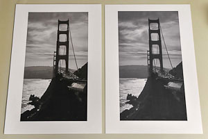
Uncoated B&W. Epson R3000 print (left) has deeper blacks and more detail.
Canon dismissed the droplet size issue in the Imaging Resource-Shimizu interview, noting everybody's pigment size is the same. That isn't quite true (Kodak's are smaller) but we had some sympathy for that. Epson's larger Pro printers like the 3880 have a 3.5 picoliter droplet size, quite a bit bigger than the R3000.
But there was no question the R3000 print of the cables and towers of the Golden Gate Bridge was sharper and more finely detailed than the Canon print. Epson attributed it to its droplet size. We suspect screening technology has something to do with it as well.
THICK MEDIA FEED. We liked the R3000's thick media feeding system that let us snug both ends of the 19-inch long sheet to a side guide. We were able to align a sheet very accurately for a second pass on one occasion, in fact.
In our original Pro-1 review, we applauded Canon for revising its thick media feeding mechanism, which is a rear tray on the Pro-1. We've subsequently found it to be a little confusing. Nobody carries a paper micrometer with them, so judging when you should use the thick media tray can take a trial and error approach.
Because you have to push the sheet into the thick media feed, a thinner sheet that will work with the normal feed, even after you properly seat it, will give a no-paper error. That's a little confusing (because there's paper seated in the feed).
This is one of those things that you quickly learn to deal with, so it shouldn't be a deal breaker. But we did prefer Epson's approach.
MAXIMUM THICKNESS. The Pro-1's thick media feed can take up a sheet up to 4 mil. thick (0.1mm), which must bend to go through the feed. The 3000's thick media feed takes 1.3mm, which is substantially thicker.
Now that could be a deal breaker.
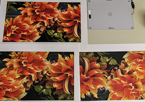
Pigment v. Dye. Top print is from a Canon 9100 dye printer and clearly packs more of a punch than either of the pigment prints. R3000 (left) is stronger than the Pro-1 print (right). All printed on Canon Photo Rag.
THE PIGMENT V. DYE ISSUE. Our collection of prints goes back a few years. Even this latest round of pigment printers, though, can't match our earliest dye prints for saturation. Dyes have come a long way in longevity if printed on the right sheet, but pigments have not improved in saturation.
If you're printing sunsets or other subjects where saturation makes the image, this should get you rubbing your chin. You may very well prefer a dye printer like the Canon Pro9000 Mark II for those images.
While we could immediately tell the dye version of our Dancing Dahlias print from both of the pigment version (R3000 and Pro-1), we don't think that matters nearly as much as sunsets. Why? Because unlike the sunset, the dahlias are probably accurately represented by the pigment print.
Still, we achieved a more saturated dahlia print with the R3000 than we could with the Pro-1.
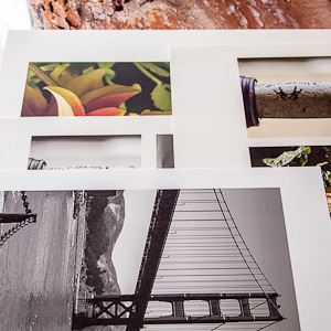
Fine Arts Papers. A wide variety of papers printed very well -- except one.
The rap against dye inks has been longevity. And they are still frowned upon by professional printers. But properly stored and exhibited, the prints will survive a very long time. We'd be more concerned about saturation than longevity at this point. They'll exceed your lifetime.
NOTES ON THE PAPERS. The fine arts sheets we printed with covered the spectrum of finishes from glossy to semi-gloss to uncoated. And among the glossy and semi-gloss sheets, we had both swellable and porous finishes. Swellable finishes are required for dye inks but work reasonably well with pigments. Porous finishes are a quick death for dyes but instant-dry for pigments.
The Ilford sheets are all porous (nanoporous, Ilford calls them).
Moab Entrada Natural, an acid- and lignin-free uncoated paper, is compatible with both dye and pigment inks. This is a beautiful, warm, uncoated sheet printable on both sides, which makes it particularly attractive for handmade photo books.

Slickrock. The Nokia image was stunning but it's not a sheet for everything.
Moab Slickrock Metallica is a resin-coated paper with a pearl-like finish well-suited to pigments but usable with dyes. We printed a Nokia 808 PureView image on Slickrock and it was just gorgeous.
Museo Silver Rag from Crane harkens back to the days of fiber-based papers and was particularly flattering to our black and white images. It became our favorite sheet for black and white images.
We also liked Ilford's Galerie Prestige Smooth Pearl for black and white images. The Smooth Gloss surface was among our favorites for color portraits.
In short, you have a wealth of fine arts papers to choose from (not to mention Canon's house brand, some of which, like Photo Rag, are made by Hahnemuhle. And with the exception of the uncoated sheets like Photo Rag when printing black and white images, the Pro-1 handles them all. Consistent results, pleasing quality, such that very rarely will you end up with something you can't use. Assuming, of course, that you've downloaded, installed and used the paper manufacturer's ICC profile for the Pro-1.
ONE PROBLEM | Back to Contents
While we preferred the R3000's paper handling and communications options, those are small advantages in the scheme of things. Where there really was a difference was in the black and white printing on uncoated, natural fiber papers. That's a sheet we very much like and the Epson produced a superior image.
The smaller droplet size had something to do with it. There was more detail on the Epson prints than the Pro-1 prints. But you had to look carefully to see it. Very fine guide wires on the top of the Golden Gate Bridge towers, for example.
The more important factor seems to be the matte black ink formulation. Epson is simply able to lay down a matte black that doesn't disappear into the paper as much as the Pro-1 matte black. Consequently the blacks are richer, the dynamic range extended and contrast more striking.
Which is an interesting situation. Were Canon to reformulate its matte black, it might very well approach the R3000's tonal quality. It doesn't seem to be a printer hardware issue so much as a question of chemistry.
ANOTHER CONCLUSION | Back to Contents
Certainly our experience with the Epson R3000 has informed our opinion of the Canon Pro-1. But our appreciation of the R3000 takes nothing away from our previous remarks about the Pro-1. They're both excellent printers.
In fact, we have to smile at what a wonderful problem you have in choosing between the two. You can't really lose.
At least as far as color pigment printing goes. And that's really their strengths.
It's true that the Epson R3000 produced better black and white images on uncoated sheets. But if you're serious about black and white printing, you'll want to consider setting up a printer with a larger set of black and white inks to extend the range of tones you can reproduce. These two printers use just three grays to print black and white. They get the job done, but isn't their strength.
So after working with both the R3000 and Pro-1 for a few months, can we draw any conclusions? Yes. It's a great day for 13x19 printing.