Canon PowerShot Pro90 ISAn impressive update to the PowerShot "Pro" line, with a 10x optically stabilized zoom lens and 2.6 megapixel CCD!<<Reference: Datasheet :(Previous) | (Next): Print-Friendly Review Version>> PowerShot Pro 90 Sample ImagesReview First Posted: 2/6/2001 |
| We've begun including links in our reviews to a Thumber-generated index page for our test shots. The Thumber data includes a host of information on the images, including shutter speed, ISO setting, compression setting, etc. Rather than clutter the page below with *all* that detail, we're posting the Thumber index so only those interested in the information need wade through it! ;) |
|
|
Outdoor portrait: (1728k) The extreme tonal range of this image makes it a tough shot for many digicams, which is precisely why we set it up this way. The object is to hold highlight and shadow detail without producing a "flat" picture with muddy colors, and the Canon PowerShot Pro90 IS does a good job. We shot samples of this image with the automatic (1695 k), daylight (1703 k), and manual (1684 k) white balance settings, choosing the automatic setting for our main series. All three settings actually produced very similar results, with the daylight and manual settings appearing just a little cool. Color is really quite nice-looking in the automatic white balance setting, though the blues of the flowers and pants appear slightly bright (these blues are somewhat difficult for many digicams to reproduce correctly). Only the slightest hint of the purplish tinge many digicams tend to give the blue flowers though. The skin tones look about right, but the red flower is so bright that it has a small halo and the details of the petals are a little obscured by it. Resolution looks great throughout the image, with a lot of fine detail visible in the bouquet and the model's face. Details are also pretty crisp. The shadow areas show a fair amount of detail as well, although with a moderate level of noise present. In fact, we noticed a little noise throughout the image, even in some of the brighter areas of the face and house siding. (We confess we goofed on this image slightly, shooting at an ISO of 100, rather than 50. We'll try to reshoot if we get the chance.) Our main image was taken with a +0.6 EV exposure adjustment, which did the best job of exposing the shadow areas without overdoing it in the highlights. Going up to the +1.0 EV (1684 k) exposure adjustment washes out the image slightly, and overexposes the highlights. The table below shows the results of a range of exposure settings from zero to +1.3 EV. Exposure Compensation Settings:
|
|||||||||||||||||||||||||||||||||||||||||||||||
|
|
Closer portrait: (1726k) The Pro90 does a nice job with this closer, portrait shot, with virtually no distortion from its 10x lens. (Shorter focal length lenses tend to distort facial features in closeup shots like this and the availability of longer focal lengths is a key feature if you're going to be shooting closeup people shots.) Keeping with the automatic white balance setting, we shot our main image with a +0.3 EV exposure adjustment, one stop less than the wider Outdoor Portrait. Color balance remains nice with good skin and hair tones. Resolution and detail look even better in this shot, with practically all the fine details of the face and hair completely visible, and much sharper too. We also picked up the more subtle textures of the house siding. Noise level remains moderately low throughout the image, and we again notice small amounts of noise even in the some of the highlights. Overall, a beautiful performance. The table below shows the results of a range of exposure settings from zero to +1.0 EV. Exposure Compensation Settings:
|
|||||||||||||||||||||||||||||||||||||||||||||||
|
|
Indoor Portrait, Flash: (1475k) The Pro90's built-in flash does a good job of illuminating the subject, though our initial shot (1496 k) with no exposure compensation and the flash at the normal intensity level produces bluish tints in the shadows and on the model's face. The Pro90 also produces a orangish cast from the incandescent room lighting. We achieved much better results, though slightly washed out, when we increased the exposure compensation to +1.0 EV (1475 k). With this increase in exposure compensation, the orangish background brightens slightly and the model's shirt has a more accurate white value. Color balance also looks reasonably good, with bright colors in the flower bouquet. Next, we placed the Pro90 in Shutter Speed Priority mode, shooting at 1/15 seconds with the flash white balance setting and the flash exposure decreased to -0.3EV. The resulting image (1494 k) is reasonably bright, though the bluish cast intensifies in the lower left corner of the image. The model's skin and shirt show most of the blue cast, however, the flowers maintain a vibrant appearance. We next shot with an external flash (1410 k) attached to the camera's hot shoe, with the flash bounced off of the ceiling and covered with a diffuser. This produced the best image overall, with bright, even lighting and good color balance (though the warm orange cast remains in the background and the skin tones are a little too pink). Finally, we also snapped an image with the camera's Red-Eye Reduction (1421 k) mode, which decreased the flash power to produce a darker orange cast, but did not cause any reflections in the model's eyes. Overall, we felt the Pro 90's flash system performed very well in this difficult mixed-lighting scene. |
|||||||||||||||||||||||||||||||||||||||||||||||
|
|
Indoor portrait, no flash: (1434 k) This shot is always a very tough test of a camera's white balance capability, given the strong, yellowish color cast of the household incandescent bulbs used for the lighting, and the Pro90's white balance system handles the challenge well. We shot with the automatic (1467 k), incandescent (1466 k), and manual (1452 k) white balance settings, choosing the manual setting for our main series. Both the automatic and incandescent white balance settings produced nearly identical images. Color looked pretty good and nearly accurate in both settings, though a tad bit warm (the model's white shirt has an orange cast and her skin tones appear rather orange). Color balance looks pretty good in the manual setting, though we detected slightly oversaturated magenta tones, and strong highlights have a tendency to "posterize", going rather bluish. (While we chose an exposure compensation setting of +0.6 for our main shot of this subject, the +0.3 EV one showed less of the bothersome highlight problems.) Still, the model's white shirt looks more true than in the other white balance settings, the white balance system doing a good job of neutralizing the heavy color cast. The blue flowers in the bouquet appear slightly dark, but the red flowers remain bright and vibrant. Resolution looks very nice, with a lot of fine detail visible in the flowers and around the model's face, as well as in the tree leaves in the background. The shadow area of the leafy stems also shows a lot of fine detail. Details are crisp and defined. Noise is moderately high, with a large grain pattern. We also shot with the camera's 50 (1247 k), 100 (1447 k), 200 (1648 k), and 400 (2048 k) ISO equivalents, noticing that the exposure actually darkened slightly with the 400 ISO setting. Noise levels start out moderate at the 50 ISO setting, but gradually increase with each higher setting, becoming very pronounced and almost distracting at the 400 ISO setting. The following table shows a range of exposure adjustments from zero to +1.0 EV. An excellent performance, marred slightly by odd color shifts in the highlights. Exposure Compensation Settings:
|
|||||||||||||||||||||||||||||||||||||||||||||||
|
|
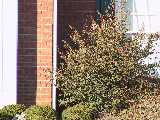
House shot: (2157k) NOTE that this is the "new" house shot, a much higher-resolution poster than we first used in our tests. To compare the image of the Pro90 with previously tested cameras, here's a shot of the original house poster in the automatic (2369 k) white balance setting. We shot samples of this image with the automatic (447 k), daylight (449 k), fluorescent (448 k), and manual (451 k) white balance settings, choosing the manual setting for our main series. Surprisingly, all four white balance settings actually produced very nice results, with only slight color casts differentiating them. The automatic setting resulted in a similar image to that of the manual setting, though just a tiny bit warm. The daylight setting was slightly cooler, and the fluorescent setting resulted in a slightly warm image. Still, the automatic, daylight, and fluorescent settings weren't too far off the mark. Overall color balance looks great in the manual setting, with a nice level of saturation. Resolution looks very good, with the bricks, shrubbery, and tree limbs showing an abundance of details, which are pretty crisp as well. Noise is moderately low in the roof shingles and shadows, seemingly with a finer grain pattern than we noticed in the Indoor Portrait. The effect of in-camera sharpening is also low, as we noticed just a trace of a halo effect around the light and dark edges of the white trim along the roof line. In addition to our standard resolution and quality series in the table below, we also snapped an image with the Pro90's uncompressed RAW format (2492 k), for those interested. (Click and download to your hard drive, this can only be read by specialized software.)
Sharpness Series We also shot with the Pro90's adjustable sharpness settings. The "Strong" setting increased the sharpness while slightly altering the image contrast. Brightness level appeared to remain the same, however. "Weak" decreased the in-camera sharpening significantly (handy if you want to do your own sharpening after the fact in Photoshop(tm) or other software), but didn't totally disable it. (We'd like to see an option that more or less completely turns it off...)
Contrast Series In addition to sharpness adjustments, the Pro90 also features a variable contrast setting. Increasing the contrast seemed to slightly dim the image while at the same time causing it to appear sharper. The lower contrast setting brightened the image with somewhat of a haze, and also appeared to slightly soften the overall image. Overall though, the range of step size of the variations in contrast seemed to be very well suited to practical use. (Unlike some cameras we've tested, which grossly overdo the effect.)
Saturation Series Finally, we shot with the Pro90's color saturation adjustments, which produced the most pronounced effects. Once again, the range of variation provided by Canon is just exactly right (in our humble opinion), very useful for real-world photographic applications.
|
|||||||||||||||||||||||||||||||||||||||||||||||
|
|
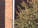
Far-Field Test (2043k) This image is shot at infinity to test far-field lens performance. NOTE that this image cannot be directly compared to the other "house" shot, which is a poster, shot in the studio. The rendering of detail in the poster will be very different than in this shot, and color values (and even the presence or absence of leaves on the trees!) will vary in this subject as the seasons progress. In general though, you can evaluate detail in the bricks, shingles and window detail, and in the tree branches against the sky. Compression artifacts are most likely to show in the trim along the edge of the roof, in the bricks, or in the relatively "flat" areas in the windows. We shot samples of this image with the automatic (407 k), daylight (406 k), and manual (408 k) white balance settings. Again, all three settings produced nearly accurate results, with the manual setting resulting in the most accurate color balance overall. The automatic setting produced a similar image to that of the manual setting, though the red tones appeared slightly cooler. The daylight setting also appeared slightly cool. Color balance looks great in the manual setting, with a vibrant blue sky and nearly accurate bricks. This shot is a strong test of detail, given the practically infinite range of fine detail viewable from a distance in a natural scene like this. Resolution looks great (!), especially in the pine needles and tree branches against the sky, as well as in the bricks and house details. Besides the great amount of detail present, the image is also characterized by a nice crispness. Very nice, very appealing. We also judge a camera's dynamic range in this shot, examining how well the camera holds detail in both the shadow and highlight areas. The Pro90 performs reasonably well here, though it's tricked a little by the bright bay window and catches only the most obvious details. However, detail in the darker shadow areas is very good, and we can distinguish the brick pattern in the shadows of the porch and the shaded shingles of the roof. Noise in the roof shingles and shadow areas of the house is moderately low, and we noticed some noise along the brighter edges of the house details (in the bricks above the bright white paint, for instance). The table below shows our resolution and quality series.
Sharpness Series We again shot with the Pro90's sharpness adjustments, which seemed to only slightly alter contrast, and left the brightness more or less unchanged.
Contrast Series We also shot another series with the contrast settings, again with very good results. (We would have liked to see the low contrast setting bring more of the missing highlight detail back, however.)
Saturation Series We again noticed that the color saturation adjustments slightly affected the brightness level, but did a good job of tweaking the saturation just enough, not going too far.
|
|||||||||||||||||||||||||||||||||||||||||||||||
|
|
Lens Zoom Range We've received a number of requests from readers to take shots showing the lens focal length range of those cameras with zoom lenses. Thus, we're happy to present you here with the following series of shots, showing the field of view with the lens at full wide angle, and the lens at full 10x telephoto, and the lens at full telephoto with the 2x and 4x digital telephoto enabled. The wide angle shot shows just a small hint of barrel distortion along the curb of the street, but presents a very wide field of view. The Pro90's 10x telephoto setting produces exceptionally fine details and gets extremely close in. Both the 2x and 4x digital telephoto do a good job of digitally enlarging the image without losing too much quality. We noticed a slightly softer image at the 2x setting, and a lower resolution at the 4x setting. However, noise levels didn't significantly increase. (We're no fans of so-called "digital telephoto" options, as regular readers will know. We did note that the 2x digital telephoto of the Pro90 seemed to be unusually sharp. Sure enough, when we tried resizing an image in Photoshop, we were surprised to discover that the 2x digital telephoto image was noticeably (but not a lot) cleaner. We'd have to say that the Pro90 does indeed do a better job of digitally "zooming" the picture than Photoshop...)
|
|||||||||||||||||||||||||||||||||||||||||||||||
|
|
Musicians Poster (1872k) For this test, we shot with the automatic (353 k), daylight (352 k), fluorescent (353 k), and manual (354 k) white balance settings, again noticing similar results among all four settings. The manual setting produced a slightly cool image, as did the fluorescent setting (which was only just a hair warmer than the manual setting). The daylight setting resulted in a slightly warm image, which produces a greenish background. Out of the four, the automatic white balance setting produced the best color balance, with pretty good skin tones, but it still wasn't perfect. (The overwhelming amount of blue in this image makes it very tough for most cameras to capture correctly.) The Oriental model's blue robe also appears pretty accurate. Resolution looks good, with most of the detail of the bird wings and silver threads on the blue robe visible, as well as a hint of the color gradations on the wings. We also noticed good detail in the flower garland and beaded necklaces. The violin strings show a slight moiré pattern, and the overall image is reasonably crisp and clear. A moderate amount of noise is present in the blue background and shadow areas, some of which is coming from the poster itself. In addition to our normal resolution and quality series, we also shot an image with the camera's RAW (2492 k) format. Resolution/Quality Series
Saturation Series We also shot a series with the camera's saturation adjustments, which made only moderate adjustments to the color saturation, unlike in our other tests.
|
|||||||||||||||||||||||||||||||||||||||||||||||
|
|
Macro Shot (1761k): The Pro90 is average to slightly below average in the macro category, capturing a minimum area of 4.40 x 3.30 inches (111.74 x 83.80mm). Color, detail, and resolution all look great, though we picked up a low level of noise in the gray background, and there's noticeable geometric distortion in the image. Printing details on the dollar bill are slightly soft, but the coins appear reasonably sharp. The Pro90's built-in flash (958 k) has a little trouble throttling down for the macro area, producing a bright reflection on the brooch. A large shadow area extends across the bottom of the flash image, due to the flash being blocked by the rather long lens. (Plan on using an external flash rig for extreme closeups.) |
|||||||||||||||||||||||||||||||||||||||||||||||
|
|
"Davebox" Test Target (1282k) Wow, a great performance! We shot samples of this target using the automatic (204 k), daylight (203 k), fluorescent (203 k), and manual (205 k) white balance settings, choosing the automatic setting for our main series. Both the daylight and automatic white balance settings produced similar results, with just a hint of a reddish cast in the daylight setting. The manual setting also produced a similar image, but with a hint more of a magenta cast. Surprisingly, the fluorescent white balance setting also did a good job, but the overall image appeared slightly warm. The large color blocks look nearly accurate, with a nice level of saturation, only the bright yellow block revealing any weakness, and very little even there. The Pro90 distinguishes the difference between the red and magenta color blocks on the middle, horizontal color chart (which is a common problem area for many digicams), though the in-camera sharpening causes the two colors overlap slightly in the middle. The camera also reproduces the subtle tonal variations of the Q60 chart well, which are completely visible up to the "B" range (another common problem area for digicams). The tonal gradations of the vertical gray scales also look exceptionally good and distinct, with detail extending all the way to the last step of the gray scale. Excellent detail in the shadow area of the briquettes, with a moderately low noise level. Detail looks good in the highlights of the white gauze area as well, where we also picked up a faint trace of noise. Resolution looks great overall, with a lot of fine detail visible in the hinges and silver disk, though the mini resolution target appears a little less distinct. We also shot with the Pro90's 50 (1266 k), 100 (1455 k), 200 (1731 k), and 400 (2154 k) ISO equivalents, which gradually increased the noise level with each higher setting. We noticed that the ISO 400 setting produced a slightly brighter exposure. The table below shows our resolution and quality series, and we also snapped an image in the RAW (2492 k) file format. Resolution/Quality Series
Sharpness Series We shot a series of images with the Pro90's sharpness adjustments, which did a good job of subtly increasing and decreasing the sharpness without affecting contrast and brightness too much. We did notice that the Strong setting increased saturation slightly.
Contrast Series We also shot a series with the contrast settings, which affected the saturation and brightness a little. The Strong setting intensifies the color throughout the image and produces a deeper black value, while the Weak setting lightens the image all over.
Saturation Series The Pro90's saturation adjustments did a good job of altering the color saturation without brightening or darkening the image very much.
|
|||||||||||||||||||||||||||||||||||||||||||||||
|
|
Low-Light Tests The Pro90 did an excellent job in the low-light category, as we were able to obtain very bright, usable images at light levels as low as 1/16 of a foot candle (0.67 lux) at ISO levels of 100, 200, and 400. At the 50 ISO setting, the best results were achieved at the 1/8 of a foot candle (1.3 lux) and above, though we could still see the target at the 1/16 of a foot candle (0.67 lux) level. Noise levels stayed moderate at the 50 and 100 ISO settings, getting higher with the 200 and 400 equivalents. (We direct readers to Mike Chaney's excellent Qimage Pro program, for a tool with an amazing ability to remove image noise without significantly affecting detail.) To put the Pro90's low light performance into perspective, an average city night scene under modern street lighting corresponds to a light level of about one foot candle. With its great performance, the Pro90 should be able to capture much darker scenes. The table below shows the best exposure we were able to obtain for each of a range of illumination levels, at each of the available ISO settings. Images in this table (like all of our sample photos) are untouched, exactly as they came from the camera.
|
|||||||||||||||||||||||||||||||||||||||||||||||
|
|
Flash Range Test Canon rates the Pro90's flash as effective from 2.3 to 13.8 feet (70cm to 4.2m), which is a slightly conservative estimation in our opinion. In our testing, we found the Pro90's internal flash effective all the way out to 15 feet, with a nice level of intensity. We also noticed a slightly magenta cast to the images, apparently due to some mismatch of color balance between the camera and the flash. (Since we shoot the flash tests in a darkened studio, with no ambient lighting, it's unlikely that any external light imbalance could have caused the minor color shift.) Below is our flash range series, with distances from eight to 15 feet from the target.
|
|||||||||||||||||||||||||||||||||||||||||||||||
|
|
ISO-12233 (WG-18) Resolution Test (1162k) The Pro90 performed very well in our "laboratory" resolution test, with excellent detail visible to 900 lines per picture height and beyond, in both horizontal and vertical directions. The onset of aliasing (slight jaggedness in the fine detail, appearing as barely-perceptible thickening and thinning of the lines) at 750 lines per picture height cause us to "call" the resolution as 750 lines in both directions. (It's almost a toss-up though, to rate it at 800 lines...) We again snapped an image with the Pro90's RAW (2492 k) format setting. Resolution Series, Wide Angle
Sharpness Series
Resolution Series, Telephoto
Sharpness Series
|
|||||||||||||||||||||||||||||||||||||||||||||||
|
|
Viewfinder Accuracy/Flash Uniformity Since the Pro90 features an electronic SLR design, we measured the viewfinder accuracy using the larger LCD monitor on the back panel. We found the LCD monitor to be very accurate, measuring about ?? percent at wide angle (0 k), and 98 percent at the telephoto (189 k) setting (for all three resolution sizes). Since, we generally like to see LCD monitors as close to 100 percent accuracy as possible, the Pro90 does an excellent job. Optical distortion on the Pro90 pretty low at the telephoto end, as we caught maybe a pixel or two of pincushion distortion. Chromatic aberration is moderate, showing about two or three pixels of coloration on each side of the black target lines. (This distortion is visible as a very slight colored fringe around the objects at the edges of the field of view on the resolution target.) "Coma" is fairly evident in the extreme corners of the frame in the telephoto shot, visible as a hazy blurring of the outer edges of the resolution target elements. |
|||||||||||||||||||||||||||||||||||||||||||||||


Follow Imaging Resource: