The World Press Photo debacle dissected. You decide: Is it adjustment, or manipulation?
posted Thursday, May 16, 2013 at 12:10 AM EDT
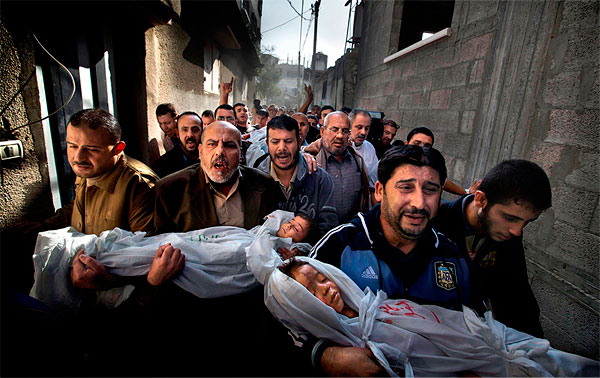
Yesterday, we reported on the controversy surrounding the winning image for the World Press Photo organization's annual Photo of the Year contest. Three months after the winning shot by Stockholm, Sweden-based photojournalist Paul Hansen was announced, accusations came to a head that the image was either a composite, or had otherwise been altered beyond the limits allowed by the contest. The WPP commissioned a panel of experts to examine the photo and, apparently, the RAW file from which it was derived, to determine if the rules had in fact been violated. Their conclusion was that everything was above board, but the winner's reaffirmation doesn't appear to have ended the controversy.
*** Imaging Resource Exclusive: Our News Editor Mike Tomkins has tracked down what we think is the largest, highest-resolution version of the World Press Photo image, and overlaid it with a scaled-up copy of the newspaper version. You can examine the differences between the two versions more closely by clicking this link, and then pointing your mouse cursor on and off the image. ***
As we see it, the issues boil down to two main questions:
-
Did post-processing of the photo violate the rules of the contest?
-
Is the level of manipulation applied permissible in the context of photojournalism and, if not, should the photo in question be held up as an exemplar of photojournalistic excellence?
Based on the findings of the expert panel, the answer to the first question would seem to be "No." As for the second point, though, the answer is much less clear.
The crux of the argument in the image's favor seems to be that, although the photographer adjusted tonal levels and color rendering, he didn't move any pixels around -- there was no cloning, nor any copy-and-pasting in of portions from entirely different images. We don't think anyone would suggest that either technique is acceptable in photojournalism, so that's not at issue.
Beyond that, the question becomes a much trickier one of whether any tone and color adjustments are allowable -- and if there is a limit somewhere, at what level do adjustments become unacceptable? In this area, the controversy lives on, and in our view there's an important dialog to be had here.
The thing is, you can do an enormous amount to change the impact or even the content of an image while making "only" tone and color adjustments. Extreme local tone and color adjustments can be indistinguishable from cloning or painting on the image, and so to our minds, there's no hard, bright line separating the two. You don't have to move pixels around to totally change the content, emotional impact, or ultimately the message conveyed by an image. Simple tone and color adjustments alone can do the job quite well.
To illustrate the point, let's take a quick look at three notorious examples of photo manipulation that either were or could have been accomplished solely with localized tonal adjustments.
The classic case where tone and color manipulation radically changed the impact of an image was with the dueling magazine covers in the O.J. Simpson case. Both Time and Newsweek magazines worked from the same mugshot of Simpson, but thanks to post-processing, each cover conveyed totally different messages. Newsweek ran the photo pretty much unaltered, while Time burned and manipulated it to produce a much darker image -- both literally and figuratively -- that portrayed Simpson as a sinister character. You can see the two images side by side below.
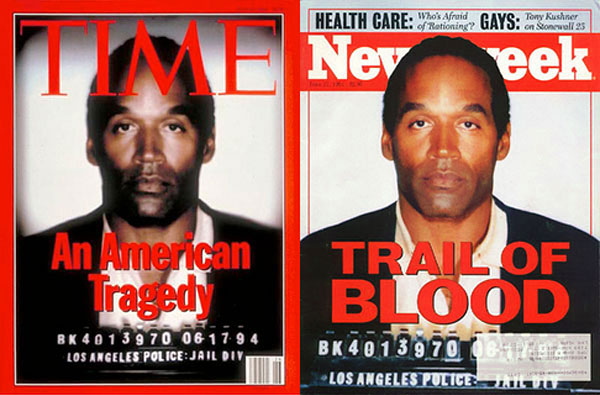
Time magazine's adjustments only affected color and tone -- mostly the latter, really -- but the impact is dramatic. At the time, there was general agreement that the cover photo had overstepped the line, and that it editorialized on Simpson's plight.
Another recent scandal involved a photo where a distracting element was apparently painted over: a referee was removed from the background in a shot of a triumphant wrestler.
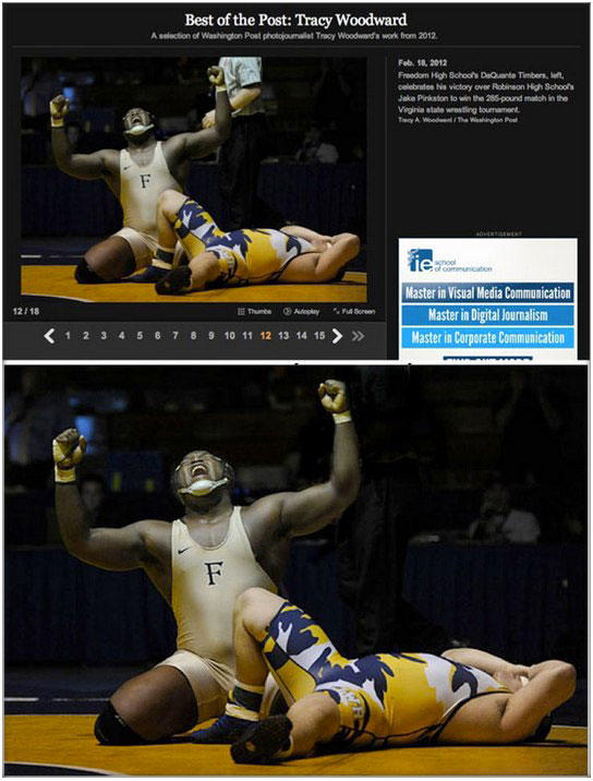
Although in this case the referee was erased from the image, the same result could easily have been accomplished by applying "only" tonal adjustments. Just use your burn tool to banish the ref into oblivion, and you'd end up with an image indistinguishable from the one which was so roundly criticized.
So... where are the limits to this? Technically, even cloning is only changing the tone and color of the pixels -- you're just doing it on a pixel by pixel basis. That this is so can, perhaps, best be illustrated by the famous John Filo image of Mary Ann Vecchio emoting over the body of Jeffrey Miller in the Kent State University shooting incident.
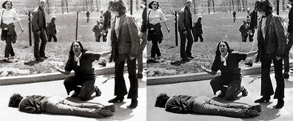
In the original image, a fence post appeared to "grow" out of Vecchio's head, but an enterprising photo editor removed it to make for a "better" picture. This was back in the days well before desktop computers and Photoshop, and so the alteration in this case was almost certainly done with retouching dyes. In the case of a black and white photograph, though, tonal values are all that's there, and so retouching was really just a matter of making local changes in the tonal values. Given that no computer was involved, there was no question of moving pixels around, either -- there weren't any. So in the extreme case, local tone and color adjustments can clearly amount to little more than painting on the image. You just use those tone and color adjustments to effect your changes, rather than a paint brush.
All of which brings us back to the question of the winning WPP photo: Were the adjustments Hansen made within acceptable limits for photojournalism? For the most part, we'd say yes, but... as you'll see below -- or on this page, if you'd like to see larger versions of the image -- the winning photo was heavily processed, and among the changes, many local manipulations were made. It's with these that we take issue.
To help in your evaluation, we've provided a comparison of both images below. You can switch from the newly-discovered newspaper version to the World Press Photo version of the image by hovering your mouse pointer over it.
If that low-res version isn't enough to make your mind up, our intrepid News Editor Mike Tomkins tracked down a higher-resolution version of the World Press Photo image, and overlaid it with a scaled-up copy of the newspaper version. The result is shown here, exclusive to Imaging Resource. (It's the largest generally available version of the image we're aware of.)
We have no quibble with overall tonal adjustments -- for example, single-image HDR techniques -- to make a camera's image better match human perception. The human visual system itself does a lot of sophisticated and nonlinear processing to extract information from a scene. Compared to a camera's rigid, linear view of the world, it's as if we have our own built-in HDR processing.
It's when we come to the matter of selective, local adjustments to images that problems arise. Selective enhancement or suppression of a viewer's perception of details is the very definition of editorializing, as opposed to the simple recording of facts. It's in this area that we believe Hansen's manipulation of the image exceeds journalistic limits, and as such that it shouldn't be held up as an example of excellent photojournalism.
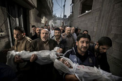
The most controversial of the changes made to the image, harking back to the Kent State photo, is the handling of the child's head in the foreground. Comparing against another version published several months ago by Dagens Nyheter, the largest-circulating and widest-distributed newspaper in Hansen's homeland of Sweden, there's a bruise on the child's head that is absent in the WPP image. Of course, without access to the original raw image -- which has yet to be provided by Hansen or World Press Photo -- there's no way to know for sure whether the bruise was removed in the contest image, or added in the newspaper image. Nor, without knowing which version is closer to the truth, can we say for sure whether Hansen or a newspaper photo editor was responsible for the change.
You can, of course, also question whether the addition or removal of the bruise really changed the image in an important way, but the standard has always been that any addition or removal of image elements is verboten. Consider the case of the Kent State photo: A fence post protruding above the subject's head didn't change the fundamental information the image was conveying in any significant way, but it was widely recognized as an unacceptable alteration. Likewise, the case of the triumphant wrestler image: Did the presence or absence of the referee in the background really affect the information being conveyed in an important way? Clearly not, but again, this image editing was regarded by most as being unacceptable.
In the current case, does the presence or absence of a small bruise on the forehead of a dead child fundamentally change anything? And do the extensive, localized tonal and color adjustments affect the information being communicated? Perhaps not, but they have everything to do with the emotional impact and the message being delivered. Regardless of which version of the image is closer to the original, and whether the alteration was made via tonal and color adjustments, cloning, or direct painting on the image, there's no interpretation of the discrepancy that reflects well on the individual responsible for the edits made. Someone either removed an element for the WPP contest, or added one for the newspaper version. One way or another, and in one context or another, the image was manipulated to introduce or remove something beyond what any fair-minded observer would consider a simple "tonal adjustment". It would be permissible in the name of art, but is it still journalism, or is it yellow journalism?
As we said at the outset, there's not a clear, delineating line here; it's all a matter of degrees. Nor is it yet entirely clear whether Hansen himself was responsible for the most troubling of edits made to the image: those made locally. Only he and World Press Photo can shed light on that, something which one would hope they will do by simply providing access to the original, unedited raw image.
Ultimately, though, readers will have to decide for themselves what they feel to be OK, and what's over the line. But how should the photojournalism community respond, and what limits should be set? Take a close look at the images, and let us know your thoughts below.
Updated 2013-05-16 13:00ET: In the course of writing this article, we reached out to World Press Photo and requested the opportunity to examine the original raw image for ourselves. We've now received a reply, and it makes clear that if there is to be complete transparency, it is Hansen who must provide this. The WPP apparently does not retain a copy of the raw image, and would not have the rights to distribute it even were that not the case. Nor can it require the photographer to provide his image. Should he wish to put the matter to rest, the ball is now in Hansen's court