How to NOT win a photo contest
posted Sunday, September 20, 2015 at 10:09 AM EDT
Our Photo of the Day contest is a great way to hone your photography skills, get your hard work noticed and even win real prizes. We currently offer a combined $600 in gift certificates from Adorama at the end of every month - including one valued at $300 for the winning image - money you can spend on that cool new tripod or camera bag you've been wanting, or to put towards that awesome lens you've been dreaming about!
It takes creativity, originality and technical know-how to produce images that rise to the top of a contest like this one, as well as just shooting a lot of pictures. And it takes patience too... there's no harm or foul in submitting again and again until you succeed. Hey, submissions are free, so there's no reason to not start now and keep it up until you break through.
But even if you have all these bases covered, have done your homework about the gear and practiced your photography for years... perhaps you've even honed a style all your own... there are still ways that you can shoot yourself in the proverbial foot, and we see this way too often. Every month we see photos that would be worthy of being at least a daily winner, and therefore merit a shot at a prize at the end of the month, that we simply have to throw out due to one of the blunders listed below, most of which are either easily corrected before submitting or that should never have happened in the first place.
Beyond our own personal tastes, though, it's a good bet that most of these would be fatal mistakes in any photo contest. So whether you've been working photo contests for years, or are just now ready to get your feet wet, you'll do yourself a BIG favor by reading and heeding the suggestions below. Avoid these obvious blunders and you'll dramatically increase your chances of success!
(Note that the images below are not actual reader submissions, as we didn't want to embarrass anyone. These are all mock-ups created from our own shots, to illustrate the issues we see most often that lead to rejected images.)
Horizons
You wouldn't believe how many submissions we get with crooked horizons or buildings (more than ten just this month!). The best photo ever taken will get thrown out due to this easily corrected error. Any good post-production editing program will have one or more methods for you to straighten your image, such as the ruler tool in Photoshop. With that, you simply draw a line across the horizon, click the "straighten image" button, and... Voila! It's straight. Then you just need to re-crop to avoid any blank areas in the corners created by the image rotation. You can also draw a grid line and "free rotate" the image until the horizon matches up with the grid line. Again, plenty of different ways to accomplish this, and some cameras now offer level gauges to help you when shooting as well.
(In-house image)
Depressing Zoo Shots
We receive a ton of zoo shots, and will certainly choose one if it's a great image, but so many end up just being depressing. Emotional content is part of what makes a great image, so who wants to see bored, depressed caged animals? Zoo shots can be fine, if the animals involved are playful, interested, engaged, etc, but otherwise you'll do better with shots of natural wildlife.
Borders and Overdone Vignettes
We understand that there may be times to add borders and also vignettes to your images, but our contest is not one of them. We throw out so many images that have borders added, and also many where the vignetting simply isn't natural. If a shot looks like it's had vignetting applied, you've almost certainly used too much. Subtlety is the name of the game with most photo effects.
Borders are even worse. It's very rare that we let an image with a border cross our own proverbial border, and it never happens that we let something through with a double-border! (Yes, we get some of those, even a few triples!) We judge the images, not how they're framed, and also want to present all images on the site on an equal basis.
(In-house image)
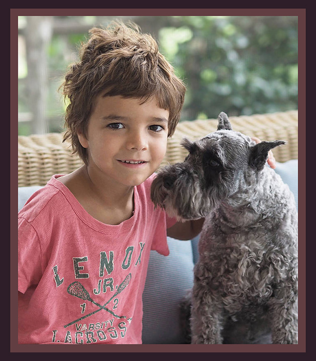
Not everyone knows Aunt Edna
We see a lot of photos of babies, spouses, relatives and pets that are obviously endearing to the people who shot them, but that don't stand on their own for people who don't know the subject. Ask yourself: "Is this a great image, or do I just like it because it's my baby/child/relative/whatever?"
Watermarks (Just say no!)
Hey - we're photographers too, and we know you want to protect your image and copyright. We take copyrights very seriously, and you can rest assured that if your image is selected in our contest, your name will always appear prominently beside it, and that you'll always retain full rights to your image (you just give us a non-exclusive right to display it for the purposes outlined in our guidelines). But we usually discard images with watermarks regardless of their merit. Every now and then, if the image is awesome and the watermark is not too intrusive, we'll let one slide.... but why chance it? If your logic is that you don't want the image stolen, you have to realize that it's pretty easy for an image thief to just clone out the watermark anyway, so a watermark doesn't provide much protection. At the same time, a watermark makes it very unlikely that your shot will end up in the winner's circle. We have a photographer who used to get a good number of dailies awarded, and even a few monthly prize winners among them, but then he started watermarking his images and rarely gets chosen anymore because of that.
(And we throw 99% of them out.)
(In-house image)
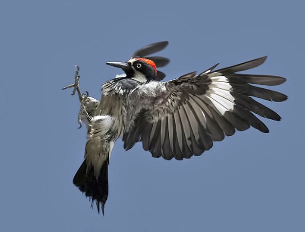
CROP, for heaven's sake!
So, so many photos we see would be winners, if the photographer had only taken a few minutes to crop out distracting foreground or background detail! I'm thinking in particular of a beautiful bird shot from some time ago, that had an ugly branch poking into the frame from the left side. It contributed nothing, just drew your eye, and there was plenty of room around the bird to allow for cropping it out. It would easily have been a daily winner, and might even have won a monthly prize, but as it was, it ended up in the discard pile. Even more often, a photo's composition could be much stronger with a different crop. (Cue the standard Rule of Thirds discussion here.) When we shoot test photos with cameras, we need to show untouched images direct from the camera, so we avoid cropping or any other modification of the image. When we're shooting for ourselves, though, cropping is more the norm than the exception. Take a good look at your photo before submitting it, and ask yourself if a different crop might improve it. Better yet, don't just ask yourself; open up the crop tool in Photoshop or your favorite photo editor, and play with it a little.
Post-processing overkill
Use post-processing to your advantage... balance shadows and highlights if needed, add or subtract a touch of contrast or saturation where warranted, perform subtle sharpening or blurring if it helps bring the image to full glory, but for goodness sakes don't over-do it! We see great images destroyed due to over-sharpening every month, we see weird filters that just made it look over-processed, and we so often see garish over-saturation. Look through our previous galleries to get a sense of the difference here.... adding on a ton of post-processing makes the judges here squint their eyes and say "Ouch!.... why'd they do THAT to such a cool photo?" And yes, every now and then a photo makes it through with a ton of processing, but that's a rare exception where the judges felt like the composition was just so strong that it outweighed the negative effects of the processing. If you're not sure, you'll do well to keep it natural.
(In-house image)
"Creative" filters aren't
You can pretty well assume that we've seen any "creative" filter or effect from Photoshop or your camera, oh, a thousand times or so. If it's not a great photo, applying an oil-painting (or whatever) effect isn't going to make it any better. We take a dim view of "creative" filters. They're fine for Instagram or your Facebook page, but they really decrease your chances in our contest. (I suspect you'd find most other photo contest judges in agreement on this point in particular.)

Blown symmetry
Shots calling attention to the symmetry of the subject can be very strong visually ... but if that's what you're going for, make sure you nail it. The original of the image above is quite striking, but the obvious mis-cropping here just looks lopsided and wrong. The thing is, our eyes are awfully sensitive to things like asymmetry, non-parallel lines, and other slight geometric perturbations. Just a slight decentering of something that's supposed to be symmetric can be the difference between great and just so-so.
Too Dark / Too Flat
Great photos need some balance, and when they're too dark they're..... well..... too dark. When shooting, it's often a good idea to underexpose slightly, to preserve highlight detail - but be sure to bump things back up in post! Unless it's a very low-key subject overall (I'm remembering a beautiful shot of a black horse in a barn we had once), or you're trying to preserve the greyness of a cloudy day as part of the picture's mood, things that are white or reflective highlights in the real world should look white on the screen. We get a lot of underexposed images, but you won't see many of them among the winners. This isn't to say we don't post images that are odd, surreal or ethereal... quite the opposite! We reserve Wednesdays for what we call "Weird Wednesday" or "Wild Wednesday" which allows us the luxury of including some shots that are a bit "off the beaten path" so to speak; we love them for the variety! So get as weird or out there as you see fit and we'll for sure consider it (within reasonable limits of decorum, of course); just don't make it too dark.
Missed focus
Last but not least, make sure your shots are in focus. If it's a person, a pet or wildlife, it's best to get their eyes in focus. There are exceptions, but if you nail focus on the eyes you'll be doing yourself a big favor most of the time.
(In-house image)
A few more quick pointers:
• We'd like to see more good people shots - not family snapshots, but carefully produced portraits and other quality people shots (once again, though, shy away from shots that are too depressing; this may not be as big a factor in some other contests, but we generally go for feel-good imagery for our site).
• Techniques like HDR and Infrared are definitely OK to submit, but these generally take skill, care and thought to pull off well, so practice your technique before submitting. Particularly for HDR, aim for a natural look; over-HDR'd images have become a cliché; you'll almost never see one in our winners' circle these days.
• While we encourage you to crop your images, do be careful with how you do so! It's easy to lose out because you inadvertently lopped off a bird's wing or part of someone's head with too tight a crop. Pay attention to the crop choices you make (...we do!).
It's not only about technique; artistry and vision are equally important, but without proper technique you're not nearly as likely to be picked.
And very, very importantly.... please remember:
2 or less is best!
• We welcome between one and three submissions per month from you, but if you submit more than this, your submissions will be ignored going forward. [Special note to our longtime regulars: Most of you are good about heeding this easy guideline, but a few of you (OK - TWO of you, to put a fine point on it) are submitting way too many photos per month. This takes up a lot of our time, and going forward you won't be considered unless you can pare it down to 3 or fewer (2 or less is best). If you need help in selecting, ask your friends or colleagues! But more than three will toss your whole collection into the archives.
Summing it all up, rules are meant to be broken every now and then, and sometimes it can work to your advantage to do so, but if you're going to break one of the rules above, proceed with caution. Not all are absolute (for instance, a super-saturated image may for some reason just "work") but break them at your own risk, and some (watermarks and borders, for instance) will get you a quick trip to the discard pile.
Read and follow the above, and you'll have a lot better chance at our contest prizes ... and maybe the budget for that cool camera bag you've been craving!
To enter our contest please see the link below, and to get a sense of the images we choose as daily and monthly winners please click the "Winner's Gallery" tab.
Good luck, and thanks for being a part of our contest!
- The IR Team
Submit an entry • See the Winner's Gallery
[Article co-written with Dave Etchells]