Video: A simple guide to landscape photography color editing
posted Tuesday, July 19, 2022 at 12:30 PM EDT
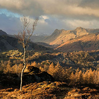
Landscape photographer Nigel Danson gets asked about color a lot. He says it's the most common topic that viewers bring up. Although there are many tools you can use in Adobe Lightroom to adjust the color of your photos, it doesn't need to be complicated. Even the color grading tools, which can seem a bit daunting at first, are easy to use once you understand how they work. In the video below, Danson provides a simple guide to editing color in Lightroom. As a bonus, he also shows off a "hidden" tool you can use to make impactful color photos.
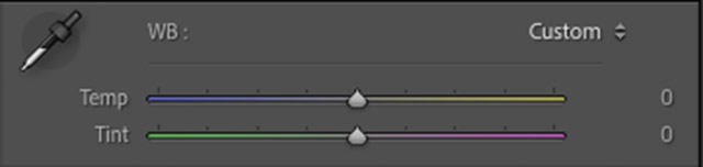
The most-used way to adjust color in your images is using the white balance tool. This includes a color temperature slider from cool to warm and a tint slider that makes an image more green or magenta. There's a lot you can do creatively with just these two sliders.
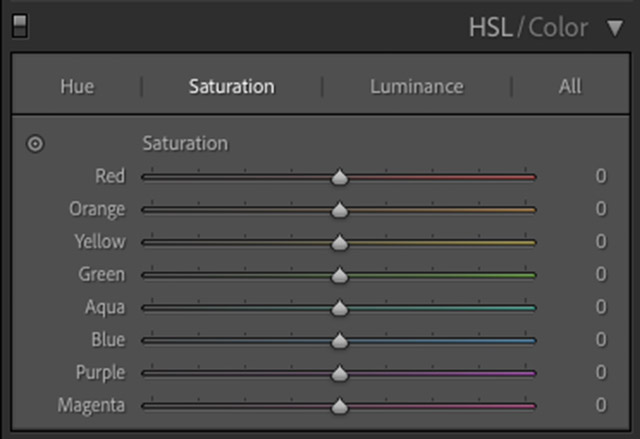
The next major way to adjust color is Lightroom's HSL/Color panel. It stands for hue, saturation, and luminance. Here you can edit the color hue, saturation value and brightness of individual color channels (red, orange, yellow, green, aqua, blue, purple and magenta). Unlike white balance adjustments, HSL adjustments don't change the neutral tones in your image. Put simply, the white balance adjusts gray tones, and HSL sliders don't. HSL sliders affect specific colors as they're perceived in your image.
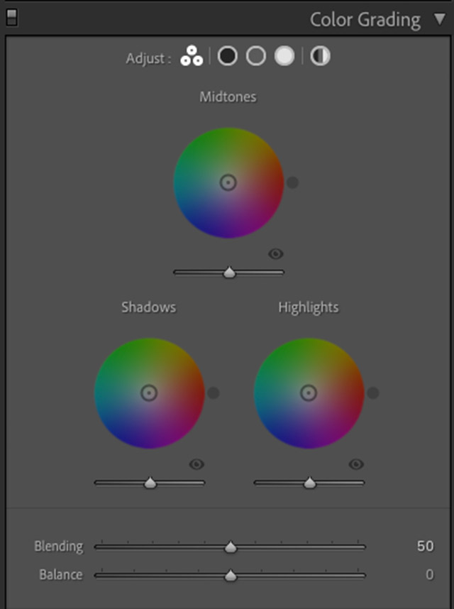
Color Grading changes the tone of specific luminance values in your image. You can adjust the color tones of your image's shadows, midtones, and highlights separately. For example, you can make shadows bluer and highlights more orange. You can also use Color Grading to create duotone black and white images. Color Grading tools don't adjust individual colors; rather, they change the color tone of pixels with different luminance values.
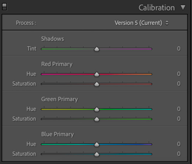
Lightroom also includes color editing tools within its Calibration section. These aren't used as often. Calibration allows you to change how Lightroom sees the pixels within your image. You can change how Lightroom displays red, green and blue pixels, which will, in turn, affect how the color in your photo looks. Danson sometimes uses Calibration tools when editing autumn images or photos with a lot of green. What's important here is that all pixels in your image have some red, green and blue. Neutral gray has equal amounts of all three. If you adjust blue pixels within Calibration, you also affect red and green to a lesser extent. They're a global adjustment because it's affecting all the pixels at a fundamental level. If you use the HSL sliders to adjust blue, it only changes the areas you perceive as blue in the photo, rather than all the individual blue values at a pixel level in the image.
It's one thing to hear about the color editing tools in Lightroom. Seeing them in action on real landscape photos is different. In the video below, Danson shows how each of Lightroom's various color editing tools can be used to change the look and feel of your photos and highlights different ways he uses the tools when processing how landscape images.
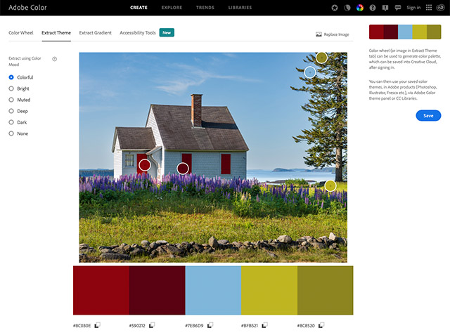
As you can see, these four color editing tools all work differently. You can use them to achieve similar results, but they work in fundamentally different ways. To take full advantage of them, it's a good idea to have a general understanding of color and the color wheel. Adobe has an awesome tool for this. If you go to Adobe Color, you can play around with a color wheel. You can also upload an image, and Adobe Color will show you the predominant colors in that image.
To see more great educational content from Nigel Danson, visit his YouTube channel. Check out his website and Instagram to see more of his photos.
(Via Nigel Danson)