Nikon D2HNikon introduces an 8 frame/second speed demon, with WiFi connectivity and an amazing new flash system to boot!<<Test Results: Noise :(Previous) | (Next): Test Results: Resolution>> Page 14:Test Results: ColorReview First Posted: 12/18/2003 |
Test Results: Color
Color rendering is obviously a key issue for digital cameras, so let's start off with a look at how the D2H performs in this area. I thought it would be most instructive to look at how the color on the D2H compares with the earlier D1H, as well as with its competitor, the Canon EOS-1D.
The first way we'll look at this is with the rollover below, showing actual color swatches (scaled down for screen display) as captured by the D2H and D1H. If you move your cursor over the image, you'll see it switch from a display of the D2H's color values to those of the D1H. (Assuming of course, that your browser supports Javascript and it's enabled.)
Note that in each set of images here, exposure for the two cameras was matched as closely as the +/- 1/3 EV adjustment precision of the cameras would allow. (No adjustment was made in Photoshop or Capture, post-exposure, these are the color values exactly as they came from the camera.) Exposure was matched based on the brightness (luminance) value of the middle gray swatch, adjacent to the yellow block. The D1H shot I had on file was slightly overexposed, as judged by the value of the white block, but I nudged the exposure for the D2H up slightly to match it, so the comparison wouldn't be tainted by different brightness levels. In the comparison against the EOS-1D, the exposure values are slightly lower, since I had both cameras on hand simultaneously, and so could set both of their exposure levels optimally.
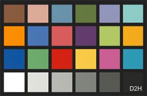
Differences between the color rendering of the D1H and D2H are subtle, but quite apparent nonetheless. The D2H shows slightly higher saturation in the orange block on the left side of the chart, but noticeably lower saturation on a number of the other blocks, particularly the blues, greens, and the magenta swatch. This agrees with what I saw in test shots of natural subjects, in that I felt I was seeing less-saturated greens and blues.
Now, let's take a look at how the D2H fares against the EOS1D:
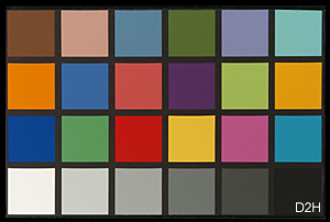
The results here are surprisingly similar to those above, in that the EOS-1D seems to mirror the color rendering of the D1H pretty closely. The 1D's color is a little more saturated overall than the D1H's, so that of the D2H comes off looking a bit less bright in comparison, but the net effect is much the same.
Still, the magnitude of the differences we see here against the EOS-1D don't seem to match what Rob Galbraith seemed to find in practice at a sports shoot, nor do they match what I saw in some comparison images my pro-friend Gibbs Frazeur brought back from a local college basketball game.
The issue seems to be that the D2H's color really takes a hit as you get into the higher reaches of its ISO range. (See Rob's page referenced above, for some exceptionally well-done comparison photos shot "live" with the D2H and EOS-1D side by side.)
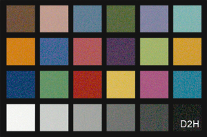
We can see this in the final rollover below, which compares the D2H and EOS-1D again, only this time at ISO 3200.
To take another look at this phenomena, the chart below shows how the
color saturation of the red swatch in the MacBeth chart varies as a
function of ISO for both the D2H and the EOS-1D:
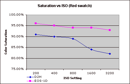
At least in red hues, it appears that the color saturation of the D2H
more or less holds steady until somewhere between ISO 800 and 1600:
By ISO 1600, it has diminished quite significantly, decreasing marginally
beyond that. (I believe that the cameras' behavior with colors other
than red is similar, but I didn't take the time to plot them.)
Turning to more natural subjects, I generally found the D2H's low-ISO
color to be quite good, although it seemed to be a little undersaturated
in reds and greens. Other reviewers have reported that the D2H's color
is more saturated than that of the D1H, but I didn't find this to be
the case. (Although I didn't have a D1H available while writing this
review, to do a side by side A/B comparison with.)
In my shots, Caucasian skin tones turned out quite well, with a nice,
natural tone, at least in the few people-pictures I shot. Here again
though, my experience (or perhaps just my taste) was somewhat different
than Rob Galbraith's, who reported some negative experience with overly-ruddy
skin tones under daylight conditions.
White Balance
The D2H has some pretty fancy technology in the white balance area, including an external ambient-light color sensor, and an anti-flicker filter as well, to help with pulsating light sources, such as fluorescent and various forms of vapor-arc lighting.
I generally found the D2H's white balance to be pretty accurate, but was disappointed by its handling of conventional household incandescent lighting. Its auto white balance system may be very sophisticated, but it's only rated to handle light sources with color temperatures of 3500K and above. Since a lot of residential and office incandescent lighting extend down to 2500K or even lower, the D2H's auto white balance system has great difficulty with it, leaving quite a bit of yellow in its images. What's more, the Kelvin-based white balance option behaved very oddly at the lower range of its settings. In my "indoor portrait" shot, under incandescent lighting of about 2450K, the 2800K setting produced a slightly warm image (as expected), but the 2500K setting produced a pronounced greenish cast. Even the manual white balance system left a very warm cast in the image.
I didn't have the occasion to work with the D2H under flicker-producing lighting, so can't comment on the performance of the white balance system under those conditions. At the risk of over-referencing his excellent article though, I'll point out that Rob Galbraith has worked with the D2H under a wide range of lighting conditions, apparently with somewhat variable results. It did exceptionally well at one venue where he's always had trouble with auto white balance systems in the past, but it apparently offered little or no improvement at two other locations with tricky lighting.
The Bottom Line for Color
The D2H has pretty decent color, particularly at lower ISO settings. Viewed on their own, its images look bright, clean, and appropriately saturated, although even standalone shots show some weakness in blues and greens. It's only when they're viewed in direct comparison with images captured by the earlier D1H of the competing Canon EOS-1D that the D2H's colors appear a little muted.
As you increase the ISO though, the D2H progressively loses color saturation. The effect is noticeable at ISO 1600, particularly in red and orange hues, and is quite pronounced at ISO 3200 and above. In fairness to Nikon though, I must hasten to point out that the ISO ratings of 3200 and 6400 are presented to the user as being outside the "normal" range, precisely because image quality there isn't up to Nikon's standards for full-spec performance. They thus provide the capability for users who must have it, but make it clear that you shouldn't expect "Nikon quality" from the camera at such elevated ISO levels. Still, the loss in color saturation at very high ISO levels is significant, and greater than that suffered by its competition.
At the end of the day, the D2H's color quality is quite good at low ISO settings, and many may actually prefer its slightly less saturated look to that of the earlier D1H or EOS-1D. Color remains pretty good at ISOs as high as 800, but diminishes markedly beyond that. Images shot at ISO 1600 and higher are still very usable, but their quality is lower than that of images shot at ISO 800 and below.
Reader Comments! --> Visit our discussion forum for the Nikon D2H!

Follow Imaging Resource: