INCAMERA
inCamera -- Calibrating
Your Digicam
Editor
The Imaging Resource Digital Photography Newsletter
Review Date: June 2003
Recently (http://www.imaging-resource.com/SOFT/ICO/ICO.HTM) we praised Pictographics for their intelligent color correction utility, iCorrect. It's intelligent because it knows its own limitations. It can't tell sky from skin -- but you can and it's smart enough to let you. Brilliant.
|
C O N T E N T S |
But how brilliant can a utility to profile your digicam be, we wondered when we saw inCamera from the same smart people. All the profiling pros we talked to told us the same thing. You can't profile a digicam.
You can try, sure, but you'll go postal making it useful. The problem isn't the digicam. It's the environment. Too many variables. Sunlight, shade, flash, time of day. Yikes.
In fact, the only situation in which profiling the camera makes sense, we were told, is in the studio -- where every variable is controlled.
ENTER PICTOGRAPHICS | Back to Contents
And that's where Pictographics (http://www.pictocolor.com) comes in with inCamera 3.1, a profiling plug-in for Adobe Photoshop.
Right out of the chute, they confirm, "A new profile must be made each time the lighting changes, so inCamera is best suited for studio photography, where several pictures will be taken under the same lighting setup."
These guys do not play games.
But before you skip to the next story, think about this a minute. You probably have one camera in which the lighting never changes. Your scanner.
And in fact, inCamera promises it can profile your scanner "using the IT8.7/1 or IT8.7/2 scanner targets, which are available from film manufacturers for most photographic color transparency and print materials."
But to our surprise, we found inCamera useful for profiling a few difficult situations our digicam found itself in. We made things tough for ourselves by using inCamera with a digicam for this review.
SYSTEM REQUIREMENTS & INSTALLATION | Back to Contents
You have to have an application that can tap into the power of Adobe Photoshop filter plug-ins to use inCamera. Versions of the plug-in are available for both Macintosh and Windows platforms.
Installation is simple. The installer creates a directory containing the plug-in and the extensive HTML help system (which links to the online FAQ). Copy the plug-in to each plug-in directory of any application that supports filter plug-ins. Done.
The first time you run the plug-in it asks for your name and serial number. That's it.
But make sure to register. There are two types of people in this world. Those who register their software and those who never upgrade anything. Even for free. Catch the wave, register.
HOW TO PLAY THE GAME | Back to Contents
Whether you're profiling a digicam or a scanner, you play this game the same way:
- Capture one of the supported color charts with your digicam or scanner.
- Open the captured image of the chart in your image editor and use inCamera to make an ICC profile.
- Use that ICC profile by assigning it to other images that were subjected to the same conditions as the chart image.
THE CHARTS | Back to Contents
One of the cardinal rules of trouble-shooting is to start from a known state. The assumptions you make (whether you're aware of them or not) always get you into trouble. It's the same for color management. The known state in color management is called The Chart.
There are really three charts. The venerable ColorChecker with 24 blocks of color, the ColorChecker DC (designed for digicams with over 200 color patches) and the IT8 (which is really two charts: the IT8.7/1 for transparency scanners and IT8.7/2 for reflective scanners). The ColorCheckers are intended for non-photographic images and color negative film, while the IT8 is intended for scanning photographic positives.
Acquiring a chart is the only hurdle you'll have to face in using inCamera. They aren't cheap and they aren't universally available. They aren't cheap because they contain known values or measured colors, the production of which is not trivial. They aren't universally available because, well, they aren't cheap. And every now and then, just to pay your dues, you really should buy a new one.
The prevailing wind on the ColorChecker DC is that it isn't worth the expense or trouble. Use the old ColorChecker.
The old ColorChecker has four rows of six colors, 24 in all. The bottom six are neutrals running from white to dark gray. The top row includes skin tones, foliage and sky colors. The middle rows include the saturated primary colors red, green and blue as well as the secondary colors yellow, magenta and cyan.
Pictographics has devised a reference file for the undocumented ColorChecker that mimics its digital version in the ColorChecker DC chart. They tell you how to make your own reference file, if you're inclined, though.
SHOOTING THE CHART | Back to Contents
Your chart and your camera should travel together. Whenever you set up for a few shots, pull out the chart and shoot it. This drops a known state into the wild variety of the location itself. We know what the color patches of the chart measure and can use them to understand the scene colors.
There are a few tricks to shooting the chart. But not many.
We like to shoot the chart large. It's possible to shoot it small, as part of a scene (even to be cropped out later), but the idea of making a profile is to include the chart invisibly anyway. So we take one shot of the chart that fills the frame, minimizing any color artifacts.
It's important that the chart is evenly illuminated. No shadows. Pictographics recommends shooting the chart on a larger standard 18 percent gray card. It probably helps calculate auto exposure, too.
And it's important that you capture the chart without any image processing. If your digicam compensates for a color tint, disable it. If your scanner has an auto color correction mode, disable it. You want to capture the image the way your device sees it. The profile will do all the work for you later.
Once you've captured the chart on location, have fun. If you move indoors or outdoors or change the scene's variables in any other way (switching to flash, say), just shoot another chart under the new conditions.
MAKING THE PROFILE | Back to Contents
Once you've captured the chart and a few images, you have the data to build a profile for that shoot. We're reluctant to call it a camera profile. Think of it as a control for the specific situation. It's almost always useful that way.
Before you work with the chart, however, you'll want to make sure Photoshop is configured to use ICC profiles when you want them used and not use them when, for example, you are profiling the chart. The Help system tells you exactly how to configure Photoshop to do that.
Then you can open the image of the chart and launch inCamera. In Photoshop, you'll find it under the Filter menu on the Pictographics' fly-out menu.
 |
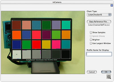
| inCamera Note the grid overlay |
You'll see a dialog window open that displays your image, a grid overlay of white outlines and a column of settings above the OK and Cancel buttons.
In a nutshell, you tell inCamera which chart it's looking at with the popup Chart Type menu, drag the grid's handles so the squares align closely to the chart's squares and type in a profile name. Hit OK and you've created a profile for that scene.
 |
| After Aligning the Grid |
SAVING THE PROFILE | Back to Contents
As if it were actually that easy. Actually, where profiles are stored on any platform is generally a mystery. Fortunately, inCamera knows all about this and the Help system is very clear on where what can be found. The Help goes so far as to recommend how to name the profile for various systems and what the best places to save the profiles are.
Pictographics has made it easy enough for a child deprived of basketball camp to make enough money for soccer camp creating profiles. Assuming you've shot the chart, it takes just a few seconds to make the profile.
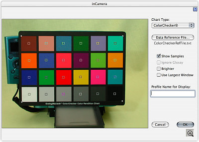
Even aligning the grid isn't a big deal. A little Show Samples checkbox displays what part of the chart is actually being read by inCamera. It proves you really don't have to be painfully precise with the grid overlay to get good samples.
 |
| Show Samples The small boxes indicate the sampled area |
And that's about where most companies would stop with a big "Ta Da!" But not Pictographics. They want to make sure you know how to use the profile.
USING THE PROFILE | Back to Contents
To use your new profile, you have to set your image editor's color management preferences appropriately. OK, this isn't a very generic issue. We're thinking about Photoshop. How do you get Photoshop to prompt you for a profile when you open an unprofiled image from the shoot?
It's actually pretty easy. Pictographics suggests you set Photoshop's Color Settings so the Working Space is the revered Adobe RGB (1998) -- when everyone's eyesight was better -- and arrange the color management policies so RGB images are converted to the working space and Photoshop asks you what to do for missing or mismatched profiles. Simple.
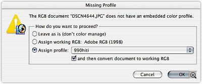
Then, when you open an image freshly copied from the camera, Photoshop will ask you what you want to do -- and one of the options will be to apply your custom profile.
 |
| Opening an Unprofiled Image 990hiti is the name of our new profile |
COLORIMETRICALLY ACCURATE | Back to Contents
Precision is a wonderful thing, but a small consolation if you don't like what you see. In fact, you may find your profiled images a little flat.
Pictographics recommends applying an S curve (darker shadows and lighter highlights) to profiled digicam images to enhance them after getting the color right. Scanned images, they say, are less disappointing.
That was about the only correction we typically made.
OUR TEST BED | Back to Contents
Pictographics gives you two approaches to the issue of color correction. You can correct color in any image, regardless of its source (or even your knowledge of its source), using iCorrect. But you can also optimize color before the fact by shooting a known test target and using inCamera to build a profile based on that particular scene.
The advantage of the latter method, to our muddled mind, is that you are not shooting blind, applying a single correction to a whole set of images. You are, instead, normalizing the scene to the response curve of your camera's or your scanner's sensor. Over the long run, you'll get more right results.
We tested this theory in the garden. A deluge of spring rain got the roses blooming early and we dashed down the stairs with our tripod bouncing off the stairs to get a few early morning shots.
The first shot was of the ColorChecker.
We missed a thin blade of a leaf that popped up over one of the gray samples, but you can retouch the image to eliminate that aberration (it's legal). You can also Show Samples to see if it will actually be sampled by the profiler.
Then we shot away, changing our EV setting to underexpose the bright flowers against the dark background.
We shot a second image of the ColorChecker for the other side of the yard simply because those blooms were all in the shade.
So we ended up with two profiles. One in the sunlight and one in the shade. And we had a nice marker in the ColorChecker images themselves to tell us when to quit using one and start using the other.
The results were interesting. Especially compared to iCorrect.
Our raw shots, despite our underexposure, were too saturated. The red roses looked like they'd been to the fluorescent hair stylist.
When we applied the profile, they jumped back to reality. They were a little flat, but they weren't saturated. We could apply the S curve trick to get a printable image.
The images in shade were a bit more trouble. The fence took on an unnatural color, even though the blooms looked good.
What intrigued us what that we couldn't get to the same place with iCorrect. Both corrections were pleasing, improvements over the originals, but different. iCorrect made a better screen image, to oversimplify, but inCamera made a better print image.
CONCLUSION | Back to Contents
It's as silly to argue over iCorrect and inCamera as to discriminate between the first and second of a one-two punch. It's the knockout that counts. With both these approaches at hand, you have automatic control over color that would cost you hours of manual work.
We were surprised at how useful inCamera turned out to be. We thought the shifting conditions of most of our work would make it frustrating to use. Not so. We were encouraged enough by the initial results to keep it in our toolkit.
We did the product shots of the HiTi 640PS the same way we shot the 630PS, but for the earlier review, we used iCorrect to help the images. For the 640PS, we used inCamera's ICC profiles. See for yourself:
- HiTi 630PS with iCorrect: http://www.imaging-resource.com/PRINT/HT630PS/HT6.HTM
- HiTi 640PS with inCamera: http://www.imaging-resource.com/PRINT/HT640PS/HT6.HTM
Pleasing color is a subjective thing. But you'll get there quicker starting from a known state. And Pictographics gives you two ways to do that. Bravo!