What to look for in Imaging Resource "Indoor Portrait" test images
By Dave Etchells
May, 2008
| More about our testing |
| New Indoor/Outdoor Portrait Tests (5/23/2008) |
| New Daylight Simulator (5/23/2008) |
| "Sunlit" Portrait - What to look for (5/23/2008) |
| Indoor Portrait - What to look for (5/23/2008) |
| Still Life and Multi Targets (Updated 11/29/2010) |
| HMI Studio Lighting (5/22/2006) |
| Performance Timing (5/22/2006) |
| New Review Format (5/22/2006) |

The original "Indoor Portrait" shot (in two different incarnations) has been part of the IR test suite from the very beginning.
The "Indoor Portrait" test shot is another of our test shots that has a long history: It was part of the original test suite back when the site was first founded in April of 1988. Like the Outdoor Portrait shot (now called our "Sunlit" test), it's been through several incarnations. The lighting for it has always been quite similar though, as it's meant to simulate a well-lit home scene of the sort you'll find a lot of here in the US.
I realized early on that household incandescent lighting was a very tough light source for digital cameras to handle, as its color balance is so warm-hued compared to daylight. To produce a reasonably-colored final image, digital cameras have to greatly amplify the signal coming from their blue pixels, and dial-down the signal from their red ones. This can produce a lot of image noise, particularly at high ISO (light sensitivity) settings.
Beyond the basic color adjustment that's needed though, a surprising number of cameras have a hard time properly recognizing this light source, and then knowing how to compensate for it. Many digital cameras fail miserably if you leave them set to their "auto" mode and shoot under incandescent lighting, producing unattractive photos tinted a strong shade of yellow.
The new "INB" test scene uses the same lighting and similar test elements, but provides much better repeatability.
I've heard that some of this may be the result of incandescent lighting being relatively uncommon in Japan, where most digital cameras are manufactured. It may also be a matter of cultural preference: A camera designer from Fujifilm once told me that, while Americans tend prefer more neutrally-hued images, many Europeans (Germany was the country he specifically mentioned) like very yellow-looking images of indoor scenes, feeling that they better convey the warm feeling of the original lighting. Whatever the cause, it's clear that many digital cameras render incandescently-lit scenes with a stronger yellow cast than most US consumers prefer.
Irrespective of personal preferences, there's certainly true that there's a lot of variation in how digital cameras handle incandescent lighting. And while incandescent lighting is being replaced by compact fluorescent bulbs in many US homes, the strong preference is still for bulbs with a very warm color cast that mimics that of incandescent lamps.
So our "Indoor Portrait" test still plays a very important part in our overall evaluation of digital cameras.
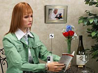
In late April of 2008, my wife Marti finally "retired" from the modeling business, after having sat patiently through many hundreds of hours of test shots. To replace her, we set up two high-end clothing mannequins, with human-hair wigs tinted to mimic the subtle variations in tone found in many people's natural hair. (More about these subtle tones a bit later.)
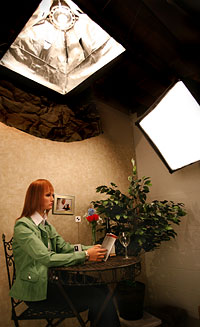
Light on the new INB set comes from standard household bulbs in photo soft boxes to give the desired contrast level. A bare bulb behind one soft box washes the wall and acts as a "hair light."
In our current setup, the lighting mimics pretty closely that of the setup immediately prior to it, albeit with a bit more contrast to bring out details in the set a bit better. The main light overhead is from a bare-filament 60-watt bulb in a medium-sized foil-lined softbox minus its front diffuser. This casts a somewhat harsh light, giving good contrast from the main light. Fill illumination is provided by another medium-size softbox a bit above and at about 45 degrees in front of the model, to camera right. This box has a 100 watt light in it, but does have its front baffle installed, to provide a soft fill. A second, larger softbox is located at about camera level to camera left, about 30 degrees in front of the model. Light from this box (also 100 watt) wraps around the left side of the model and set, softening what would otherwise be deep shadow there. Finally, a 60-watt clear bulb is hidden behind the upper soft box, to act as a hair light, producing brighter highlights off individual strands of the model's wig.
The overall color temperature of this collection of lights is about 2650K (the individual bulbs range from 2,600 - 2,700K), making a good match with light sources found in typical US homes. The light level is about 6.4 EV, roughly corresponding to a well-lit residential living room.
We typically shoot this scene with all available white balance settings that would be appropriate for this type of lighting. In the case of basic point & shoot cameras, this probably means just the Auto and Incandescent white balance settings. More advanced models have a Manual or Custom setting that lets you set the camera's white balance by pointing it at a neutral white or grey reference card and pressing a button. Some SLRs also add a Kelvin white balance mode, which lets you set the color temperature of the lighting directly. From among these, we choose the white balance and exposure we find the most pleasing and load that image into our Comparometer(tm).
What to look for in the Indoor Portrait test images
Color rendering
As we've just discussed, the primary intent of the Indoor Portrait test is to show how the cameras we test handle typical household incandescent lighting. The key word in that sentence is "show," deliberately chosen rather than "measure." We've wrestled a bit over whether to include a MacBeth ColorChecker target in the scene or not. I may yet change my mind on this, but for the moment, the only absolute reference in the image is a WhiBal grey card. My resistance to including a ColorChecker in the scene revolves around the issue of absolute vs subjective measurements and their role in camera testing.
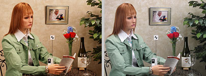
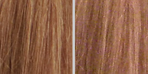
There's a lot of variation in how cameras respond to incandescent lighting. Some cameras' auto white balance settings in particular have trouble with this light source. Of course, it's all relative: Which photo above looks good to you?
Absolute, numerical accuracy isn't the goal
Given that white balance handling for this lighting is so much a matter of personal preference, I don't want to get into the position of holding up absolute color accuracy for this particular light source as a measure of camera quality. While people almost universally expect a perfectly neutral white balance in images shot under daylight conditions, most also react to perfectly neutral shots taken under incandescent lighting as "cold" in hue: They actually prefer a little warmth in the shot, as a suggestion of the warmth of the original light source. Given this, the most preferred camera response is actually an inaccurate rendering, at least in terms of an absolute standard like the MacBeth chart. Reporting "color error" as we routinely do for daylight-balanced lighting would thus convey a false impression of cameras' performance in this area.
Let your eyes be the judge
As with many aspects of image quality, beauty here is very much in the eye of the beholder. That means your eyes, since you're the one who ultimately needs to be pleased with the pictures you take. Just look at the overall picture, and decide whether the color balance looks good to you or not. Note whether the best-looking white balance setting is Auto or something else: If it's something else, be prepared to have to switch away from Auto to get the best results with this camera. A surprising number of people never take their cameras out of Auto mode. If that describes you (or the person you're buying or recommending the camera for), the results in Auto mode will be pretty important.
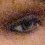
Image noise looks a lot like the "snow" seen on analog-era TV sets with bad reception.
As megapixel counts have marched ever-upward, sensor pixels have gotten progressively smaller. This matters because smaller pixels gather less light, so there's less valid image data and more noise coming from the sensor. Noise in digital camera images looks a bit like "snow" on a TV screen tuned to a weak channel. It's to the point now that most of us would be shocked if we saw the images our cameras are actually "seeing," before any processing has been applied to them.
Modern cameras are remarkably successful at filtering out image noise, but it's often difficult for them to distinguish between noise and legitimate subject detail. The general approach is for the camera's processor to look at the local contrast (brightness level) in local areas of an image. A lot of local contrast means there's probably useful subject detail there, so the noise filters leave that part of the image more or less alone. Lots of contrasty subject detail also tends to mask any noise that might be present, so we're less aware of it. On the other hand though, if there's very little contrast, not only is there probably less subject detail in that area, but any noise present would be much more visible. In areas of low contrast, the camera's processor assumes that the variations between pixel values is probably the result noise, so it flattens-out the tones in that area.

Camera noise-reduction systems are generally pretty good at cleaning up noise in image areas with little or no subject detail present.
This approach to noise reduction works well at the ends of the scale: Smooth areas of the image (clear blue skies, for instance) remain unsullied by image noise, and strongly contrasting subject detail is left alone, giving the impression of good sharpness. Where noise reduction techniques run into problems though, is in image areas characterized by fine subject detail with subtle contrast. That is, where there's fine detail present, involving objects that are close to each other in color and tone. A good example of this is human hair, where the individual strands are both very fine, and quite close to each other in color and brightness. Another example is foliage of various sorts, particularly grass and pine needles. In such cases, cameras' noise-reduction processing often obliterates considerable subject detail.
The more noise is present, the more likely a camera is to lose subject detail while trying to reduce the noise. You may thus see relatively little detail loss at low ISO (light sensitivity) settings, but a lot of more loss at high ISOs.
Strongly-colored light sources also tend to result in more image noise because the camera has to amplify the signals from some of its pixels to compensate for the light coloring. In the case of incandescent lighting, the signal from the blue channel has to be amplified to offset the yellow cast of the lighting. Any noise present in the blue channel gets amplified along with the image data, doubly bad since the blue channel is generally the one with the most noise in it to begin with.
Noise artifacts in the Indoor Portrait test scene
The model's hair in this shot is a tough test of cameras' noise handling. The shot on the right is from a low-end digicam that's thrown out a lot of detail in its quest for low image noise. The shot on the left is from an entry-level DSLR, where larger sensor pixels mean less noise to begin with, and more sophisticated processing further improves matters.
In our Indoor Portrait test shots, you can look for the effects of noise reduction processing in the model's hair, which shows a pretty wide range of local contrast, from quite distinct (where the hair extends over her forehead, contrasting with her skin tone), to very subtle (where the strands of hair lay over others of similar color). This makes this subject an excellent test of how well cameras balance the preservation of subtle subject detail with the need to reduce image noise.
This is an area where you'll see huge differences between the performance of digicams and DSLRs. The larger sensors on DSLRs produce far less noise in the first place, so their processors have an easier time distinguishing what noise is present from the underlying subject detail.
By happy accident, it turns out that the model's green coat is also a pretty tough test of noise-reduction systems, although we'll stick to showing examples from the hair in our comparison crops. The fine shadings of the threads in the fabric is very easily lost to over-active noise reduction processing. Consistent with our past practice (despite the significantly different subjects), we'll probably continue showing crops of the model's hair in our discussions of noise handling, but interested readers may want to look at the model's coat on their own to further understand cameras' limitations in this area.
High-ISO performance
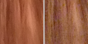
At higher ISOs, the model's hair really shows differences in how cameras trade off detail vs noise. (Both shots were captured at ISO 800, the one on the left by a Fuji F100fd, the one on the right by a Canon SD790 IS.)
The relatively low light levels in most homes means that this is the environment where most users are going to most often need to boost the light sensitivity of their cameras. Even when shooting with flash, the short range of many digicam flash systems mean that you'll often be using higher ISO settings when shooting indoors. As such, the Indoor Portrait test is an excellent place to look at cameras' image quality at high ISO settings. When you consider the negative impact of the warm-hued light source on image noise, indoor shooting in the home becomes one of the most challenging situations a digital camera can encounter.
For this reason, we've long used crops from the Indoor Portrait shot as the acid test of cameras' high-ISO performance. While this represents something of a worst-case scenario for high-ISO image quality, we feel that the fact that so many low-light shooting situations will involve this light source (or one even more strongly colored) makes it both a legitimate and important test of cameras' performance in this area.
As you can see from the crops above, even among consumer cameras, there's a huge range of variation in how well cameras handle high-ISO shooting under the conditions of this test. Look for crops like these in our test results discussions, to see how competing cameras stack up.
Bottom line
While you can also use the Indoor Portrait test scene to look at things like shadow detail and depth of field in digicams (it's always shot with the lens wide open, using a medium focal length zoom setting on digicams), the best uses of it are for subjectively judging how well cameras respond to typical household lighting here in the US, and how well they perform at high ISO settings. Our test results write-ups include crops to illustrate both these points, but interested readers can also visit our Comparometer(tm) to make their own direct comparisons.