Canon PowerShot Pro1New level of sophistication takes over the top spot in the PowerShot line.<<Reference: Datasheet :(Previous) | (Next): Print-Friendly Review Version>> Pro1 Sample ImagesReview First Posted: 05/14/2004 |
Digital Cameras - Canon PowerShot Pro1 Test Images
| I've begun including links in our reviews to a Thumber-generated index page for the test shots. The Thumber data includes a host of information on the images, including shutter speed, ISOsetting, compression setting, etc. Rather than clutter the page below with *all*that detail, we're posting the Thumber index so only those interested inthe information need wade through it! |
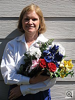
| Outdoor Portrait:
Excellent detail and resolution, with accurate color and saturation
as well. The extreme tonal range of this image makes it a tough shot for many digicams, which is precisely why I set it up this way, and why I shoot it with no fill flash or reflector to open the shadows. The object is to hold both highlight and shadow detail without producing a "flat" picture with muddy colors, and the PowerShot Pro1 handled the challenge pretty well, although it's default contrast is a little higher than I'd like. The shot at right was taken with a +0.3 EV exposure compensation adjustment, less than this shot usually requires. The camera's somewhat high native contrast still left the highlights a little too bright though, and some of the shadows on Marti's face are a little dark. I chose the Manual white balance setting as the most accurate overall, as the Auto and Daylight settings resulted in cooler, slightly purplish color balances. (I'd say that the correct color balance would be roughly halfway between that of the Manual and Auto settings here.) Skin tones look very good, although the slight overall yellowish cast makes them a bit more sallow than in real life. Other colors are generally excellent though, with the blue flowers in the bouquet almost dead right. (Many digicams have trouble with this blue, often producing exaggerated purplish tints in the petals. However, the Pro1 does a great job here.) Color and saturation look good throughout the frame, and the camera does a particularly good job at maintaining shape and detail in the bright red flowers. Resolution is excellent, and detail is strong and well-defined throughout the frame, even in the shadows. Image noise is low as well. To view the entire exposure series from zero to +1.3 EV, see files PRO1OUTMP0.HTM through PRO1OUTMP4.HTM on the thumbnail index page. Contrast Series:
Saturation Series:
|
||||||||||||||||||||||||||||||||||||||||||||||||||||||||||||
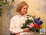
| Closer Portrait: 
Excellent resolution and detail. Exposure and color are similar to the wider shot above, and the Pro1's 7x zoom lens prevents any noticeable distortion of Marti's features. The shot at right was taken with a +0.3 EV exposure compensation adjustment, which resulted in very bright highlights but good midtones and at least some detail in the shadows. Resolution and detail are even stronger in this close-up shot, with great definition in the details of Marti's face and hair. This shot was captured with the Pro1's Auto white balance settings, so you can see the slightly purplish cast in it, as compared to the shot above, which was shot with the Manual (aka Custom) option. To view the entire exposure series from -0.3 to +1.0 EV, see files PRO1FACM1.HTM
through PRO1FACP3.HTM on the thumbnail index page.
|
||||||||||||||||||||||||||||||||||||||||||||||||||||||||||||
| Indoor Portrait, Flash:
A strong, bright flash, with good color and exposure. The Pro1's built-in flash did a good job here, and illuminated the subject with good intensity. The shot at right was taken with a +0.7 EV exposure compensation adjustment, slightly less than average for this shot. The flash is almost too bright here, coming close to blowing out the highlights on Marti's shirt, but the +0.3 EV setting resulted in a shot that looked underexposed. Color looks good, with an accurate blue in the flower bouquet. Skin tones are a little washed out, but still good. The camera's Slow-Sync flash mode resulted in slightly softer lighting, due to the longer exposure time, but the strong incandescent room lighting resulted in a very warm color balance. (This is pretty common. A few cameras have their flash heads more nearly color-balanced with incandescent lighting, to provide a better color balance in just this situation. The Pro1 follows the more common practice of having a flash that more closely approximates daylight color balance.) I again opted for a +0.7 EV exposure compensation boost in the Slow-Sync shot. To view the entire exposure series from zero to +1.3 EV in the normal flash mode, see files PRO1INFP0.HTM through PRO1INFP4.HTM on the thumbnail index page. To view the same exposure series in the Slow-Sync flash mode, see files
PRO1INFSP0.HTM through PRO1INFSP4.HTM on the thumbnail
index page. |
||||||||||||||||||||||||||||||||||||||||||||||||||||||||||||
| Indoor Portrait, No Flash:
Nearly accurate color with the Incandescent white balance setting, good exposure as well. This shot is always a very tough test of a camera's white balance capability,
given the strong, yellowish color cast of the household incandescent bulbs
used for the lighting. The Pro1's Auto setting
had a lot of trouble here, but did well with both its Incandescent
and Manual white balance options. I was a
little torn as to which white balance option to pick for the main exemplar
for this shot. The Incandescent setting produced a very nice-looking shot,
but it felt a little cold to me, while the shot taken with the Manual
setting seemed a tad too yellow. I eventually settled on the Manual option
though, because I felt it evoked more of the warmth of the original lighting.
The shots at right were taken with a +1.0 EV exposure compensation adjustment,
about average for this shot. (Perhaps most impressively, the tricky blue
flowers came out just about right, quite a feat under the very warm-hued
incandescent lighting.)
|
||||||||||||||||||||||||||||||||||||||||||||||||||||||||||||
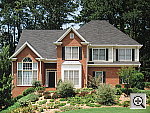
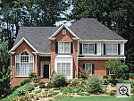
| House Shot:
Accurate color with the Manual white balance, excellent resolution and detail. All three of the Pro1's white balance settings produced good results,
though the shot taken with the Manual setting
had the best overall color and white value in the house trim. The Auto
and Daylight settings both produced slightly
warm color balances, but still good results. Resolution is very high,
and the tree limbs and front shrubbery show strong detail, as does the
house front. (Even though the poster was made from a 500MB scan of a 4x5
transparency shot with a tack-sharp lens, the Pro1's eight-megapixel CCD
extracts practically all the detail that's to be found here.) Canon's
conservative approach to in-camera image sharpening is seen here in the
form of a slight softness to details throughout the frame, although the
images take sharpening in Photoshop(tm) very well. There's a little increase
in softness in the corners of the frame, but the worst of the effect seems
to be confined to the extreme corners, not projecting very far at all
into the body of the photo. |
||||||||||||||||||||||||||||||||||||||||||||||||||||||||||||
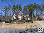
| Far-Field Test 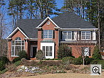
Exceptional resolution and detail, with a good dynamic range and amazingly little distortion of any sort. (Note: The main shot here was captured with the Pro1's low contrast setting.) This image is shot at infinity to test far-field lens performance. NOTE that this image cannot be directly compared to the other "house" shot, which is a poster, shot in the studio. The rendering of detail in the poster will be very different than in this shot, and color values (and even the presence or absence of leaves on the trees!) will vary in this subject as the seasons progress. In general though, you can evaluate detail in the bricks, shingles and window detail, and in the tree branches against the sky. Compression artifacts are most likely to show in the trim along the edge of the roof, in the bricks, or in the relatively "flat" areas in the windows. The Pro1 is the first time Canon has put "L-series" glass on an integrated-lens digicam, and the results really show in this image. This is my ultimate "resolution shot," given the infinite range of detail in a natural scene like this, and the Pro1 does a really excellent job with it. Details are strong and very well-defined throughout the frame, especially in the tree limbs over the roof and in the fine foliage in front of the house. Even the very fine details of the tree bark on the small cherry tree in front of the house are clear and distinct. In-camera sharpening does a good job here, as details are pretty sharp throughout the frame, with little or now visible "halos" around contrasting objects. Most impressive though, is how sharp the image remains, even in the extreme corners of the frame, and the almost total lack of coma or chromatic aberration. This is quite unusual in my experience, and a real indication of the quality of the Pro1's lens. The camera did lose most of the detail in the bright white paint surrounding the bay window with its default contrast setting. The low contrast adjustment worked beautifully though, taming the highlights and opening the shadows, without adversely affecting either exposure or color. Overall color looks good, and the exposure is just about right as well. The table below shows a standard resolution and quality series, followed by ISO, sharpness, saturation, contrast, and effects series. Resolution Series:
Sharpness Series:
Saturation Series:
Contrast Series:
Effects Series:
|
||||||||||||||||||||||||||||||||||||||||||||||||||||||||||||
|
Lens Zoom Range Am excellent 7x zoom range. I routinely shoot this series of images to show the field of view for each camera, with the lens at full wide angle, at maximum telephoto (7x, in this case), and at full telephoto with the digital zoom enabled. The Pro1's lens is equivalent to a 28-200mm zoom on a 35mm camera. That corresponds to a pretty wide angle to a pretty substantial telephoto, a very useful range. Following are the results at each zoom setting.
|
||||||||||||||||||||||||||||||||||||||||||||||||||||||||||||
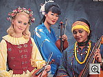
| Musicians Poster
Pretty good performance from all three white balance settings tested. High resolution and well-defined details. This shot is often a tough test for digicams, as the abundance of blue
in the composition frequently tricks white balance systems into producing
a warm color balance. All three of the Pro1's white balance settings that
I shot with produced pretty good results though, with only slight color
casts. I found the best color with the Daylight
setting, as the Auto setting was slightly
warm, and the Manual setting a bit cool and
magenta. The blue robe looks about right, without any strong purplish
tints in the deep shadows. Resolution is excellent, with strong detail
in the embroidery of the blue robe and red vest, and in the other fine
details. (The original data file for this poster was only 20MB though,
so cameras like the Pro1 are definitely capable of showing more detail
than the poster has in it.) |
||||||||||||||||||||||||||||||||||||||||||||||||||||||||||||
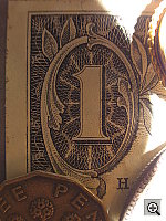
| Macro Shot
Really exceptional macro performance, with good color and detail, though the flash is blocked by the lens. The Pro1 performed exceptionally well in the macro category, capturing
a very tiny minimum area of only 0.97 x 1.29 inches (25 x 33 millimeters).
Resolution is very high, with excellent detail in the dollar bill. The
coins and brooch are soft due to the shallow depth of field at the very
short shooting distance (not at all the fault of the Pro1), but the level
of fine detail in the bill is excellent. As is often the case with digicam
macro shots, all four corners of the frame are rather soft, due to curvature
of field at this very close shooting distance. While it would be better
if this were not the case, almost every camera I test that shoots anywhere
near this close ends up with softness in the corners of its images. The
Pro1's flash is in a bad spot for macro shooting,
especially given the very close range, so you'll definitely need an alternative
light source for the closest macro shots. |
||||||||||||||||||||||||||||||||||||||||||||||||||||||||||||
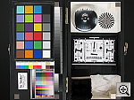
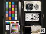
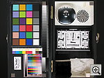
| "Davebox" Test Target
Excellent color and saturation, and an accurate exposure. The Pro1's Auto and Manual
white balance options both produced very good results here, so I stuck
with the Auto setting for the main shot. The Daylight
setting was a hint warm, but results were still pretty good. Overall exposure
looks about right, and the Pro1 does a good job with the subtle tonal
variations of the Q60 target. The large color blocks are very accurate
and well-saturated, though the blue and red additive primary color blocks
are just a little oversaturated, to my eye. Highlight and shadow detail
are both excellent, with low noise in the shadow areas. All in all, an
excellent job. ISO Series:
Sharpness Series:
Saturation Series:
Contrast Series:
Effects Series:
|
||||||||||||||||||||||||||||||||||||||||||||||||||||||||||||
|
Low-Light Tests Great performance, with good color and exposure even at the darkest light levels. The Pro1 produced clear, usable images down to the 1/16 foot-candle (0.67 lux) limit of my test, with good color at all four ISO settings. (Though at ISO 50, the best shot was at the 1/8 foot-candle, 1.3 lux, light level.) The camera's automatic white balance setting did a very good job here. Color balance is just a little pinkish at the lowest light levels, but overall color is much better than average. Noise is quite low at the lower ISO equivalents, rising to a moderate level at ISO 200, becoming distracting at ISO 400. The table below shows the best exposure I was able to obtain for each of a range of illumination levels. Images in this table (like all my sample photos) are untouched, exactly as they came from the camera. (Note: If you'd like to use a light meter to check light levels for subjects you might be interested in shooting, a light level of one foot-candle corresponds to a normal exposure of two seconds at f/2.8 and ISO 100.)
|
||||||||||||||||||||||||||||||||||||||||||||||||||||||||||||
|
Flash Range Test Great intensity and performance, with virtually no falloff even at the furthest distance of this test. In my testing, the Pro1's powerful flash illuminated the test target all the way out to 14 feet, without any significant decrease in intensity. Canon states the strobe's range as being from 11.5-16 feet at ISO 100, as the lens zooms from maximum telephoto to maximum wide angle. Given that the shots below were taken at ISO 50, Canon's own spec seems very conservative. Below is the flash range series, with distances from eight to 14 feet from the target.
|
||||||||||||||||||||||||||||||||||||||||||||||||||||||||||||
|
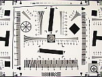
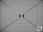
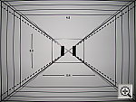
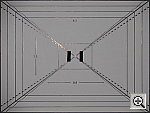
ISO-12233 (WG-18) Resolution Test
Very high resolution, 1,600-1,650 lines of "strong detail." Higher than average barrel distortion, but very low pincushion distortion. The Pro1 performed very well on the "laboratory" resolution test chart. It started showing artifacts in the test patterns at resolutions as low as 1,100 lines per picture height, in both horizontal and vertical directions. I found "strong detail" out to at least 1,600 lines vertically, 1,650 horizontally. "Extinction" of the target patterns didn't occur until about 2,000 lines, and even then, some detail is still visible. A note on "resolution:" Some reviewers would doubtless report the Pro1's resolution as being higher, but I tend to be conservative in these numbers, feeling that you shouldn't rate a camera as resolving a level of detail if the artifacts and aliasing are as strong as the primary subject detail. Hence my somewhat lower figures. It's also worth noting that I've found the resolution of the four 8-megapixel digicams I've tested thus far (the Pro1, Olympus 8080, Sony DSC-F828, and the Nikon Coolpix 8700, as of this writing) to be the same, in terms of the number of lines they can resolve on the test charts. There are differences between their res-chart images though, in terms of how crisp the images appear. This has as much to do with the cameras' image processing though, as it does with their actual optical resolution, so I don't try to slant my figures here to acknowledge that. (For what it's worth though, I found the Sony F828 to be the most crisp looking, the C-8080 and the Pro1 in a near-tie next, and the 8700 the softest of the lot, although not by a great amount.) Optical distortion on the Pro1 is higher than average at the wide-angle end, where I measured approximately 0.9 percent barrel distortion. The telephoto end fared much better, as I found only 0.06 percent pincushion distortion there (about two pixels' worth). Chromatic aberration is higher than I'd have expected, given the "L-series" glass in the Pro1's lens, with about seven or eight pixels of fairly strong coloration on either side of the target lines in the corners. (This distortion is visible as a very slight colored fringe around the objects at the edges of the field of view on the resolution target.) It's likely that the chromatic aberration was exaggerated somewhat by corner softness, which I noticed in a few shots (most visibly in the macro shot). Resolution Series, Wide Angle
Resolution Test, Telephoto
Sharpness Series
|
||||||||||||||||||||||||||||||||||||||||||||||||||||||||||||
|
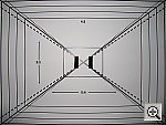
Viewfinder Accuracy/Flash Uniformity Excellent accuracy from the electronic viewfinder. The Pro1's electronic "optical" viewfinder (EVF) is very accurate, showing 99+ percent frame accuracy at both wide angle and telephoto zoom settings. The LCD monitor is also very accurate, since it shows the same view, just on a larger screen. Given that I like LCD monitors to be as close to 100 percent accuracy as possible, the Pro1's LCD monitor is essentially perfect in that regard. Flash distribution is good but a little uneven at wide angle, with some slight falloff at the corners and edges of the frame. At telephoto, flash distribution is more uniform, with only faint falloff at the very corners. |
||||||||||||||||||||||||||||||||||||||||||||||||||||||||||||


Follow Imaging Resource: