Digital Cameras - Nikon Coolpix S200 Test Images
Not sure which camera to buy? Let your eyes be the ultimate judge! Visit our Comparometer(tm) to compare images from the Nikon Coolpix S200 with those from other cameras you may be considering. The proof is in the pictures, so let your own eyes decide which you like best!
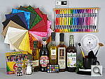
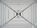
This is our new "Still Life" test target. We're combining some of the elements from previous shots (DaveBox and Res Chart) into this and the "Multi Target" shot below, plus added a number of elements that are very revealing of various camera characteristics and foibles. Here's what to look for in this target:
|
||||||||||||||||||||||||||||||||||||||||||||||||||||||||
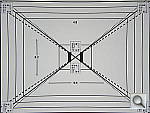
Our new "Multi Target" is actually an interim design that we plan to replace with a modified version within the next few months. (By the end of summer, 2006.) In its current form, its just an ISO-12233 res chart with several other elements attached to it, covering portions of the target we don't generally use in our reviews. (We'll continue shooting the full res chart in SLR reviews for the sake of interested readers, but all lesser cameras will now show just the Multi-Target instead.) The added elements largely mirror ones that were present in our "DaveBox" test target, which we've now semi-retired. Here's some of what you'll find in this target: Res chart elements: In placing the new elements on the ISO target, we were careful to leave the highest-frequency hyperbolic resolution wedges (the sets of fine lines that fan out vertically and horizontally), since these are what most people look at on the ISO chart to judge camera resolution from. There are also enough of the slanted black parallelograms available to use them to measure a camera's Spatial Frequency Response characteristics with Imatest. Gray Scale: While reflective gray scales don't cover the full dynamic range of higher-end cameras, advanced readers may be interested in using the gray scale here to evaluate noise performance vs brightness level, and/or examine the shape of a camera's tone curve. MacBeth Chart: This is about as common a color standard as you can get these days, very widely available for only mildly exorbitant cost, and quite well controlled in its production. It thus serves as a good basis of comparison between cameras and between test setups. Imatest also understands the MacBeth colors very well, and uses them to produce its color accuracy map that we feature in all our reviews. Kodak Color Separation Target: We include this for reference because it's used by other reviewers out there, but caution our readers that it really isn't well-suited for use as an absolute color standard. As its name suggests, its actual intended purpose is as an aid in setting exposure levels for old-style film-based color separation, using panchromatic graphic arts film, RGB filters, and halftone screens. It's ideal for that usage, but the colors aren't well-controlled enough and are too subject to fading for it to be usable as a true reference standard for color accuracy. Kodak Q60 target: This is another target that's perhaps not well enough controlled for quantitative measurements between cameras, but one that does have several useful characteristics nonetheless. For instance, it provides a good reference for the handling of various colors representative of common skin tones (the tan and brown patches along its right side), as well as of lighter, less-saturated tints of both additive and subtractive primaries (red, green, blue, cyan, magenta, and yellow). The MacBeth chart's colors lean heavily toward highly saturated values, and there aren't any pastel tones present at all. In the past, we've found that cameras with contrasty tone curves sometimes have trouble with the pastel tones in the Q60 target, making it a valuable reference that we'll continue to include.
Resolution Series:
Wide and Tele Resolution Tests:
|
||||||||||||||||||||||||||||||||||||||||||||||||||||||||
"Sunlit" Portrait:
The lighting in this shot is deliberately awful, about what you'd expect from noontime sunshine here in the Atlanta, GA area. (In fact, the color balance has been chosen to pretty well match the hazy sunshine here in mid-August.) The reason for the harsh lighting is to provide a real "torture test" of how cameras handle conditions of extreme contrast; and in particular, how well they do holding onto highlight detail. Look for:
To view the entire exposure series from zero to +1.7 EV, see files CPS200OUTAP0.HTM through CPS200OUTAP5.HTM on the thumbnail index page.
|
||||||||||||||||||||||||||||||||||||||||||||||||||||||||
Closer Portrait: 
The original intent of this shot was to illustrate why you really want a zoom lens if you intend to take close-up shots of people. Fixed focal length lenses tend toward the wide angle end of the spectrum, meaning that you have to get very close to your subjects to fill the frame with them. This results in very unnatural, chipmunk-like face shot, with exaggerated noses and rounded cheeks. These days, most digital cameras come equipped with zoom lenses, so you won't have to worry about the "Chipmunk look" in your portrait shots. (Just zoom the lens out to its telephoto position when you're taking close-in shots like this.) To view the entire exposure series from zero to +1.7 EV, see files CPS200OUTFACAP0.HTM through CPS200OUTFACAP5.HTM on the thumbnail index page.
|
||||||||||||||||||||||||||||||||||||||||||||||||||||||||
|
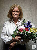
Indoor Portrait, Flash:
This shot duplicates indoor shooting conditions in most US homes, with fairly bright incandescent room lighting. The challenge here is for the camera's flash to blend naturally with the room lighting, and produce good, neutral color overall. - Some cameras will be overly affected by the room lighting, even with their flash enabled, and the result will be a strong orange cast. Another common failing is for the highlights from the flash to take on an unnatural bluish cast. Finally, exposure is important here, and frequently a tough challenge for the cameras. Marti's white shirt is central in the scene, reflecting a lot of the light from the flash right back at the camera. As a result, most cameras underexpose this shot, and require some positive exposure compensation to produce a good result. - And that's an important consideration in itself: Does the camera even permit adjustment of its flash exposures? Many do not. These photos are a tough exposure challenge, if they come out OK, the camera in question can probably be coaxed into delivering a good flash exposure of any subject within its range. Note too, that the normal flash shot (as opposed to the slow sync one, if the camera offers that feature) will be sharply rendered, any subject or camera movement frozen by the quick pop of the flash. That makes this shot a good one to look for the effect of over-aggressive noise suppression in Marti's hair. To view the intensity series from zero to +1.3 EV in the normal flash mode, see files CPS200INFP0.HTM through CPS200INFP4.HTM on the thumbnail index page. To view the same series in the Slow-Sync flash mode, see files CPS200INFSP0.HTM through CPS200INFSP4.HTM on the thumbnail index page. |
||||||||||||||||||||||||||||||||||||||||||||||||||||||||
|
Indoor Portrait, No Flash:
The incandescent lighting used in most US homes actually has a very strong yellow color to it. Our eyes have an amazing ability to ignore color casts like this, something digital cameras struggle to emulate. The incandescent lighting used for this shot is thus not only very common here in the US, but also very difficult for most digital cameras to deal with. While we probably want a little yellow color to remain in the image (to convey some of the mood of the original scene), too much will look unnatural and distort colors. Most cameras' auto white balance systems have a great deal of difficulty with this shot, but many incandescent white balance settings struggle as well. (It seems that many cameras' incandescent settings are actually calibrated to the tungsten lighting used in professional studio systems, which isn't nearly as warm-toned as typical household lighting.) If you intend to do much shooting indoors after dark, pay careful attention to this test, as cameras vary widely in this regard. To view the entire exposure series from zero to +1.7 EV, see files CPS200INMP0.HTM through CPS200INMP5.HTM on the thumbnail index page.
ISO Series: One additional note about this particular test series though: Because these images are shot under household incandescent lighting, the camera has to boost its blue-channel signal quite a bit to get back to a neutral color balance. Since the blue channel is generally the one with the most noise, this makes this shot a real acid test of noise performance. Noise levels in high-ISO shots taken under daylight conditions usually won't show as much noise. (See the "Far Field" test for examples of high ISO shots captured in daylight.)
|
||||||||||||||||||||||||||||||||||||||||||||||||||||||||
|
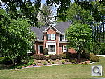
House Shot:
Like several of our tests, these images are actually photos of a high-resolution poster, shot under studio lighting. As of this writing, the poster in question was produced from a high-resolution scan of a 4x5-inch transparency, scanned to a resolution of about 150 megapixels. Even at that, it's starting to show its age, as the combination of camera lens, film emulsion and scanner resolution mean that many of the current 5+ megapixel cameras come close to capturing all the detail that's present. (We have a new poster under production, produced from 45 separate digital images, "stitched" into a single 400+ megapixel image, that should comfortably outpace the resolution of portable digital cameras for years to come.) Why did we choose to shoot a picture of a picture? The idea was to show a typical subject (a house and surrounding foliage) in a way that would be absolutely consistent from camera to camera. Any outdoor subject is going to vary considerably from day to day, as the lighting changes with the weather, atmospheric conditions, and season. Shooting a poster lets us compare images from cameras shot weeks, months, or even years apart, with the sure knowledge that nothing has changed from one shot to another.
Things to look for here are fine detail, as seen in the foliage and tree limbs against the sky, sharpness in the corners, and the preservation of subtle detail in the shaded brick patterns. - Many cameras with overactive noise suppression severely blur the brick patterns that are in shadow. |
||||||||||||||||||||||||||||||||||||||||||||||||||||||||
|
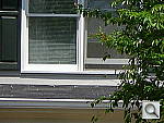
Far-Field Test 
While the House poster in the shot above provides absolute repeatability from test to test, it doesn't offer the range of brightness (dynamic range) that the original scene had, nor does it contain the nearly infinite range of fine detail found in nature. For these reasons, we still shoot the original house, even though the vagaries of nature mean that no two shots will ever be directly comparable. (In fact, over the eight or so years since we first shot this subject, the trees in front of the house have now grown so large that they obscure much of the subject. - We're unfortunately going to have to switch to a different subject in the near future.) Things to look for here are how well the camera handles the range of light levels from very bright to quite dark, and how well it renders the very fine detail visible in various parts of the image. Note though, that because this is shot outdoors, the character of the light is unavoidably going to change quite a bit, depending on the atmospheric humidity and the time of year. - You thus shouldn't rely on it for absolute comparisons between cameras, since it's unlikely that conditions will be identical from one test to the next.
|
||||||||||||||||||||||||||||||||||||||||||||||||||||||||
|
Lens Zoom Range Simply reading "4x zoom range" doesn't do a lot to help you visualize what that means. It also says nothing regarding just how wide the wide-angle end of that range is. To give you an idea of exactly what each camera's zoom lens does, we shoot this series of images, showing results at maximum wide angle, maximum telephoto, and telephoto with "digital zoom" enabled. (Note of course though, that so-called "digital zoom" just crops out and enlarges the central pixels of the image, achieving increased size at the cost of reduced resolution.)
|
||||||||||||||||||||||||||||||||||||||||||||||||||||||||
|
Musicians Poster
We've discontinued use of the Musicians poster in our testing, due to its low resolution, and the unavailability of any higher-resolution versions of the image. |
||||||||||||||||||||||||||||||||||||||||||||||||||||||||
|
"Davebox" Test Target
Because most of its various elements are now contained or represented in the combination of the Still Life and Multi Target shots, we no longer routinely shoot the Davebox by itself, as would normally appear in this space. (We do however, still use it for our flash range and low light tests below.) |
||||||||||||||||||||||||||||||||||||||||||||||||||||||||
|
Macro Shot
Many are interested in close-up or "macro" photography. This test shows the best results we could obtain using each camera's macro mode. What to look for:
|
||||||||||||||||||||||||||||||||||||||||||||||||||||||||
|
Low-Light Tests Low light photography is an area where there are really enormous differences between digital camera models. This test starts at a light level about equivalent to typical city street lighting at night (one foot-candle), and then progresses down from there, each successive test being at half the light level of the preceding one. You may also see the effect of poor low-light autofocus in some of these shots, although we use a different test setup to check autofocus performance more directly. (The results of which are reported on in the main Test Results section.) Things to look for here include:
(Note: If you'd like to use a light meter to check light levels for subjects you might be interested in shooting, a light level of one foot-candle corresponds to a normal exposure of two seconds at f/2.8 and ISO 100.)
|
||||||||||||||||||||||||||||||||||||||||||||||||||||||||
|
Flash Range Test Digital camera makers have gotten better with their flash-range ratings. In the early days, many cameras had rather "optimistic" flash range specs, to put it politely. These days, the manufacturers seem to be toeing the line. (No doubt at least in part because of tests like this.) Consistent with our philosophy of testing worst-case conditions, this test also involves some use of each camera's zoom lens. Flash range is greater at wide angle focal lengths than at telephoto ones. If you're shooting at the wide angle end of the lens' range, you might get better flash range than what's shown here. - But you'll never get a nasty surprise if you let the test shots below be your guide to flash capability.
|
||||||||||||||||||||||||||||||||||||||||||||||||||||||||
|
Resolution Target
Because the critical elements of this target now appear as part of the Multi Target above, we no longer shoot standalone images of the Resolution Target. |
||||||||||||||||||||||||||||||||||||||||||||||||||||||||
|
Viewfinder Accuracy/Flash Uniformity Viewfinder accuracy is an important parameter, especially for shots where framing is critical. The optical viewfinders on most digital cameras match the (poor) accuracy of those on film cameras, typically showing only about 85% of the actual final frame area. It's likely that this is a deliberate design choice by the camera engineers, to help avoid users accidentally cutting off the heads of their subjects. We disagree with this approach, or at least feel that it should be mitigated a bit, perhaps by increasing the accuracy to 90 to 95%. Unlike the optical viewfinders, the LCD viewfinders on most digital cameras tend to be quite accurate. There are exceptions though, and it's unfortunately not uncommon to find an LCD monitor that only shows 90% or less of the final frame. Things to look for on this test chart are:
|
||||||||||||||||||||||||||||||||||||||||||||||||||||||||


 Fujifilm GFX 50S Review
 Fujifilm X-T3 Review
 Olympus E-M5 III Review

Follow Imaging Resource