Digital Cameras - Olympus Stylus Verve Test Images
| I've begun including links in our reviews to a Thumber-generated index page for the test shots. The Thumber data includes a host of information on the images, including shutter speed, ISO setting, compression setting, etc. Rather than clutter the page below with *all* that detail, we're posting the Thumber index so only those interested in the information need wade through it! |
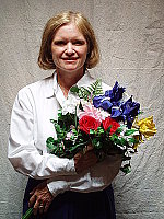
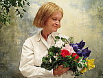
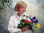
| "Sunlit" Portrait:
The extreme tonal range of this image makes it a tough shot for many digicams, which is precisely why I set it up this way, and why I shoot it with no fill flash or reflector to open the shadows. The object is to hold both highlight and shadow detail without producing a "flat" picture with muddy colors, and the Verve did pretty well with it, but did have slightly high contrast in response to the harsh lighting. The shot at right was taken with a +0.3 EV exposure compensation adjustment, which still results in slightly dark midtones. Highlights are bright, but actually managed to hold onto a surprising amount of detail there, although the shadows in Marti's eyes are very dark. I chose the Daylight white balance as the most accurate overall, as the Auto setting was just a bit warmer. Skin tones are nearly right, just slightly warm, and the blue flowers in the bouquet are a little darker and more purple than in real life, but still fairly close to accurate. (Many digicams have trouble with this blue, which is really a light navy with just hints of purple in it.) Saturation is pretty good overall, though the red flowers are somewhat oversaturated. Resolution is very high, and detail is strong throughout the frame. Though the shadows are quite dark, detail is actually pretty good in them, and image noise there is moderate. Overall, a good job with a very difficult subject. To view the entire exposure series from zero to +1.0 EV, see files VRVOUTAP0.HTM
through VRVOUTAP3.HTM on the thumbnail index page.
|
||||||||||||||||||||||||||||||
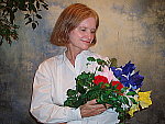
| Closer Portrait: 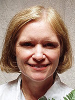
Increased resolution and fine detail, though high contrast and slight distortion from the relatively short focal length. Exposure and color balance are similar to the wider shot above, and the Verve's 2x lens allows a little geometric distortion of Marti's features. (Longer telephotos are much better for extreme closeup portrait shots like this.) The shot at right was taken with a +0.7 EV exposure compensation adjustment, which resulted in slightly dark midtones but rather bright highlights. Resolution and detail are stronger in this close-up shot, and fine detail is strong in Marti's face and hair. To view the entire exposure series from zero to +1.0 EV, see files VRVOUTFACAP0.HTM
through VRVOUTFACAP3.HTM on the thumbnail index page.
|
||||||||||||||||||||||||||||||
| Indoor Portrait, Flash:
Good coverage with the built-in flash, but some adjustment capability would have been nice. The Verve's built-in flash underexposed the subject slightly at its default
exposure setting, though coverage was actually fairly even. I tried boosting
the exposure by +1.3 EV with the Verve's exposure
compensation adjustment, but it had essentially no effect on the image.
(Exposure compensation on the Verve seems to only affect non-flash exposures.)
The background incandescent lighting results in a warm cast on the back
wall, which also spills onto Marti's features. Lighting from the flash
has a blue cast, which produces a cooler color in the highlights. Overall
though, results are pretty good, particularly for a basic point &
shoot digicam. |
||||||||||||||||||||||||||||||
| Indoor Portrait, No Flash:
Good color with the Incandescent white balance, good exposure as well. This shot is always a very tough test of a camera's white balance capability, given the strong, yellowish color cast of the household incandescent bulbs used for the lighting, but the Verve handled it better than most. The Verve's Incandescent white balance setting did the best job here, as the Auto setting resulted in a stronger yellow cast. (Although I should note that many people prefer a pronounced warm cast like this for shots taken under incandescent lighting.) Marti's skin tones are a little pink, however, and the blue flowers are dark and purplish (almost to be expected with this shot). Image noise is a little high here at ISO 100, but detail is strong. (Marti's features are soft though, because the camera focused on the bouquet, rather than her face.) The main exposure was taken with a +0.7 EV exposure compensation adjustment, slightly less than the average required here. A very good job with a tough light source. To view the entire exposure series from zero to +1.3 EV, see files VRVINTP0.HTM
through VRVINTP4.HTM on the thumbnail index page. ISO Series:
|
||||||||||||||||||||||||||||||
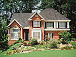
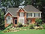
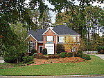
| House Shot:
Good color, though slightly warm, and high resolution. The Verve's Auto and Daylight
white balance settings resulted in very similar images, with slight warm
casts, so I chose the Auto setting for the main shot. The tree limbs above
the roof and fine foliage in front of the house show a lot of fine detail,
with good definition in the leaf patterns. (The Verve's four-megapixel
CCD stretches the limits of this poster as a test target. Even though
the poster was made from a 500MB scan of a 4x5 negative shot with a tack-sharp
lens, the Verve is close to extracting all the detail that's to be found
here.) Details are reasonably sharp throughout most of the frame, though
details soften slightly in the extreme corners. |
||||||||||||||||||||||||||||||
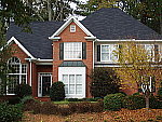
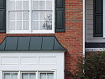
| Far-Field Test 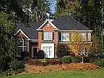
Excellent resolution and detail, with a good dynamic range. This image is shot at infinity to test far-field lens performance. NOTE that this image cannot be directly compared to the other "house" shot, which is a poster, shot in the studio. The rendering of detail in the poster will be very different than in this shot, and color values (and even the presence or absence of leaves on the trees!) will vary in this subject as the seasons progress. In general though, you can evaluate detail in the bricks, shingles and window detail, and in the tree branches against the sky. Compression artifacts are most likely to show in the trim along the edge of the roof, in the bricks, or in the relatively "flat" areas in the windows. This is my ultimate "resolution shot," given the infinite range of detail in a natural scene like this, and the Stylus Verve did a pretty good job with it. The tree limbs over the roof and fine foliage in front of the house show good detail, although the image is slightly soft overall, perhaps from anti-noise processing. (As witness the slightly rough edges along the white trim in the central gable of the house, where the noise-suppression processing gives way in the face of the abrupt brightness change.) In-camera sharpening does a pretty good job here, although I'd like to see the image slightly more crisp overall. To its credit there seems to be relatively little of the softness I've come to expect in the corners of digicam images. The very harsh lighting of this scene causes the
Verve to lose essentially all detail in the white paint of the bay window
on the front of the house, while at the same time losing most of the detail
in the deep shadows around the door. Not the worst I've seen in this respect,
but I'd like to see a bit lower native contrast. Resolution Series:
ISO Series:
|
||||||||||||||||||||||||||||||
|
Lens Zoom Range A modest 2x zoom range. I routinely shoot this series of images to show the field of view for each camera, with the lens at full wide angle, at maximum telephoto (2x, in this case), and at full telephoto with the digital zoom enabled. The Stylus Verve's lens is equivalent to a 35-70mm zoom on a 35mm camera. That corresponds to a moderate wide angle to something a little sort of a real telephoto. Following are the results at each zoom setting.
|
||||||||||||||||||||||||||||||
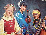
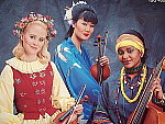
| Musicians Poster
A slight reddish color cast in response to the large amount of blue in the composition, but excellent detail. This shot is often a tough test for digicams, as the abundance of blue
in the composition frequently tricks white balance systems into producing
a warm color balance. Though slightly reddish and magenta, I preferred
the overall color of the Daylight white balance
setting to the warmer Auto setting. The blue
background has some purplish tints in it that aren't in the original image,
and the deep shadows of the blue robe are purplish as well. Resolution
is very high, and detail is strong in the embroidery of the blue robe,
as well as in the beaded necklaces and instrument strings. (The original
data file for this poster was only 20MB though, so cameras like the Verve
are definitely capable of showing more detail than the poster has in it.) |
||||||||||||||||||||||||||||||
| Macro Shot
A very small macro area with excellent detail. The Verve performed very well in the macro category (particularly for
a subcompact model), capturing a minimum area of only 1.50 x 1.12 inches
(38 x 29 millimeters) in its "Super" macro mode. Resolution
is very high, and detail is strong in the dollar bill. The close shooting
range renders the brooch and coins somewhat soft, though a lot of detail
is still present. In Super Macro mode, the camera's flash is disabled
due to the very close shooting distance. |
||||||||||||||||||||||||||||||
| "Davebox" Test Target
Good exposure, but a slightly warm color cast. The Verve's Auto and Daylight
white balance settings both resulted in warm, very similar images, so
I stuck with the Auto setting for the main shot. The camera's exposure
system handles this high-contrast subject fairly well, and the Verve has
no trouble distinguishing the subtle tonal variations of the Q60 target.
The large color blocks are rather warm-hued, but saturation is good (although
the large red and blue primary color blocks are a bit oversaturated).
The shadow area of the charcoal briquettes is very dark, with fairly good
detail, but somewhat high image noise. ISO Series:
|
||||||||||||||||||||||||||||||
|
Low-Light Tests Limited low-light performance, but good enough to handle average city street lighting at night. The Verve produced clear, bright, usable images only down to the 1/4 foot-candle (2.7 lux) light level, and that at the 200 and 400 ISO settings. At ISO 100, images were bright as low as 1/2 foot-candle (5.5 lux), and at ISO 64, images were only bright as low as one foot-candle (11 lux). Color balance was warm, but as the exposure dimmed, the color balance turned pink. Since average city street lighting is typically about one foot-candle in brightness, the Verve ought to do just fine under bright exterior lighting at night. Noise is actually pretty good, showing only moderate levels at the lower sensitivity settings, and a moderately high level at ISO 400. Also very much to its credit, the Verve focused well down to light levels a little under 1/8 foot-candle, surprisingly good for a camera without an autofocus assist light. The table below shows the best exposure I was able to obtain for each of a range of illumination levels. Images in this table (like all sample photos) are untouched, exactly as they came from the camera. (Note: If you'd like to use a light meter to check light levels for subjects you might be interested in shooting, a light level of one foot-candle corresponds to a normal exposure of two seconds at f/2.8 and ISO 100.)
|
||||||||||||||||||||||||||||||
|
Flash Range Test A weak flash, with low intensity even at the shortest test distance.
|
||||||||||||||||||||||||||||||
|
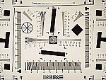
ISO-12233 (WG-18) Resolution Test
High resolution, 1,050 lines of "strong detail." High barrel distortion at wide angle, and a small amount at telephoto. The Verve performed fairly well on the "laboratory" resolution test chart, a bit below the best full-sized 4-megapixel digicams. It started showing artifacts in the test patterns at resolutions as low as 800~900 lines per picture height horizontally, and about 600~800 lines vertically. I found "strong detail" out to about 1,050 lines. "Extinction" of the target patterns occurred around 1,500 lines. Optical distortion on the Verve is quite high at the wide-angle end,
where I measured approximately 1.2 percent barrel distortion. The telephoto
end did much better, as I measured only 0.2 percent barrel distortion
there. Chromatic aberration is fairly low, showing only faint coloration
on either side of the target lines, and then only across a fairly narrow
range of wide-angle focal lengths. (This distortion is visible as a very
slight colored fringe around the objects at the edges of the field of
view on the resolution target.) As I noted earlier, there's also very
little of the softness in the corners of the frame that I'm accustomed
to seeing from digicam lenses. Resolution Series, 50mm
Resolution Test, Zoom Series
|
||||||||||||||||||||||||||||||
|
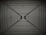
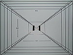
Viewfinder Accuracy/Flash Uniformity Very good accuracy from the LCD monitor. The Verve's LCD monitor is quite accurate, showing about 97 percent of the final image area at wide angle. At telephoto, accuracy would probably be about the same, but the bottom measurement line was just cut off in the final frame, so an exact measurement wasn't possible. Given that I like LCD monitors to be as close to 100 percent accuracy as possible, the Verve's LCD monitor does very well. (It also does much better than average under very bright lighting, remaining visible even in full sunlight.) Flash distribution is uneven at wide angle, with strong falloff at the corners and edges of the frame. At telephoto, flash distribution is more uniform and a lot brighter. |
||||||||||||||||||||||||||||||

VERVE Test Images
VERVE Specifications
VERVE "Picky Details"
Up to Imaging Resource digital cameras area

Follow Imaging Resource: