Deep Dive: Why does Adobe have so many different apps?
posted Wednesday, May 2, 2018 at 8:00 AM EDT

I’ve personally been following Adobe for years as both a big fan and a harsh critic of their products, dating back to the first time I ever opened an Adobe application in 2002. That outspoken dichotomy is a result of a fact about me: if I love your products, I expect the creators to love and respect them in kind. I want success for brands like Adobe and always hearing praise isn't how a company continues to evolve and succeed. I use an Adobe app at least once per day, and my taskbar is one third Adobe apps, ranging from InDesign and Premiere to Photoshop and Lightroom.
In short, I pay attention to and speak out about Adobe because I use their stuff every day.
Recently, I was thinking back on the launch of Creative Cloud and how not long after, a steady stream of applications seemed to flow out of their California headquarters (I mean that as a plural headquarters, like San Jose and San Francisco, together). At first, I was paying attention to every one, like Sketch and Draw and apps like Kuler which eventually evolved into Color.
But it wasn't long before I was not able to pay attention to every app and give each the attention they deserved. Suddenly there weren't just five or ten. Or even twenty or thirty applications. There were more. A lot more.
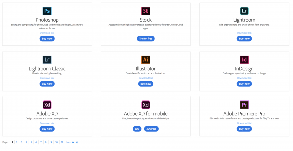
If you go to Adobe’s website today, you might stumble upon this page that lays out all of Adobe’s applications. I know I did recently, and as I clicked page after page, the situation of their app economy became even clearer to me. In the time I stopped paying attention to every app they released, simply because I didn't have the capacity, their apps ballooned in number. There are a lot of them.
Like, really a lot of them. There are presently 13 pages with nine different apps shown per page. That’s 117 different applications spanning across multiple platforms and a plethora of creative uses. It’s stunning actually, and as a Creative Cloud subscriber, I see 24 presented to me in my CC desktop application when I’m told it’s time to update something (or when I'm forced to click on it to shoo away a notification). Honestly, I use about six of these apps regularly. How could something like the Creative Suite of just a few mainstay applications morph into an ecosystem of over a hundred distinct applications?
As I perused page after page of apps I didn't even know existed, I wondered who they were for, why they existed, and what happened to other apps I distinctly recall using just a few years ago, or even last year (remember Photoshop Touch, Revel, Hue, or Line, for example?).
These weren't questions I was going to find the answers to without actually asking Adobe. So I did. I reached out to my friend Bryan O'Neil Hughes, their Director of Product Management, CC Platform and Services. His wheelhouse is Photoshop, and he's also a member of the Photoshop Lightroom software team. He also has his hands on a lot of other apps and has seen them grow over the last several years. Bryan has been at Adobe for a really long time; like, he's been there since well before the Creative Cloud launch. He first started there way back in 1999. So suffice to say, Bryan has been through some of the biggest changes Adobe has ever seen and is the perfect man to ask why it feels like Adobe's applications seem to grow less like flowers, but more like weeds.
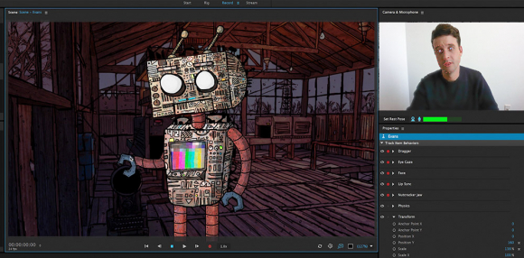
My first question to Bryan went right at the heart of the issue I have with their apps: there are so many, why can't they be consolidated? It's like my gripes with Facebook: why do I need so many apps to get the full experience? To illustrate this question, I asked Bryan why something like Character Animator needed to be separate from After Effects, since much of what powers Character Animator comes directly from After Effects. Could it not just live in the same application?
The answer was... not what I expected.
Bryan turned the question on me, and used a different example. The relationship between Character Animator and After Effects, Bryan said, was just like the relationship between Lightroom and Photoshop. "At a certain point, using Lightroom as an example, it was very obvious that Photoshop was not going to solve the problem that people shooting 1000s of images were having. Adobe felt like they would have to start all over again just to architect something that could deal with that."
He continued, "Traditionally, when they branch a product, they do it for either technical reasons or usability reasons," Bryan explained. "Both of these were taken into consideration with Lightroom. It makes a better program that is better for the user."
So then, taking a step back, apps like Character Animator are separate from what could be considered "parent apps" because they exceeded the architecture of the original application. Character Animator is separate, I am now extrapolating based on what Bryan told me, because it can succeed better as a separate application, freed from the bonds of After Effects' necessary parts.
In that same vein, I wanted to know why apps with very, very similar goals are separated. It makes sense perhaps to have Character Animator and Lightroom be separate from their parent products, but why are apps like Sketch and Draw separate? Even those app names are synonyms.
Bryan laughed. "Sketch and Draw should probably be one app. Right now they are two apps, one is vector drawing and one is expressive drawing," But Bryan agreed with my sentiment, "As far as the user is concerned, it’s putting a stylus to an iPad. It's the same thing. Both apps are very popular, huge hits, but they are separated by their functionality, and to my point they are synonymous." Perhaps to Adobe they are different, but Bryan agreed, "To the user their separation is not important."
Bryan is especially proud of how well these two apps are doing, however. "These apps always made sense for the iPad, but when the Pro and Pencil arrived, our usage (especially with our existing pro subscribers) went through the roof. The work that they’re creating is incredible. Illustration with a (very) high-fidelity stylus, directly on the canvas, is a true, uncompromised desktop alternative – though we see a lot of our users integrating with our desktop tools and Photoshop brushes. To your point, yes, I’d also love if these two were one app. "
Apps like Sketch and Draw are the product of early development with the Creative Cloud ecosystem. "First apps were, admittedly, trying to find their ground. I see them as more of stages of the rocket. We have learned a lot. When apps first started, there was no real idea of what the iPad was going to do and how it would fit," Bryan said. "The devices were not that powerful."
That may have been the case initially when the apps were gaining footing, but philosophy and strategy have since sharpened. Bryan explains, "In 2014 Adobe did a reboot of the mobile strategy, and that coincided with Scott Belsky from Behance. He said we need to be consistent across apps, value access to work wherever you are, connection with mobile apps and integration with desktop. They need to be high fidelity, they need to be supported in all the languages that we support on desktop." Bryan emphasized the goal: "We need to be platform agnostic."
The iPad Pro changed things. "It was super powerful and together with the pen, it led to a much closer relationship with Apple. That changed things too," Bryan said.
That year marked a turning point for Adobe Apps. They weren't just going for cool standalone features or neat ideas. "Starting then is when things were honed. Apps were polished," Bryan explained. But it wasn't all perfect. "We over-atomized originally. We broke them up too much in our quest to make them easy to use." Sketch and Draw are examples of this. "There were more apps than there needed to be. You’ve seen omission and consolidation. Like with Photoshop Touch and Ideas, they were misaligned with strategy and were shelved.

"Internally, Adobe realized how confusing the number of apps would be," Bryan told me. "Much of the functionality of Adobe Ideas went into Sketch and Draw. Photoshop Touch was popular, but misaligned strategically for Adobe. It was a replication of a desktop experience on a mobile device and they argue that most apps that give a desktop experience on a smaller, touch-driven screen, don't work out."
Bryan continued, "Adobe did not focus on extensibility for a while there. We could give a lot more love to third-party devs on desktop and on mobile, and we want to do that. When I look at the Adobe App ecosystem, I don’t think we should be solving everything, but we could be empowering others and sharing our engine with them."
But something needs to be clear: "All of these mobile apps and many browser-based applications are free. Anyone can use them," Bryan said. But as Adobe refines and grows, they can actually make product worth purchasing.
"We are getting to the point where we are gating features for paid customers. We are starting to turn on functionality unique to our paid users. Not only is that great for paid users, but also that these apps are getting to the point where they deserve to be members only.
"Right now, they are all free. I think that’s important to stress. I think that’s a huge change from the $5, $10 apps we used to sell. Photoshop Touch was $9.99. Original apps were paid. Now, no."
There are now a ton of apps that you don't need a subscription to use. You can see them all here.
Back to his rocket ship metaphor, Bryan went on, "The first couple stages of the rocket were paid apps. One of the first things we did with that reboot was to make getting them easy, make them free, and the feedback we get would be how we make our apps better."
He went on, "Our current mobile apps are the byproduct of a lot of work and innovation; in most cases, when we deprecate a product, the technology (and certainly the learnings) live on in the evolution of the segment." Adobe has consolidated and deprecated a number of apps over the years, here’s a list:
Apps that have been shelved:
- Color Lava
- Eazel
- Nav
- Photoshop Touch
- Adobe Revel
Apps that were consolidated or renamed:
- Adobe Ideas (fueled Sketch & Draw)
- Adobe Line (went into Draw)
- Adobe Hue, Color (which was formerly Kuler), Brush & Shape were all consolidated into Capture CC
All that experience with making apps that didn't succeed has allowed Adobe in the present day to be more selective about how they implement applications. It's not enough to just make something, which they clearly are capable of doing. It's now more important to them to make something that has staying power.
When you talk about mobile and desktop experiences in the photo community, you can't not talk about two very popular apps: Affinity Photo and Pinnacle Studio. Affinity Photo is arguably Photoshop's biggest competitor and has a fully-functional mobile experience (their iPad app is pretty much identical to their desktop app). Pinnacle is the most full-featured video editing application that I've ever seen on mobile and gives you a ton more tools on a mobile device than anything Adobe has put into Premiere Clip. It's basically like Premiere Pro, but on an iPad.
Though Bryan respects the excellent work those two developers did in making such powerful mobile applications, he doesn't think what they have done there was necessarily the "right" move.
"Hats off to Pinnacle and Affinity for their functionality to iPad." He said that specifically with Affinity, "it’s highly functional, and gets a lot of attention. They have done great stuff and have proven that a lot can be done on mobile."
But...
"From a usability standpoint, I think that it is really limited," Bryan said. "The desktop metaphor, which is to say hundreds of menus, tools and panels, served up on a small touch-driven screen is not a very pleasant experience. That’s why Lightroom’s interface was totally rethought for the phone."
So it's not that Adobe couldn't put a ton of functionality into a mobile experience, it's that they choose not to.
"There should ultimately be feature parity, but the struggle is design and UI," Bryan continued. "What separates a good app from a great app is usability, integration, precision, fidelity, translations, and functionality on hardware. Fundamentally speaking, the best apps that have the longest life are those that follow this." In that same vein, "Look at Affinity’s popularity on the App store. They have fallen considerably, and I think that’s due to this."
But that doesn't mean that Adobe doesn't want to bridge the gap between desktop and mobile. Heck, look at what they're doing with Lightroom CC. That gap is closing. Bryan agreed, "Desktop functionality on mobile is not unrealistic and should exist. Adobe is an operating system-agnostic company, and should be platform agnostic. You can look at Lightroom for example, with 85% parity between desktop and phone."
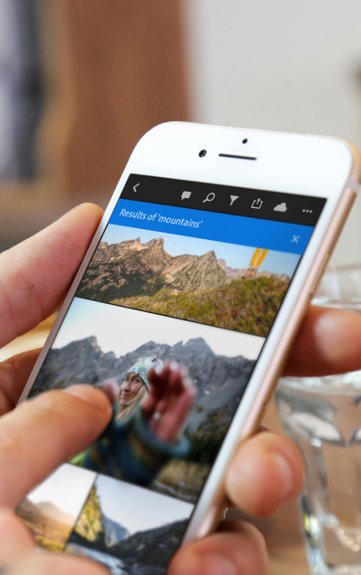
Speaking about Lightroom, I expressed my concern with Adobe's emphasis on mobile and how, for just about every professional photographer, the goals of going mobile do not align with the goals of the shooter.
"I understand that you don’t use Lightroom on mobile devices," Bryan said. "I understand that many working pros with an established desktop workflow have the solution that they need in their studio/office today." But it is also important to realize that Adobe isn't building software just for us "pros."
"When we consider the billions of casual photographers and the tens of millions who have fallen in love with photography via the 'camera they have with them,' this is a perfect in-road to our technology. With that over 85% feature parity with Lightroom Classic, we’re offering people an incredibly powerful solution that’s walk-up friendly. The team has raced to evolve the product far beyond access, and you’ll see this momentum continue across mobile, desktop and web."
As a professional photographer, it's easy to judge this route because it doesn't help me specifically. But it's also important for me to understand that because professional photographers make up such a small portion of the overall camera userbase, what is built for me perhaps should only take up a small portion of what Adobe is doing. Dedicating a ton of resources to help me specifically when there are millions more users who are more casual doesn't make business sense. They are focusing on making a product that the most people can enjoy, and it's important to respect that.

Looking now at those eleven pages of apps, it may seem like a lot but... now knowing what I know, it makes sense. Adobe has long since evolved past the "just throw it out there" attitude towards apps, but my memory of that time had not evolved with them. Things are most certainly different now than they were six, four, or even two years ago. Adobe is serving a huge number of creative professionals, and each subset of them is looking for something different from their toolbox. For me, it's Lightroom Classic, Photoshop, After Effects, Premiere and InDesign. That toolset changes for graphic designers, for web designers, and even other photographers. It's Adobe's job to make sure there is a wrench out there for every bolt, and for some artists that means things can look overly complicated and messy.
You could say the same for a hardware store. It's unlikely any one customer is going to need the whole hardware store, but different customers will need different aisles because, in the end, we're all trying to build something different.