Does Color Management Really Matter? See your images exactly the way you intended them.
posted Friday, November 26, 2021 at 4:00 AM EDT

You are probably familiar with color management if you’ve spent any time on photography or videography. We have all taken photos, ordered prints and noticed that they have a flaw, like a green cast. “That’s not what it looked like when I shot the photo!” is the most common reaction. Nobody wants unattractive skin tones; not in their personal photos, and certainly not in their professional work.
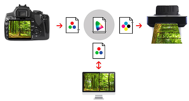
Color Management is technology designed to minimize color and brightness inaccuracies. To a certain extent, color management attempts to simulate the brain and corrects the raw data coming from the sensor in order to match the feeling of human perception more closely. It can do even more than just that. While a human being represents a closed system “more or less”, where everything is finely tuned, this is not the case with modern technology. We combine input devices (cameras, smartphones, etc.) and output devices (monitors, printers, etc.), without considering that each device has a different range of capabilities to capture or display colors. Different papers also have their own reflective properties in prints.
All devices must be coordinated with each other to prevent any unpleasant surprises. This is why color management is necessary to achieve consistent color across devices and outputs.
Color control
High-quality color control that is time- and cost-efficient is almost impossible to achieve without color management tools. Anyone who has ever set up their printer for fine art prints and ended up using an entire ink cartridge and a lot of high-quality paper for test prints will understand this. The concept of color management involves coordinating systems so that once taken, the image on the output side (monitor, printer or other output device) appears as close to the original as possible. This also includes deliberate changes made to image content. In other words, photographic editing needs to be reproduced on the output side as it was originally carried out. Why? Depending on the make and model, digital cameras have different color characteristics that can be corrected using a color calibration tool.
We can influence the appearance of the digital image on the display. Without corrections, we see an interpretation of the image that may not be representative of its true colors. This is determined by the electronic components of the display and its age. It can get even more tricky when it comes to printing images on paper.
The eye is not enough
In short, we are moving between physical worlds of color. We can work with several devices, which each individually interpret the colors for us. If you rely solely on the expertise of your eye and make adjustments according to your vision, you will very quickly reach your limits. Every additional device included in a color workflow will heighten the complexity. To add to this, color variations don’t behave in a linear fashion, but differ according to saturation level and the shade of color.
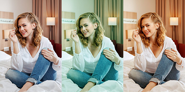
You’ll notice how fast your eye compensates for color casts, such as when you change the color profile on your monitor. Our brain adapts for the brightest white in the field of vision. This phenomenon is called color constancy. It means we can’t trust our eye to tell us if a display is neutral, as our brain may have “neutralized” it for us. These are just some of the many reasons why you should have a color managed workflow to achieve your intended creative vision.
LEARN MORE ABOUT DATACOLOR COLOR MANAGEMENT
This is a sponsored article, paid for by Datacolor.