Image Stabilization Testing, Version 2
posted Monday, August 30, 2010 at 5:06 PM EDT
It's been said that the excellent sometimes stands in the way of the good, and after more than a year since our last posting of image stabilization results at Imaging Resource, we have to admit that this been the case with our prior IS testing methodology.
While our previous approach for IS testing produced truly quantitative measures of IS shake reduction performance (as far as we know, the only such on the internet), the process of arriving at those results proved to be so labor-intensive that we just couldn't afford to do it on any kind of a regular basis. As a result, after a very laborious development process, stretching over almost 2 years of elapsed time, we realized that we simply weren't going to be able to incorporate that particular IS testing methodology into our normal lens testing workflow.
The problem was that we had to shoot and analyze anywhere from 500-1000 images for each lens at each focal length tested, in order to develop enough statistical data to calculate the specific number of f-stops of shake reduction the systems provided. This took days of lab time, days of number-crunching on a fast computer, and days of analysis. The results were uniquely revealing of IS performance, but the expense just wasn't supportable, at least not by an organization of our modest means and perpetually overbooked schedule.
Because image stabilization is such an important part of the current lens and camera market, though, we felt we really needed to be giving readers at least some idea of how IS systems perform -- for every lens we test, rather than once in a blue moon. From the very beginning, our IS testing has shown a huge range of performance, with some systems working much better than others (and at least one lens we we examined literally showing no IS benefit at all). Clearly, we need to communicate differences of this magnitude to our readers.
While we'd someday like to come back to a more quantitative approach, we realized that we don't need to measure IS performance to a tenth of an f-stop to be able to say that one system is excellent, and another basically worthless. Even between those extremes, camera shake and IS behavior are pretty statistical: It's not as if a good IS system magically makes all your shots above a certain shutter speed tack-sharp; it's more a matter of shifting the odds in your favor, simply giving you a higher percentage of "keepers" at slow shutter speeds with IS than without. When you're pushing the limits, the difference between 50% and 55% keepers probably isn't that big a deal, but the jump from 10% to 90% surely will be. Bottom line, we decided that more qualitative IS performance data would much better serve our readers than no IS testing at all.
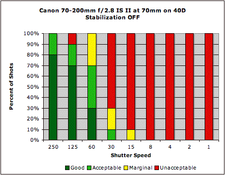
What we decided to do was to go back to a simple stacked bar graph of the sort shown below. Basically, each bar shows the percentage of shots captured at each shutter speed that were Good, Acceptable, Marginal, and Unacceptable. Comparing graphs like this for the IS-On vs IS-Off case (just mouse over the graph) gives a pretty good idea of how a given lens or IS-equipped camera body performs, even if it's not precisely quantitative. We'd used graphs of this sort in some of our very early testing of image-stabilized digicams on Imaging Resource, but had been aiming for a more quantitative approach for our lens tests. While they're not minutely quantitative, though, simple bargraphs like the one below at least show the overall behavior of IS systems, and can help separate the figurative sheep from the goats.
 |
|
Mouse over this chart to show results with IS activated.
|
There's a really important point to be made about graphs of this sort, though (or about any IS system measurement, for that matter): Without an objective and repeatable way to characterize blur in test images, the results become pretty much meaningless. Anyone can tell the difference between a really blurred image and a really sharp one, and there'd be no disagreement between different people as to which was which. The problem comes when you start trying to make finer distinctions: Relatively minor differences in what you call "good," "acceptable," "marginal," or "unacceptable" can significantly distort the results, resulting in unequal comparisons between systems. Small shifts in judgment from day to day or from person to person can make a very noticeable difference in the apparent performance of the systems being tested.
It's not just a matter of potential variation in the judging, though: What about differences between the camera bodies used for testing, or even the underlying optical performance of the lenses themselves? If one lens is inherently softer than another, how do you reliably decide when its increase in blur (caused by camera motion) matches that of a lens that started out sharper? Do sharp lenses get a pass because motion blur can soften their images slightly before they would reach the point at which softer lenses start out? Are soft lenses penalized? Can you consistently, reliably, and objectively separate and quantify image softness caused by camera shake from that inherent to the lens optics themselves? Extreme motion blur has a clear directional component to it, but smaller amounts of camera movement will often produce image softness without a clear directional component. The biggest issue by far, though, is the difficulty of reliably judging incremental blur. It's relatively easy for humans to say that image A is blurred more, the same as, or less than image B - But they have a very difficult time telling whether the increase in blur from image A to B is the same as in that from C to D, when the starting points differ more than slightly. Judgment of incremental blur between different lenses shot on different cameras is thus very likely to be inconsistent. Clearly, these issues must be addressed for IS test results to have any validity.
Our answer to all these issues is to base our IS tests on objective measurements of blur, rather than relying on the vagaries of human judgment, or on the ability of a tester's "calibrated eyeballs" to consistently determine incremental blur relative to each lens' baseline sharpness.
Objective Measurements: Measure IS, not the lens (or your eyes)
Our methodology is quite simple, built around the objective blur measurements provided by DxO Analyzer. For each test, we begin by determining what exposure parameters we'll be shooting with (focal lengths, shutter speeds, apertures, ISO levels, and light levels), and then capture a set of 10 or more reference shots for each distinct test condition, with the camera locked down on a rigid mount. The average blur values measured from these shots establish the baseline sharpness of the lens for each test condition. We then capture two sets of handheld shots across the range of shutter speeds of interest, one set with IS on, and the other with IS off. We then subtract the average baseline blur values from the blur measured for the handheld images at each shutter speed. This effectively removes blur arising from either the camera or from any limitations in the lens' basic resolution, leaving behind only the blur caused by camera shake. We then sort the results into the four sharpness categories we've established, using specific numeric thresholds.
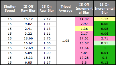
This table shows an example set of data for a lens shot at 1/15 second. The raw blur values for IS On and IS Off appear on the left side of the table, the average blur found for 10 shots on a tripod is in the center, and the net blur numbers for IS On/Off are on the right. The color coding for the net blur numbers matches that used for the Good/Acceptable/Marginal/Unacceptable levels used in the bar graph example shown earlier.
The initial choice of blur thresholds defining the performance categories is of course highly subjective, and overly stringent or overly generous choices can obviously influence the outcomes. Within a reasonable range, though, consistency is the most important requirement. If our standards are tighter than your own, then you can pay more attention to results falling into the "Acceptable" or even "Marginal" categories. On the other hand, if your work requires more critical standards, you'll want to look more to results in the "Good" category. As long as the thresholds remain the same from test to test and system to system, you'll be able to decide for yourself how to interpret the results.
Here's how the blur categories we've established translate into practical, real-world results:
-
Good - For most people, entirely acceptable for all uses. You might be able to see a difference when compared side by side with shots from a tripod, but most people would feel that 13x19 inch prints would be acceptably sharp. At lower print sizes, most users would be hard-pressed to see any difference between handheld and tripod shots.
-
Acceptable - Slightly soft 13x19 inch prints, but acceptable for most uses. Most people would find 8x10 inch prints plenty sharp.
-
Marginal - Very visible softness, but the images might be usable for non-critical applications even to 8x10 inches; 5x7 inch prints would be fine for most users.
-
Unacceptable - Very blurry; pretty unusable. The low end of this range might be OK for 5x7 or 4x6 inch prints, but most shots in this category would be unusable for any purpose.
Blur Examples
So what does image stabilization blur actually look like at our various thresholds? The crops below show examples of typical blur at the lower and upper end of each range. Besides showing the general range of blur we're talking about, they're also an excellent illustration of how fine the dividing line is between categories, and how difficult it is to make such judgments visually: The bottom end of "Acceptable" looks a lot like the top end of "Good."
There isn't a lot of visible difference between shots falling right on the cusp between two categories, so it would be tempting to say that it's just splitting hairs to try to discriminate this finely. That's probably true when you're out shooting with a lens, in that you wouldn't care much whether a given shot fell into the low range of what we're calling Acceptable or the high end of Good. When you're comparing systems against each other, though, how you make the calls can make a big difference in the test results: A slight shading one way or another could mean one lens scoring a lot more "Good" shots than another, when in fact their performance is very similar. As noted earlier, this is particularly an issue if one of the lenses is more or less sharp than the other from the get-go.
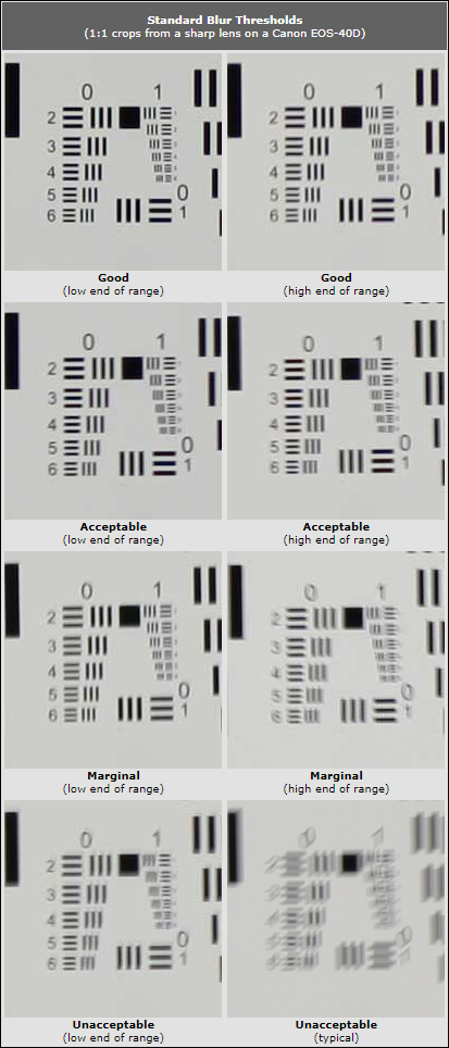
The crops above are taken 1:1 from images shot with a Canon 40D (10 megapixels), using the very sharp Sigma 70mm f/2.8 lens. This combination will produce sharp 13x19 inch prints full-frame at high shutter speeds or on a tripod.
Note that blur here needs to be considered relative to the final output size, rather than to camera resolution. The same shots above would look more blurry if they were shot on a 18-megapixel Canon 7D vs the 10MP 40D, because the target elements themselves would cover more pixels. If you printed images from the two cameras at the same output size, though, the incremental blur would look essentially identical regardless of the camera resolution: The 7D would have more pixels, but they'd be packed closer on the output. What matters is the amount of blur relative to the frame size.
What should you expect?
It's generally been our experience that less-steady shooters get a bit more benefit from IS systems than more stable ones. Most readers should thus expect to see the same or better levels of shake reduction than what we've measured. You may not be able to hand-hold to shutter speeds as low as those shown in our graphs, so your overall performance will be shifted somewhat towards higher shutter speeds. - But the amount of improvement you'll see from IS Off to IS On may actually be greater than a rock-steady shooter. In other words, our results for the amount of improvement from IS should represent the lower end of what you'd experience in your own shooting.
What constitutes acceptable will of course depend on the photographer and the particular application involved (a photo to hang on the wall, vs one for use in a magazine spread that will be examined closely, for example). That said, general rules of thumb are that a blur result in the "Good" range would produce an image that the average viewer would consider acceptably sharp when printed to 13 x 19 inches. Blur in what we're calling the "Acceptable" range would make a tolerably sharp print at 8x10 inches. Shots in the "Marginal" range might be OK at 5x7 inches or smaller. "Unacceptable" shots would likely be pretty blurry-looking, even at 5x7 inches.
Bottom Line
The bottom line of our IS testing process is test results that will provide a reasonably reliable and consistent basis for evaluating IS system performance. The amount of improvement for a given system is still subject to some variation based on the camera-holding abilities of the individual photographer, but the results overall will give a very good indication of what an experienced, fairly steady shooter can obtain with the lens or camera body in question.