The keys to perfect prints: Monitor calibration & color profiles ensure that your prints match expectations
posted Tuesday, January 31, 2023 at 3:40 PM EDT

Have you ever printed a photo only to have the print look nothing like the image on your screen? It's a frustrating outcome. Fortunately, you can avoid the problem once you integrate monitor calibration, soft-proofing and ICC profiles into your printing workflow. Whether you're printing at home or ordering prints online, this guide will ensure your prints come out perfectly.
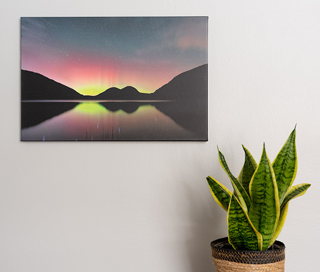
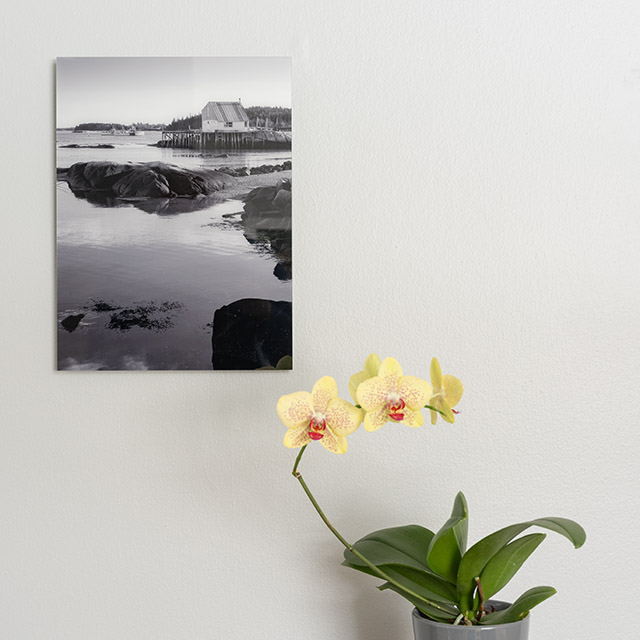
Digital cameras can capture incredible photos, and you can bring them to life through printing. Creating a beautiful print is one of the most satisfying and rewarding parts of the entire photographic process. We recently ordered a few different prints from Saal Digital and used their extensive online support to help ensure that our prints came out looking great, with the expected colors, detail and brightness.
Are your prints too dark or bright? Monitor calibration will help.
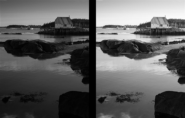
One of the most common printing issues is that prints appear too bright or too dark. This is commonly due to an uncalibrated or poorly calibrated monitor. Numerous variables affect how well a monitor matches a print, but one of the most important is the overall brightness of the display. If you're editing images on a screen that is too bright, your prints will often come out too dark.
Whether you're using a laptop display or a standalone external display, you can perform software and hardware-based calibration. Software calibration is accomplished using tools included with your computer's operating system. For example, you can select and fine-tune different display presets on macOS, including the white balance and brightness. Similar tools are available on Windows.
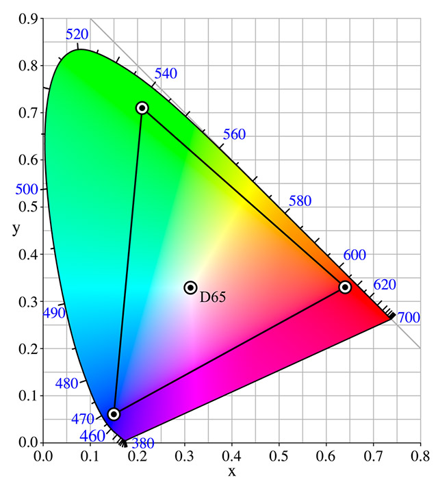
Using software calibration, you can change your monitor's white point, or white balance. A common preferred white point within the graphic arts industry is the CIE standard illuminant D50, which is often written as simply "D50." A popular recommendation for photographers is the D65 white point. It's a common standard that correlates to roughly the average midday light in western and northern Europe. While that sounds complex, it nearly corresponds to a 6500 K white balance, hence the "65" in the name. The expert printers at Saal Digital recommend D50. Whichever white point you select, it's important to match ambient lighting to your monitor as well as possible, ensuring that your eyes don't need to readjust when you look away from the screen. If your ambient light appears bluer or yellower after looking at your monitor, the ambient light isn't matched well to your display.
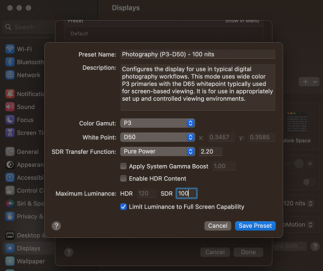
Display brightness is measured by candela per square meter (cd/m2), which is a unit of luminance. By default, many displays are way too bright. Some photographers prefer luminance as low as 90 cd/m2, while 120 cd/m2 is a common choice at the high end. If you haven't changed your monitor's brightness to the appropriate value for photo editing and printing before, your monitor may seem too dim to your eyes at first. Don't worry, you'll adjust quickly. If your monitor is still too dim after an adjustment period, you're working in too bright of an environment and should find a way to reduce the ambient light. Like with white balance, ambient light conditions are important to ensure consistent, accurate photo editing and printing results. The more control you have over lighting and the more consistent your working environment, the better.
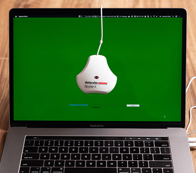
You can set your display's white point and brightness using software, but to ensure that the values are accurate and to precisely adjust how your monitor displays colors, you must use hardware calibration. This requires a separate accessory that you connect to your computer and use to measure your monitor's spectral output. Hardware calibration ensures the most accurate results.
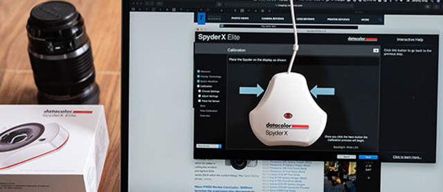
Unfortunately, you can't perform hardware calibration with every monitor, but most monitors aimed at enthusiasts and professionals should be compatible with hardware calibration. You can purchase calibration tools from reputable brands such as Calibrite, Datacolor and X-Rite. Monitor calibration solutions come with a colorimeter, which you connect to your computer and then place on your display. When using accompanying software, your display runs through a series of tests, and the colorimeter reads the results. The tool compares the results against a standard and adjusts your monitor to match the standard. You will also see the test results, so you'll know your display's precise luminance and white point before and after calibration.
Where hardware calibration excels, especially compared to software calibration, is color accuracy. While many monitors are accurate out of the box, some displays can still miss the mark when it comes to displaying colors accurately. For example, if your monitor shows red with a magenta shift, that will dramatically affect how you edit your photos. If you edit your images to have colors that look good to you, but are displayed inaccurately, then your print won't match the display. For example, if you edit an image on an uncalibrated display that shows colors incorrectly, your prints won't match the display. Issues with color accuracy can be especially evident with "memory colors," such as a blue sky, or skin tones, resulting in people in prints looking unnaturally pink, yellow or red. You should calibrate your monitor monthly, as displays can change slightly over time and require additional calibration.
To make a long story short, you can perform software calibration to set your monitor's white point and brightness without purchasing anything special. You should set your white point to D50, or in some cases, D65. Regarding brightness, it depends slightly on your ambient light conditions, but you should set the luminance to between 90 and 120 cd/m2. Hardware calibration delivers the best results. To perform hardware calibration, you need a compatible calibration device to measure and adjust your monitor's brightness, white point and color rendering against a selected color standard.
What's an ICC profile, and how does it affect your prints?
An ICC profile is a data set corresponding to a color input or output device. An ICC profile maps color attributes from a device source and profile space. Every device, like a monitor, can be assigned an ICC profile. The profile defines the color gamut that a device displays. Whether a monitor can display all colors within a profile accurately depends on its display technology – more on that in a bit.
Caption credit: Wikipedia
Image credit: Juanjfb~commonswiki, used with CC BY-SA 3.0 license.
Digital images have their own color space, which you can embed into the file to ensure that when you send it to a printer, whether it's one on your desk or an external printing service, the file will be reproduced in the appropriate color space. Two common color spaces are sRGB and Adobe RGB (1998). Both color spaces define the precise red, green and blue values that can be displayed, with Adobe RGB (1998) offering a wider color gamut. A wider color gamut means you can see smoother transitions of colors and more colors themselves. Many high-end displays focus on delivering as much of the Adobe RGB (1998) color gamut as possible. Adobe RGB (1998) is ideal for advanced photography and printing. In most cases, this is an ideal profile for printing photos.
There's a common color profile you'll see if you edit your images in software like Adobe Lightroom and Photoshop – ProPhoto RGB. This color space, developed by Kodak, is even wider than Adobe RGB (1998). This is great when editing your raw images, as it allows you to work with a wider range of colors. However, while you can achieve more saturated colors when working within the ProPhoto RGB color space, it is not always a good choice for printing. If you're ordering prints from a company such as Saal Digital, you can use sRGB, Adobe RGB (1998) or ProPhoto RGB for some products, while others should be in sRGB or Adobe RGB (1998).
ICC profiles are critical when preparing files for output, but they're also important before you get to the printing stage itself. You can use ICC profiles for specific media to perform soft proofing. You can soft proof images inside your favorite photo editor, like Lightroom or Photoshop. Prints have a narrower color and contrast range than your display, so photos won't look the same when printed compared to your monitor.
Suppose you're going to print an image on Hahnemuhle Baryta fine art paper – a truly excellent paper for your fine art photography needs. This paper has a specific look. It has a certain tone, dynamic range and color profile. You can download and install an ICC profile for a specific printer and paper combination to view a software-simulated preview of your print. It's critical to never embed the ICC profile into your final output file for printing. The ICC profile is for soft proofing, but not printing.
When viewing a soft proof, you can see if there are any issues with the tonal range or colors in your print. You can see if certain colors are being clipped, meaning they're outside the available gamut. This is a great way to double-check your photo before going through with the printing process. However, it's important to consider a limitation – your display emits light, whereas a print won't. This critical limitation can make it difficult to achieve a perfect preview of your print. However, the goal isn't having a print that looks exactly like your display but making a print that comes as close to your monitor as possible, looks the way you expect, and is beautiful. That goal is not only realistic but possible to achieve consistently.
Dialing in the ideal workflow to achieve the perfect print
We've covered quite a bit of ground, some of it is complicated, so let's summarize the most important parts of a good printing workflow.
Monitor calibration is critical. You need to ensure, either through software or hardware calibration, that your monitor is using either the D50 or D65 white point and that your monitor's luminance is between 90 and 120 cd/m2. Incorrect brightness, white balance and color rendering cause many bad prints.
Color space matters, too. A color space, or gamut, determines how colors are rendered for a specific image file. Common spaces include sRGB, Adobe RGB (1998) and ProPhoto RGB. You may have also heard of CMYK color space, which relies upon cyan, magenta, yellow and black instead of using red, green and blue color information to create colors. You don't need to worry too much about CMYK, but note that it's a subtractive color model that removes color to create different colors. RGB, on the other hand, is an additive color model. It adds red, green and blue information to create colors. Some printing processes use CMYK, but it's very rare for today's photo printers.
While you should print using a file with embedded sRGB, Adobe RGB (1998) or ProPhoto RGB color profiles, you can preview a print using specialized ICC profiles that correlate to a specific printer and paper combination. This process is called soft proofing. It's important to remember that your screen emits light, whereas a print won't, so a soft proof is not a perfectly accurate preview.
What about file type, size and resolution?
With a calibrated display, appropriate color space, and using helpful ICC profiles, you can achieve accurate prints that match your display as well as possible. Your prints will look how you expect them to.
However, there's more to do when preparing your image files for printing. You must also consider file type, image size and resolution. For file type, your print output file should be in JPEG format using high or maximum quality. You may be tempted to save in lower quality to save storage space, but this will come at great cost to your print quality. Bad file quality results in images with artifacts and banding. When saving JPEG files for printing, ensure that you are saving a copy, rather than overwriting your uncompressed files, such as .DNG, .TIFF or Photoshop .PSD files.
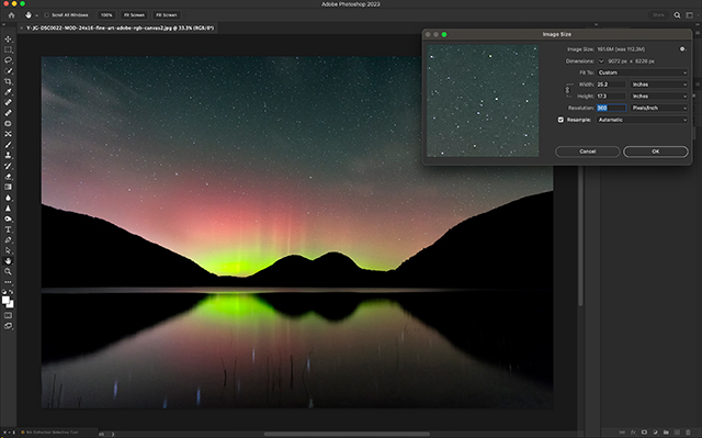
The optimal image size depends upon the size print you will make. There's nothing wrong with having an image size larger than the print size, but you want to avoid having an image that's too small. These days, most digital cameras have at least 20-megapixel image sensors, which offer plenty of resolution for high-quality large prints, even poster-sized prints. If you need to increase the size of your image, you can use specialized software to upscale photos with great results. There are even some that use machine learning (artificial intelligence) to synthesize pixels that accurately reflect the content of your image.
Resolution is another important parameter of your image files. Resolution is often measured by dpi (dots per inch) or ppi (pixels per inch). Different printers and printing products have varied optimal resolutions, but a resolution of 300-400 dpi (120 pixels per centimeter) is often ideal for excellent print quality. You can achieve good results with at least 200 dpi. When you upload your file for printing from Saal Digital, the printing tool will assess the image you upload and tell you its quality.
Summary: Making perfect prints
Once you've calibrated your monitor and come to grips with color spaces and profiles, you're well on your way to making perfect prints. With a good workflow, you'll avoid common printing pitfalls. Seeing your photo come to life in an accurate, vibrant print is one of the most satisfying parts of the photographic process. Once you achieve a consistent, reliable workflow, you'll be making fantastic prints time and again. With a good workflow, you'll also be free to experiment with a wide range of printed products, including trying out different paper types. The possibilities are endless!
For more information about Saal Digital's print product, please visit their website.
This is a sponsored article paid for by Saal Digital.