The ultimate guide to Fuji’s Film Simulations; A DEEP dive to de-mystify one of Fuji’s best features
posted Tuesday, August 18, 2020 at 5:17 PM EDT
The "Film Simulation" modes in Fujifilm cameras are a major Fuji feature that I've wanted to write about for years now. They're truly unique among all the camera makers, and there's way more to them than most people realize. It's a big topic, though (as you'll see from the 12,000+ words and more than 90 illustrations below ;-) I could never manage to justify the time it would take to do the topic justice, in and around all the daily demands of running the IR site.
As a way of forcing the issue on myself, though, I proposed a sponsored article to Fuji in late 2019, and they accepted. It turned out that telling the full story was a much, much bigger task than I'd anticipated, and combined with the sale of IR, a trip to Japan in early March of this year (that I still haven't managed to write much about) and the whole COVID-19 thing, I'm only just now managing to post this story in mid-August, 2020.
It's been a massive project, but I'm happy to have finally been able to delve into a topic I've wanted to for years now. Thanks to Fujifilm for indulging my inner geek and sponsoring this deep excursion!
A lot more than just "Scene Modes"...
I've never been much of a fan of the usual "scene" or "creative" modes on digital cameras; they've always seemed kind of niche and amateurish to me. Sure, I might want to bump the saturation on a sunset shot, or dial back the contrast and saturation for portrait shoots, but I never had a good sense of exactly what the average scene mode would do for me outside of its usually very narrow definition. I'd always just shoot normally, and plan on boosting saturation as needed for a sunset or landscape shot after the fact. If it was a portrait shoot, I'd maybe dial down the color saturation manually a bit, but would always just assume that I'd be spending some time processing RAW files to get the look that I'd want.
When it comes down to it, Scene Modes and various Creative Filters have always felt like gimmicks to me.
Fuji's Film Simulations are different, though; they're one of the few in-camera image tweaks I've actually found valuable as part of my creative process.
Rather than gimmicky, dumbed-down Instagram-y filters, Film Simulations are an integral part of my creative process whenever I shoot with a Fuji camera.
Fuji's "Film Simulation" modes do just what their name implies: They simulate the look of classic color and black-and-white films. Few people realize what this actually means, though; most assume that they could do the same thing with a few tweaks of the sliders in Photoshop.
Fuji's Film Simulations involve far more than that, though, and use a lot of deep color science to achieve their effects. In this article, I'm going to go way, way inside what they do and how they do it, and how the various film types differ from each other.
Quick links for individual film simulations:
There's a lot of text here; if you'd like to skip to a specific film simulation or perhaps the part about third-party simulations not matching what your Fuji camera produces, just click one of the links below:
-
Why can't I do this in Photoshop?
(How color film works) - Understanding the color plots used here
- The PROVIA/Standard Film Simulation
- The Velvia/Vivid Film Simulation
- The ASTIA/Soft Film Simulation
- The CLASSIC CHROME FIlm Simulation
- The PRO Neg.Std Film Simulation
- The PRO Neg.Hi Film Simulation
- The Classic Neg Film Simulation
- The ETERNA/Cinema Film Simulation
- The ETERNA Bleach Bypass Film Simulation
- The ACROS Film Simulation
- Film grain and the ACROS film grain simulation
- Yellow/Red/Green filters for black and white photos
- The Monochrome Film Simulation
- The SEPIA Film Simulation
-
Heads-up: Third-party RAW apps' film profiles look different(!)
The old days: Change the film to change your look
Back in the film days, it was the film that made the image, not the camera, and different films had very different "looks" from each other. Looking for super-saturated colors, with deep greens, rich blues and vibrant reds? Load a roll of Velvia. Shooting in a studio and want to control the contrast with your lighting? Fuji's color-negative NS160 (NPS160 in the US) is the ticket.
Differences between film emulsions went way beyond just high vs low contrast or color saturation, though. The details that went into a film's look are incredibly complex. One film might produce a fairly neutral, technically-accurate color rendering, while another might simultaneously:
- Saturate dark greens more than lighter ones
- Saturate all shades of green more than skin tones.
- Significantly hue-shift oranges and sky-blues
- Leave the hue of bright reds the same, just bump their saturation
(This describes just some of the things going on in the ASTIA film simulation)
As we'll see, these complex color mappings are what gave the signature looks of many classic films. Writing this article, I was struck again and again by how much some of the film simulations matched my memories of shoeboxes full of photo prints and box after box of color slides from my childhood.
The look of film is etched on our psyches
Just as happened with vinyl LPs in the audio world, film is experiencing something of a comeback in photography these days. And not just among hipsters, either. The look of different film emulsions can bring different shades of feeling to your photos.
I think a lot of the renewed interest in film is because the distinctive colors, tonality and grain structures of film have been ingrained in our psyches by the photojournalism, creative and personal photography we grew up with, or have come to associate with historic images. Tapping these deep and largely unconscious cultural memories can help set the mood and tell our own stories.
The new Analog: Film Simulations
As appealing as the "film look" might be though, few photographers care to spend the time, money and effort that's part and parcel of film photography. Even more so, almost no one wants to give up modern conveniences like the ability to review your photos after capturing them, or the ability to fit thousands of them on a memory card the size of a postage stamp, costing less than a single roll of film and processing in the old days. (Never mind being able to share your pictures online with friends and family, with just a few clicks of a mouse.) Beyond all of that, some classic film emulsions aren't even being manufactured anymore, and commercial film processing is getting harder and harder to come by.
This is where Fuji's Film Simulations come in. Dating back to the company's founding as a motion picture film maker in 1934, Fuji has more than 85 years of color science experience, and a deep understanding of all the complexities of how film works. They've drawn on this background and extremely detailed characterizations of different film types to create camera modes that simulate the analog look of various types of both color and black and white films.
The Film Simulation modes offered in Fujifilm's cameras give us the best of both worlds. With a quick change of settings, you can recreate the colors, tonal response and grain structure of classic photographic films, choosing the film type that best suits your subject as you're shooting it.
Finally, a reason (for me) to shoot RAW :-)
Here's the really cool part: If you shoot raw files, you can change your mind about what Film Simulation you want to use after the fact! Pressing the menu button in playback mode will present you with a RAW processing function built right into the camera itself. Switching between different film types on your computer takes just a few mouse clicks with the company's bundled X RAW STUDIO or RAW FILE CONVERTER EX software, and many popular third-party applications like Capture One and Lightroom also support Fuji's film simulation profiles as well. (Although as we'll discuss below, these third-party versions don't produce identical results to what the camera does; the only software solution that provides exact matches to the camera's own conversions is X RAW STUDIO, which actually uses the camera's processor to perform the conversion.)
That beats shooting actual film, hands down. Changing the look of your photos no longer means juggling rolls of film, and you can even create the look of multiple different film stocks from a single image. If you want, you can get a gorgeous ACROS black-and-white image and a deep, rich Velvia one from the same shot.
It's kind of funny; I'm usually just a JPEG shooter, only bothering to shoot RAW when I'm faced with a particularly difficult subject. The simple fact of the matter is I usually shoot for pleasure rather than art, and after spending dozens of hours every week in front of a computer screen for work, it's hard to bring myself back to the computer again in my leisure time.

[Image by IR contributor Jeremy Gray]
By contrast, though, I always shoot RAW with Fujifilm cameras. The ability to so easily get entirely different looks from the same image is just too compelling to miss. I shoot JPEGs as well, selecting various film simulations depending on the subject, and more often than not am very pleased by the result. But I really like some of the unique looks available, and especially love the gorgeous tonality of the ACROS black & white profile. Images rendered with that Film Simulation take me back to the many (many) happy hours I spent in my youth, souping film and prints in the darkroom.
Having the RAW files available, I can shoot in whatever mode appeals to me for a given subject, but then go back after the fact (or even while the card is still in the camera) and choose something entirely different. I mentioned my love of ACROS, but I also find myself taking something originally shot in PROVIA or Velvia and making a version of it in Classic Chrome or Classic Neg. Those two simulations in particular take me back to the shoeboxes of prints we had around the house when I was growing up. Classic Neg is a very new profile, first appearing in the X-Pro3, so I hadn't experienced it until I wrote this article. Wow, talk about a trip down memory lane! It's hard to describe the almost visceral experience it was to look at images rendered with it; I felt transported across time and space, back to my parent's home when I was growing up.
In a more subtle direction, while I tend to use PRO Neg.Hi for portrait shots, I also often want to try something like Astia, depending on the lighting and the subject's skin tone. Or I might drop down to PRO Neg.Std if the lighting is very contrasty and I want more subdued tones. Other times, I might decide to use Provia for a bit more saturation and contrast.
The great thing is, these options and all the rest are available to me at any point in the future, as long as I have the RAW file to work from.
Why can't I just do this in Photoshop?
As I said at the top, this is why I've wanted to write an explainer article about Fuji's film simulations for years now: They go way beyond what you can do with just a few sliders or curve tweaks in Photoshop. To understand why, let's take a deep dive into the details of how color film emulsions work. (Fair warning, this next section does get pretty deep. If you'd rather skip it, just click here.)
Film emulsions involve incredibly complex interactions of light and chemistry, and a lot of different factors determine the relationship between colors in the original subject and the resulting color and tonal rendition in the final image. We'll talk about color reversal (slide) films here, but the same concepts apply to color-negative films as well.
Color films have multiple light-sensitive layers for each of the three primary colors (red, green and blue light), with color-filtering and interface layers between them. Each of the light-sensitive layers have complex sensitivity curves relative to the color of the incoming light, and on the output side, the colored dyes the image is ultimately rendered into likewise have unique and very different density-vs-color curves. As a result, there can be a lot of differences between film emulsions, in the way they record colors.

Let's take a pair of Fujifilm color reversal (slide) films as examples, Provia 100F and Velvia 100F. Provia is a more or less "balanced" emulsion, intended to provide natural-looking, true-to-life colors. Velvia on the other hand aims for a dramatic look, with highly-saturated color, especially in greens and reds. (Velvia has long been a favorite of landscape photographers, for its vivid rendering of foliage.)
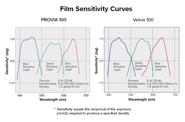
The graphs above show how the light-sensitive layers of the two films respond to different colors of the spectrum. The numbers along the bottom of the graphs are the wavelength of light, ranging from blue (short wavelengths) on the left to red (long wavelengths on the right). The sensitivity curves for Provia are on the left, Velvia on the right. Differences between the two films are easy to see: Note how the green curve for Provia is lower than that for Velvia; it's no surprise that Velvia would emphasize greens more. At the same time, Velvia's sensitivity curves for the three primary colors also overlap much more than those of Provia do, meaning that its red and blue layers both react more to green hues than Provia's do. Normally this would mean lower color saturation, but as we'll see below, the spectral sensitivities of the different film layers are only part of the equation, though; the spectral curves of the three color dyes used are also critical.

The graphs above show the density curves of the dyes used in Provia and Velvia films. Here, the peaks show how much light is absorbed as a function of color/wavelength. (For those wondering why we're looking at cyan, magenta and yellow dyes, when we started out with red, green and blue light, here's a quick overview on additive vs subtractive color.)
Perfect dyes would have no overlap in their curves, so the magenta dye would block only green light, yellow only blue light, and cyan only yellow light. In practice, though, real-world dyes block colors they aren't supposed to. This results in impure, less-saturated colors in the resulting images. Here we see even more significant differences between the two different film types; when it comes to the dyes used to make the color image, there's a lot more "spillover" from one color to the next in the Provia dyes than in Velvia's. In particular, there's a lot more absorption of blue light by Provia's magenta and cyan dyes than is the case with Velvia.
This helps explain why recreating all of this in Photoshop can be challenging or downright impossible. It's not just a matter of changing a tone curve, or individually tweaking the tone curves for red, green and blue channels separately, since the red or blue layers for a particular emulsion might also have some level of sensitivity to various shades of green, and vice versa, and the dyes involved can have even more complex spectral profiles.
The point of all this is that film's rendering of color is an enormously complex process that's virtually impossible to mimic with simple slider adjustments in an image editor. We'll get into the specifics of what goes into the particular "look" of various film types below, but I wanted to give some sense of just how complex the color responses of different films can be.
(As a side note, while I've only been talking about color film so far, the same is also true even for black & white emulsions. Even when there aren't color dyes involved, the way in which black and white emulsions respond to color varies all over the map, and different emulsions can be quite different in their response to different parts of the spectrum. The most obvious example is that panchromatic film emulsions respond to all wavelengths of light, while orthochromatic ones aren't sensitive to red light at all, only to greens and blues. The situation might not be quite as complicated as with color film, but the color responses of black and white emulsions are still complex. Then there's film grain; we'll get into that when we talk about Fuji's gorgeous ACROS film simulation.)
Bottom line, it takes a lot of data to characterize a film emulsion across not only the entire color spectrum, but across the full tonal range for each color as well. (We've talked about color and contrast separately, but in the real world, the tonal characteristics of the different color layers may vary some as well.) Doing it right requires enormous effort, but this was a fundamental part of Fuji's film-manufacturing business over the last seven-plus decades, so they already had the mass of data they needed, when they decided to create their film simulations. They also had the benefit of the tremendous amount of engineering that went into creating their legendary Frontier minilabs. The film scanners in those machines were tasked with converting any kind of film into a digital format for printing and saving, a very tall order for 1990's technology. Fujifilm managed it, though, and could tap the years of refinement and real-world data from that product line when it came to simulating various film types in their cameras.
This engineering wasn't just a matter of pure numbers and statistics, though, but involved a deep study of what are called "memory colors." People tend to remember colors differently than they actually were in real life. A lot of times, a totally accurate rendering isn't as pleasing as one that's skewed a bit towards how people tend to recall a color instead. Memory colors have been a part of film engineering from the beginning, and were an important part of the Frontier system's development, in translating those colors into digital form. Some film emulsions (and now their digital counterparts) lean more towards accurate color representation, and others lean towards color that's "pleasing", and striking the right balance is as much art as science. (The Astia and Provia emulsions and their simulations in current Fujifilm cameras are good examples of this.)
It still took a lot of work to translate all this knowledge into code that could be run by digital camera processors, but Fuji could leverage data that no other current camera maker has available to work with.
A quick history of Fujifilm's Film Simulations
Even for Fuji, though, it's taken years to develop all the film simulations we see today. The first variant of the technology appeared in 2003, as part of the company's FinePix F700 camera, although at that time it was called FinePix COLOR and offered a choice of just three film looks: F-Standard, F-Chrome or F-B&W. While they were based on Fuji's wealth of historical data, these settings weren't designed to exactly mimic the look of any given film.
The current Film Simulation name first arrived along with the Fujifilm S3 Pro DSLR in 2004, but while this and the followup S5 Pro (2007) both offered more film types than the F700, it wasn't until the FinePix F200EXR made its debut in 2009 that Fuji first started branding its Film Simulations with the names of its classic film types.
The initial set of films that could be simulated by the F200EXR included Fuji's PROVIA, Velvia and ASTIA, as well as more generic B&W and SEPIA looks. In 2012, the Fuji X-Pro1 added PRO Neg.Hi and Standard looks, renamed B&W to MONOCHROME, and added a choice of three black and white filters at the same time. CLASSIC CHROME was added to the roster in 2014 with the Fuji X30, and ACROS in 2016 with the X-Pro2. ETERNA simulation made its debut with the X-H1 in 2018, CLASSIC Neg. arrived with the Fuji X-Pro3 in late 2019, and ETERNA BLEACH BYPASS just landed in late February 2020, with the advent of the X-T4.
Color plots will help us see what's going on "inside" the Film Simulations
As photographers, we naturally tend to think more about the look and visual impact of our final images and less about the inner workings of the tech that produces them. That said, I've found plots showing how the various Film Simulations render various subject colors really helpful in understanding what to expect out of them, and to compare one against another.
In the writeups for each Film Simulation below, we're going to look at a particular type of color plot; here's where that comes from and how it works:

Imatest Master is an incredibly deep application for analyzing every imaginable image-quality characteristic; I've been using it for more than 15 years now, but have never more than scratched the surface of its features.
We're going to be using just one of its color-analysis capabilities, a tool that looks at images of an X-Rite ColorChecker card and compares the values the camera captures against the theoretically ideal ones based on the carefully-controlled colors in the charts.
The image above shows a computer-generated image of the ColorChecker chart, with the theoretically ideal RGB numbers for each swatch, in the sRGB color space that's the default for many cameras and computer monitors. The swatches themselves are made using specially-formulated and very tightly-controlled paints, with pigments that are very resistant to fading. They're a well-known and very reliable reference for analyzing color rendering, whether it be film or digital.

The plot above shows colors in what's called the CIELAB color space. You can read this Wikipedia page to learn all the details, but the basics are that the horizontal a* axis runs from green on the left to red on the right, while the vertical b* axis goes from blue on the bottom to yellow at the top. A cool feature of the La*b* color space is that it's designed to match how our eyes see colors, so the distance between colors roughly corresponds to how different they appear to our eyes. Colors that look very similar are close to each other, while ones that look different are further apart. (This is why the gradation between the colors there seems so smooth.)
You can also see that the distance from the center of the diagram corresponds to saturation. Whites and greys are right in the middle, and the most saturated colors are around the edges.
I find this kind of chart super-handy handy, because it lets me simultaneously see changes in both hue and saturation very easily. I've used it a lot to understand differences between different cameras' color rendering, and it's especially useful for seeing at a glance what each of the Film Simulations are doing with color.
Finally! Let's look at some Film Simulations!
With all that as background, we're finally equipped to see clearly just what makes the various Film Simulations unique, and how they vary from each other. We'll look at the details of how each one handles color, and then see how that plays out in some specific images. In all cases, we'll be looking at what the cameras themselves produce, whether directly in-camera or through Fuji's X RAW STUDIO software. (It turns out third-party RAW converter programs don't precisely match what the cameras do, even if they appear to offer the same options for simulating film. We'll cover this issue in some detail at the end, once we've looked at the various Film Simulations themselves.)
As I'm writing this article in early August, 2020, there are now 17 different Film Simulations available, covering 10 distinct film types. Here's how they break down:
PROVIA/Standard

FUJICHROME PROVIA is a professional color reversal (slide) film that's intended to provide a super-fine grain structure, with vivid but faithful color reproduction and well-balanced gradation. Fujifilm recommends this as its standard color Film Simulation (it's every camera's default), as it's the one which should be most broadly applicable regardless of subject matter. It takes the middle road both in terms of saturation and tonality. In its marketing materials, the company refers to it as the ace of spades -- "the strongest card of all, and you can be confident of the outcome even when you do not know what to expect". That's maybe a little glowing, but it does make a good choice for the default. When I shoot with Fuji cameras myself, I use this as my own default as well, but I'll very frequently pick other simulations, depending on the subject.

The 2D a*b* plot tells essentially the same story; it's pretty much what you'd expect from a "standard" film emulsion. There are a few points worth noting, though. First, we can see that the saturation of pure reds is bumped slightly, and you might also have noticed that the orange hues from swatches 12 and 7 are both shifted a bit towards yellow. I've noticed that cameras that don't make this sort of shift tend to produce slightly muddy-looking yellows and oranges that can be hard to separate visually.
One of the biggest color shifts happens in the light blue swatch 18, whose more cyan color is shifted in the direction of pure blue. This is very common in digital camera color management; I've seen it to one extent or another in pretty much every camera I've tested. I've never had it confirmed by a camera-company engineer, but I think its function is to produce nicer-looking blue skies. Very early digicams had a hard time getting sky colors to look right; I think this sort of shift is what the industry settled on as a way to make skies look more appealing.

[Image by IR contributor Jeremy Gray]
On a practical basis, Provia gives pretty neutral color, neither under- nor over-saturated, with what most people would consider "normal" contrast. As noted, I'm comfortable using it as the default when I'm shooting with a Fuji camera, but will very often use one of the other profiles for other subjects. (Actually, unless I really need higher buffer capacity for continuous shooting, I always shoot RAW with Fujifilm cameras, so I'll have the option of choosing other film simulations later. In day to day life, I'm much more inclined to just rely on camera JPEGs, but Fuji's film simulations are a compelling reason for me to dedicate the card and hard drive space to RAW files :-)
Velvia/Vivid

Compared to PROVIA, FUJICHROME Velvia is also a professional color reversal film with a super-fine grain structure, that also aims for ultra-high saturation and contrast. First introduced in 1991, it's especially popular with nature photographers, and the company also recommends it for landscape, commercial, product and interior photography. While highly saturated, Fuji nonetheless designed this film with the intention of representing scenes as photographers remember them. (Perhaps just a brighter, happier memory of the original :-) Blues, in particular, skew a bit towards magenta for something more akin to royal blue skies. Because of its intense saturation, you'll want to avoid Velvia for portraiture.

Looking at the 2D a*b* plot, it's easy to see how dramatically different Velvia is. You can see from all the lines reaching further out to the edges of the color space that all the colors are more saturated than with Provia, but dark greens, dark blues and pure reds are especially so. Interestingly, light cyan (swatch #6) is shifted a bit less, ending up closer to its technically accurate value than Provia manages, but the more intense cyan patch is shifted quite a bit more towards blue. This plus the much higher saturation of the dark and medium-toned blue swatches account for the bright, clear sky colors Velvia is famous for. As noted, though, skin tones get really pumped as well, though, so you'll probably want to avoid this Film Simulation for portrait shots.


[Image by IR contributor Jeremy Gray]


[Image by William Brawley]
Velvia was a favorite of mine back in the film days. I shot more landscapes back then, and I loved the pop of its greens and the great, rich sky colors. It was also very fine-grained, so the slides looked great, even when projected very big on the screen. (Wow, *that's* a blast from the past! I still have my slide projector and screen tucked into a corner of my basement somewhere. The dark room, bright image, and the smell of the hot projector bulb transport me back to another time. I guess I'm showing my age; when was the last time anyone you know watched a slide show, with slides and a projector, vs just on a computer screen?)
ASTIA/Soft

Again comparing to the more neutral PROVIA, FUJICHROME ASTIA is another professional color reversal film with super-fine grain. ASTIA is particularly intended for naturally-lit, spontaneous portrait photography. It's described in the Film Simulation menu as "soft", but I find that a bit misleading. I tend to think of soft vs hard as words describing contrast. ASTIA does have a bit less contrast than PROVIA, but I tend to think of its softness more in terms of how it handles skin tones, vs its contrast.
While ASTIA offers excellent color accuracy coupled with the vivid look you'd expect of a reversal film, it provides softer, more pleasing skin tones than PROVIA or some of the other profiles. It's also designed to not hold onto highlight detail, while making shadows a bit harder for greater crispness. This is why I don't consider it "soft" in terms of its contrast, and because of that last attribute, Fuji also recommends it for use with older, mount-adapted lenses that have lower contrast than modern optics.
The 2D a*b* plot shows that Astia's color mapping is quite different from Provia. In a lot of ways, ASTIA looks like a bit of a blend between that of Provia and Velvia. Dark greens are saturated more than with Provia, yellows and oranges a bit less. The shifts of cyans and light blues more towards pure blue is more pronounced, and darker blues are noticeably more saturated. Interestingly, while the caucasian skin tone is shifted slightly towards yellow and almost dead-on its true color, darker skin tones are somewhat more saturated, perhaps producing richer-looking tones for darker complexions.


[Image by IR contributor Jeremy Gray]


As you might imagine from the two shots above, I like ASTIA for portraits and some flower photography. Digital cameras tend to emphasize skin blemishes or blotchiness in Caucasian skin tones, and ASTIA does a great job of dealing with that. It's no substitute for careful retouching in formal portraits, but it'll make your job easier, and straight-from-camera results don't produce the ugly blemish-enhancement that's so common in digital images.
CLASSIC CHROME (see here also)

Fujifilm's CLASSIC CHROME simulation is particularly meant for street and documentary photographers, mimicking the classic look of Kodachrome reversal film. Compared to PROVIA it has much lower saturation -- lower than most other Film Simulations -- but with somewhat harder tonality. It's a bit more complex than that, though, because while shadows have higher contrast, highlights still give a somewhat softer look.

A lot of classic color film emulsions lacked the color saturation that later developments in dye technology provided. This is reflected in the CLASSIC CHROME color profile. Every color is less saturated than with the relatively neutral PROVIA simulation, with yellows, yellow-greens and dark blues through purples all pulled back significantly. Bright greens and reds are also less saturated, going from slightly high saturation to slightly low in the case of the greens and slightly high to neutral in the case of the reds. Looking at our standard Still Life test image, CLASSIC CHROME's harder contrast also stands out.
The CLASSIC CHROME color profile is another example of why it's just not practical to duplicate Fuji's film simulations in Photoshop; the color handling is not only radically different in different parts of the spectrum, but it varies as a function of starting saturation and brightness as well. Look how differently the cool hues from cyan through purple are handled. The bright cyan swatch is almost dead-on the true color, while the light cyan patch (technically a color between cyan and green) is desaturated and shifted considerably in the "blue" direction. Meanwhile, the medium and dark blues are desaturated and shifted more towards cyan. While Photoshop's Selective Color and Hue/Saturation controls give you a great deal of control in different parts of the spectrum and the Color Balance tool lets you the overall color balance separately for highlights, midtones and shadows, the sorts of changes seen in Classic Chrome just aren't possible through any manual adjustment.


[Image by IR contributor Eamon Hickey.]


I've said all this already in the captions above, but CLASSIC CHROME has a really unique look to it, which brings to mind the way print magazines looked decades ago. I find it very distinctive, and a great choice for street photography. (I have to admit I'm not much of a street photographer; I don't have the brass to walk up and shove a camera in someone's face. - But I enjoy capturing people in candid moments with a longer lens, and CLASSIC CHROME is my favorite look for it.)
PRO Neg.Std

The PRO Neg simulations came in response to certain Fuji professional users, who wanted very soft-toned looks similar to what they were familiar with from Fujifilm's pro-oriented NS 160 color-negative emulsion. NS 160 (called NPS160 in the US) was a favorite of studio portrait photographers. It produces very low-contrast images with muted colors, and if you shot with it under typical outdoor conditions, the results would be very dull and flat-looking.
In the studio, though, photographers can control overall contrast by how they arrange their lighting. With the overall contrast set by the lighting, the flat tone curve of NS 160 means that skin-tone gradations can be very smooth-looking, and skin blemishes or uneven complexions will be muted. NS 160 also had a unique fourth, cyan-sensitive emulsion layer, that gave Fuji's color scientists better control over skin-tone reproduction.
PRO Neg.Std is meant to be a faithful reproduction of the NS 160 emulsion, and as you'll see from the photos below, its color and tone are quite muted. As with the film it's simulating, it's definitely for studio use, where you can control the contrast through your lighting.

In terms of color, PRO Neg.Std is directionally similar to CLASSIC CHROME, but a lot of colors aren't as desaturated. Comparing its color plot to the one for CLASSIC CHROME above, you can see that the lines connecting the true to measured colors are generally pointing in the same directions, but the changes in both hue and saturation aren't as extreme. That said, though, PRO Neg.Std's tone curve is quite different, being much less contrasty. This translates into some darker colors (like the green fabric swatch in the still life shot) looking less intense than with CLASSIC CHROME, even though the saturation for that color is essentially identical between the two shots.


Pro Neg.Std does exactly what it's intended to, giving accurate but desaturated color and a very flat tone curve. Working in the studio, putting a light on something naturally increases the contrast of the scene. Because we're working with concentrated light sources, it's much easier to add contrast than take it away, so a Film Simulation like Pro Neg.Std makes life considerably easier. The low contrast combines with its very neutral handling of skin tones (whether Black, Caucasian, Asian or any other) to help hide skin blemishes and wrinkles. It's a great choice for studio shooting, but I find the increased contrast of Pro Neg.Hi much more useful for the kind of shooting I do.
PRO Neg.Hi

PRO Neg.Hi is similar to PRO Neg.Std, but it just doesn't go quite as far in that direction. Its color is closer to neutral saturation, and its tone curve is a bit more contrasty. Fujifilm says it's meant for pros wanting excellent skin tones, but in situations where they want a bit more contrast because they don't have as much control over the lighting. (Think wedding or street photography, for example.)

As you might expect, the color plot for PRO Neg.Hi looks a lot like that for PRO Neg.Std, just with more saturation and contrast. The actual increase in saturation isn't as much as you might think, from looking at its sample images vs those for PRO Neg.Std; some of the brighter "pop" of the colors you see is due to its steeper tone curve. The increased contrast makes darker shades in particular look more saturated.


PRO Neg.Hi is my personal go-to for casual portrait shots. ASTIA is tagged the "official" Film Simulation for casual portraits, but I personally prefer the look of PRO Neg.Hi. I feel that it's color rendering is more accurate than ASTIA's (which it technically is), but it ultimately comes down to a matter of taste, and I find the combination of hue accuracy, saturation and contrast level of PRO Neg.Hi just right for casual people-shots I take. (But as I've said more than once here, I always shoot JPEG+RAW with Fujifilm cameras, to have the option of coming back later and re-rendering the shot using another simulation :-)
Classic Neg.

Although it's not been given a film name, the Classic Neg. profile is most closely modeled on Fujifilm's consumer-oriented SUPERIA 100 color negative film, first introduced in 1998. While I don't have any well-preserved SUPERIA prints to compare it to, to my eye CLASSIC Neg looks like a lot like old prints from my parents' shoeboxes. The profile produces very contrasty and slightly red-tinted images. Perhaps more than any other profile, it has an "old time" look. It has the lower saturation of the PRO Neg profiles, but much higher contrast.
It's particularly worth noting that the tone curve varies more between colors in this profile than any of the others. Some colors are given a flatter tone curve than others, to increase the contrast between colors.

Wow, CLASSIC Neg's color is wild! There's so much going on, it's a little hard to interpret at first glance, but generally, it's like the film sim hates bright yellows and greens, as well as bright purples and blues, but loves reds. It's as though the color gamut was squished, to avoid greens and magentas, but then ballooned out in the reds.
Looking at the Still Life shot, you'll get what I mean about it reminding me of old prints that have been in a drawer for a few decades. I don't know if my parents ever used Superia, but this looks a lot like what I remember seeing in a lot of shoeboxes when I was growing up.


More than any other Film Simulation, Classic Neg takes me back to an earlier time. It truly gives photos the look of color prints shot with classic color-negative films of the 1960s - 1980s. While it evokes strong memories, it's not a look that I seek out myself very often, but I can easily see why so many people find it so appealing. It's really a cool look, and writing this article has convinced me to explore it more in the future.
ETERNA/Cinema (and also here)

If you're not a cinematographer, you may not have heard of ETERNA, but it's a simulation even still photographers should know about. ETERNA is a film stock that was never really available to consumers, intended instead for the motion picture industry. While the ETERNA film simulation will appeal to videographers, the reasons behind that should find it a place in still shooters' workflows as well. Cameras that offer this profile as of this writing (August, 2020) include the X-H1, X-T3, X-T4 and GFX 100. The emphasis here is on providing a wider 12-stop(!) dynamic range with softer shadows and highlights, and lower saturation than PROVIA, giving extended exposure latitude without going to the extreme of log-gamma curves.
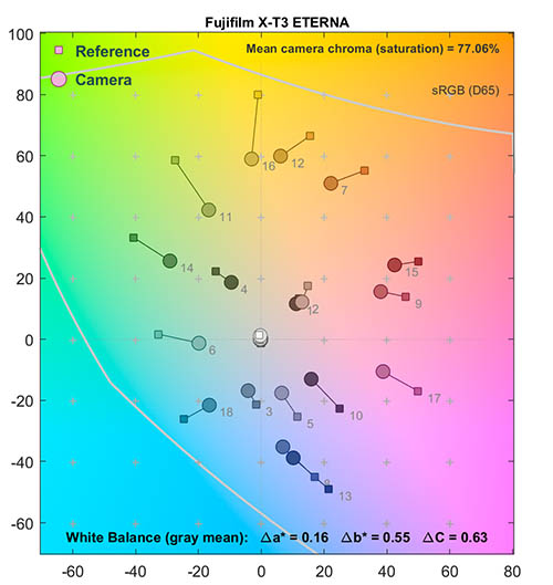
Looking at ETERNA's color mapping, it has a similar squashed color palette to CLASSIC Neg, desaturating greens, magentas and purples more than other parts of the spectrum, although it doesn't do so nearly as strongly, and its tone curve is way, way flatter. Fujifilm told me that their focus was also on very accurate color as well, with less hue shift than many other film simulations. Unlike most other Film Simulations, ETERNA isn't intended to produce results that would be used as an end product, but rather to provide a very neutral starting point, with a lot of latitude to take the tone and color wherever you need it. Videographers and cinematographers have to work with footage shot in a wide range of lighting conditions, and somehow distill it down to a uniform "look" across the entire piece. Many still shooters tend to just tweak whatever default color the camera gives them, but if you're aiming for a particular, unique look, Eterna will give you a lot more room to maneuver than higher-contrast, more saturated and conventional-looking renderings would.


As mentioned above, while ETERNA may more immediately appeal to videographers, you may find it useful on some shots, and if you retain the RAW files from your images, you can always check it out on a case by case basis after the fact.
ETERNA Bleach Bypass

ETERNA Bleach Bypass is the newest of Fuji's film simulations, only available in the X-T4 and GFX100 as I'm writing this in early August, 2020. Its name refers to a step in color negative processing, where the silver used to record the image is removed from the emulsion, leaving only the colored dyes behind. This is called the bleaching step, and either reducing or skipping it entirely results in an image that looks like a contrasty black and white photo with a bit of color overlaid on it. The contrast is so high because the silver left in the film in the highlight areas (remember, we're talking about a negative printing process) results in very bright, washed-out highlight, and if printed to maintain the midtones, the shadows end up very dark. For this reason, shots intended for bleach bypass processing are frequently captured with up a stop or so less exposure than normal images would be.

As you can see, the color map for ETERNA Bleach Bypass is way, waay undersaturated, even more so than CLASSIC Neg. But the undersaturation of ETERNA Bleach Bypass is pretty uniform across the spectrum, and there's very little in the way of hue shifts. From a color standpoint, its hue shifts and relative desaturation between colors match ETERNA's almost exactly; it's just that overall saturation is much, much lower, and contrast is way, way higher.
Looking at the lab shot, you can see the washed-out highlights that are a hallmark of bleach bypass film processing. Unlike film, though, this image was "developed" from a properly-exposed RAW file, so you needn't worry about losing highlight detail in your originals, as long as you retain the RAWs. If you plan on using the in-camera JPEGS directly, you might want to dial back exposure by a stop or so, but if you're processing from RAW, you can make the exposure adjustment as part of that, and still have a correctly exposed RAW file to use with Film Simulations.


Even more so than ETERNA itself, I think a lot of still shooters will be drawn to ETERNA Bleach Bypass for its unique, gritty look. I myself don't expect to use it often, but I really like its raw, grungy look for urban scenes, and it's an interesting choice for what would otherwise be highly-colored subjects like the flowers above. And, at the risk of overstating the point, if I decide I don't like how a shot looks with it, I can always just re-render the RAW file in another profile :-)
ACROS (+ optional Ye/R/G filter)

Finally, we come to Fujifilm's monochrome film simulations, led by the gorgeous. ACROS profile. ACROS is the only monochromatic Film Simulation that mimics a specific family of Fuji's film, specifically the Neopan ACROS series. Many people don't realize that traditional black and white films responded differently to different parts of the color spectrum. These color-response differences combine with the details of each film's tone curve to result in a unique "look" for each emulsion. Changing the color mode from RGB to Grayscale in Photoshop just removes the color information from the image, leaving behind the luminance or brightness data. The contrast and effective color sensitivity will depend a lot on the characteristics of the color original, but in general, this luminance-only conversion tends to produce bland-looking images. You can of course just bump up the contrast in Photoshop, or even use the Curves control to create a custom tone curve, but I've personally never been as happy with the results I could achieve as I was with the black and white prints I made in the darkroom (many) years ago.

Back in the black and white film days, photographic film makers put a lot of effort into the details of how their emulsions responded to color and what their tone curves looked like. I remember the first time I saw an ACROS-simulated image and thinking "oh yeahhh!" I haven't yet been able to figure out what it is about the ACROS simulation that connects so viscerally for me, but the images just look good to my eye. I'd certainly still dodge and burn a critical image as needed, and perhaps even mess with the Curves tool some, but ACROS provides a good starting point, and straight-from-the-camera images shot with it are pleasing to my eye.
This is also why just changing the color mode in Photoshop from RGB to Grayscale tends to produce such bland-looking images. The contrast of a black and white image made from a color one will obviously depend a lot on how contrasty the color original was, but the subtleties of black and white films' color sensitivity will be missing.


ACROS grain simulation
There's another wrinkle to ACROS though, that sets it apart from simple Photoshop processing, and that's its grain simulation. Film grain looks a lot different than digital noise, and even fairly sophisticated "grain overlays" in Photoshop and other programs don't accurately reproduce what actual film grain looks like.
Most of us know what film grain looks like: Even if you never shot film yourself, you'll have seen plenty of old black and white prints or magazine photos. Most people don't realize just how different film grain is from the sort of high-ISO noise we see in our digital images, though. Film grain has a very different structure to it than digital noise, and different film emulsions each had their own unique grain structure.
Where does film grain come from?
Black and white film chemistry is a seriously complex subject. The full story goes way beyond what we can cover here, but check out this excellent, detailed and surprisingly understandable description of how black and white film chemistry works, by Tim Johnson of the University of Wisconsin, if you're interested in the details. I'll try to share the basics here, without getting too far into the weeds.

(Image from here)
It all starts with tiny crystals of silver halides, chemicals like silver chloride, silver bromide and silver iodide. When photons of light hit these molecules, they split them apart, producing separate atoms of silver and whatever other element was involved. In a film emulsion, only a few molecules in each film grain are split like this, but the development process converts the entire halide crystal to silver, even if only a few molecules were initially affected.

[Image by IR contributor Jeremy Gray]

The larger the silver halide crystal, the more likely it is that a few of its molecules will be affected by incoming light, and that the whole crystal will eventually be turned to silver during the development process. Larger crystals are thus more sensitive to light, which helps explain why high-ISO films have much coarser grain than lower-ISO ones. (As a side note, any film emulsion has a range of different grain sizes; the distribution of grain sizes is part of how film manufacturers control contrast curves.)


The serpentine patterns from Photoshop look a bit like the ACROS grain simulation from Fujifilm cameras, but they seem to be a general artifact caused by Photoshop's demosaicing, as I see fairly similar structures in high-ISO images from a range of cameras, both Bayer and X-TRANS.
But even when the individual silver particles are completely turned to silver, they're generally too small to be noticed on their own. During the development process, the silver particles actually clump together to form the film grain that our eyes can see.
The original size and shape of the silver halide crystals and the way the resulting silver particles clump together during development affects not just the size but also the shape and general appearance of what we perceive as film grain. As if that wasn't enough, the structure of grain can be quite different in highlight areas than in shadows.


Fuji's ACROS Film Simulation models this entire process. The result isn't just a collection of random digital dots, but an algorithmic re-creation of the structure of the original ACROS film grain, including the way the texture changes as you go from light to dark areas of the image.
I've greatly enlarged the samples seen here, so we can see more of the details of what's going on. At two screen pixels per original camera pixel, this is pixel-peeping carried to an extreme(!) There's no good way to translate how images look when printed onto a computer screen; the impression caused by the structured grain simulation from the ACROS profile is much more subtle than the crops here would indicate. It's hard to convey in words; use the following links to download full-resolution versions of the above image, with the grain set to None, Weak and Strong and print them yourself to get a sense of what ACROS grain looks like.
Two factors affect grain in ACROS Film Simulation images
ACROS was a relatively low-ISO, fine-grained emulsion, unless it was push-processed to higher ISO ratings. The built-in ACROS grain combines with the natural noise at higher ISO levels to produce a more grainy-looking result than at lower ISOs, similar to film. I'm told that the basic ACROS grain processing is always the same, but on a practical basis, you'll see more "grain" at higher ISOs, so if you know you're going for a grainy look in a given shot, shoot the original at a higher ISO setting, even in brighter lighting.
The second way to control grain with ACROS is just the same as with all the other simulations, namely the no grain/weak grain/strong grain options that the camera gives you on the separate "grain" menu selection.

The grain simulation in the ACROS profile is only available with ACROS: The Monochrome/black & white Film Simulation also offers options for "grain", but it's more of a random digital pattern, rather than the carefully-constructed and more natural-looking grain provided by ACROS.
As I said above, my immediate reaction to seeing photos rendered with the ACROS Film Simulation was along the lines of "aaahh, now that's what I'm talking about!" It's by far my favorite black and white mode on any camera I've shot with to date, and it's draws me to shooting black and white much more than I used to, in my earlier digital days.
Optional yellow, red and green filters
If you ever did shoot black and white film, there's a good chance you had at least one or two color filters in your bag. I often used a yellow filter to make clouds pop in skyscapes, or even a red filter if I wanted to get really dramatic and darken green foliage at the same time.
Both of Fujifilm's black and white Film Simulations let you apply yellow, red or green filters to the image before the conversion to black and white, replicating their effects with black and white film.

(Mouse over to see the PROVIA original)
[Image by Dave Pardue]

The green filter darkens the sky slightly, but the main impact is to soften contrast in the green foliage.
(This may not be the best shot for showing the effecct of a green filter;
a landscape shot with more deep green foliage would give a better idea of a green filter's impact)


The optional yellow, red or green filters we've just previewed are available in both the ACROS and standard Monochrome Film Simulations. Cameras since the X-T3 and X-T30 also have an option called "B&W Adjust" that lets you adjust the color tone of the black and white image, with nine steps in either direction from neutral to warm or cool tones. (Many back & white printing papers have distinctive tones to them; this lets you mimic those characteristics. You might for instance choose a warmer overall tone for a portrait shot, or a much cooler one for a winter snowscape.)
MONOCHROME (+ optional Ye/R/G filter)

The MONOCHROME profile -- originally called B&W in earlier Fujifilm cameras -- is based on the PROVIA Film Simulation, but with the color removed. Compared to the ACROS profile, the result is a flatter tone curve, and grain isn't emphasized as much either. As with ACROS, though, you can opt for yellow, red or green filters, and can give the resulting image a warm or cool color cast on cameras since the X-T3 and X-T30.


[Left image by IR contributor Jeremy Gray; Right image by Dave Pardue]
I've spent a lot of time touting the glories of ACROS, but that doesn't mean that the standard Monochrome Film Simulation is without merit. The flatter tonality may, in fact, be preferable for some subjects, whether you're going for a softer, dreamier look in a landscape, or dealing with a very contrasty subject with strong highlights. I can't recall the last time I've actually shot with it, but I'm sure I'll be thankful it's still there at some point in the future :-)
SEPIA

Finally, we come to the SEPIA simulation, giving a result similar to that of the MONOCHROME profile but with a warm, sepia-toned look that gives your images a retro feel.
Sepia toning was a big thing back in the earlier days of photography, but it wasn't just an aesthetic choice back then. Sepia toning involved replacing the silver particles in a print with silver sulfides. Sepia tonight gave prints a characteristic warm cast, but its main benefit was that silver sulfide is much less affected by environmental pollutants, especially sulfur, a major pollutant from the coal-burning that powered the Industrial Revolution. Sepia toning also sidestepped possible fading issues from incompletely fixed or washed prints.
Its practical benefits made sepia toning almost ubiquitous among formal portraits of the day, so we associate it strongly with old portraits. If you're looking for an old-timey air in a photo, check out the Sepia Film Simulation on your Fuji camera.
Fuji film profiles in third-party software: The same thing or... not?
A number of third-party RAW conversion apps support Fujifilm cameras, and offer film simulations matching those found in the cameras. Or do they? (Match, that is.)
When I first started working on this article, I was happily slaving away in Photoshop, converting image after image from the RAW files, using the different Fuji film profiles that are built into Adobe Camera Raw. But then I happened to see a from-camera JPEG of the same shot I'd just converted with the same profile in Photoshop. The results were different - a lot different!
Really? I'd just spent hours converting dozens of photos, only to find that the "PROVIA", "Velvia", etc in Photoshop didn't actually look like those simulations in the cameras. I was a little... perturbed.
When I compared images converted by X RAW Studio using various cameras' own processors with those from Photoshop, the differences were immediately obvious. Some Film Simulations were at least in the right general ballpark, but others were completely different, usually in ways I didn't like. If it were just a matter of tonal tweaks, I could always compensate for that with an action in Photoshop, but the color rendering was different as well.
Curious? Check these examples...

The film profiles in Adobe Camera Raw are at least notionally similar to what the various Film Simulations are doing, (Velvia is more saturated than the default, Pro Neg is flatter, etc), but you can see just how dramatic the differences are in the images above and below.

Of course, you may find that you like the look of the film sims in ACR or Capture One, and that’s perfectly OK. But workflows that don't involve the camera's processor are going to result in different looks than you'll get straight from the camera. As I said, you might actually prefer the renderings in Photoshop, Capture One, Silkypix or whatever to the camera's own output, but you need to be aware that the two are different; often very different.

Bottom line, while various RAW processing programs may appear to offer the same film simulation options as found in Fujifilm cameras, the only way to reproduce what the camera is actually doing is to use the camera’s processor itself, whether in-camera or through Fuji's X-RAW STUDIO.
(One important side note: Adobe and CaptureOne handle the JPEG thumbnails that are embedded in Fujifilm RAW files. The thumbnails in the files are generated by the camera, based on the Film Simulation that was selected at the time of capture. When you bring an RAF file into Lightroom, Adobe ignores the built-in thumbnail that the camera created and instead builds its own, rendered with the default Adobe "Fujifilm" look. In contrast, Capture One displays the thumbnail as it came from the camera. In the case where you have both JPEG and RAW versions of your shots, Adobe's approach could be a bit confusing, as the RAW file thumbnails might look quite different from their JPEG counterparts.)
Phew... Questions/comments?
From our discussions with them, we'd expect to see Fujifilm continuing to add even more film types in the years to come. (As well as continuing to improve and refine the look of its existing simulations, something it has already done more than once as newer cameras have been announced, and more powerful image processors become available.)
What Film Simulations would you like to see added to the roster? And do you have any thoughts or questions on Fujifilm's Film Simulations tech that you'd like to see answered? If so, sound off in the comments below -- I'll be monitoring comments for at least a couple of weeks after we publish this article, and will do my best to get the answers you're seeking!